These may be perfect for the world of gamers for sig creation.
However, not so much in the professional realm of graphic design simply because you tout the fact they are made in Photoshop. Logos for business usage must be created in a vector program like Illustrator and there are certain conventions that need to be followed so that they can be used in all of the various ways a company uses their logo in the real world. The most important convention is not using any imagery or effect that is resolution-dependent. That’s not to say a proper vector logo can’t be brought into photoshop for some bling action on occasion, but that isn’t where they start.
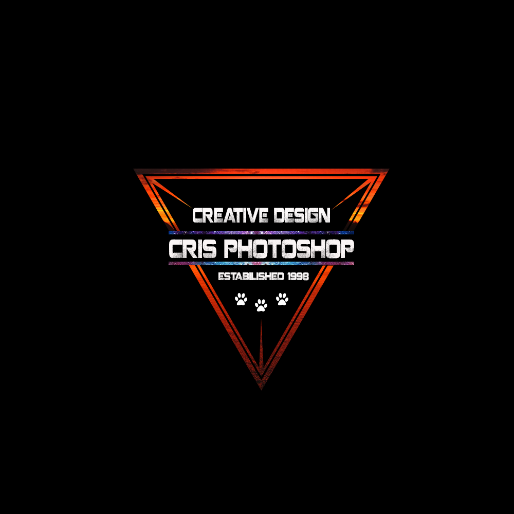
You say you are a beginner, yet one of your logos says Est. 1998? Which statement is untrue?
Maybe he was born in 1998…just a guess though.
I thought about that. LOL.
If you were born in 1998, that’s a good start. You still have a long way to go. Check other post where people have asked for advice you can apply to your case.
Here you have one of them: https://www.graphicdesignforum.org/t/logo-critique/3118
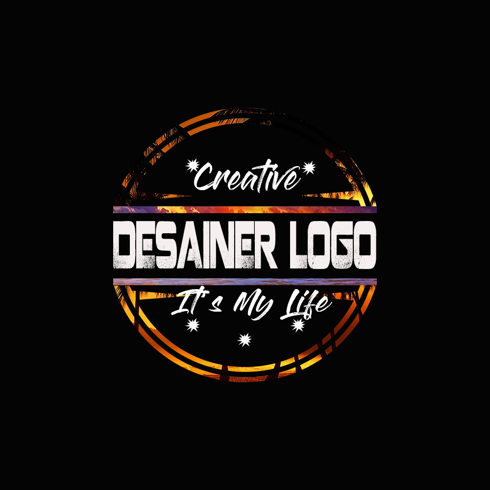
“Desainer” Logo?
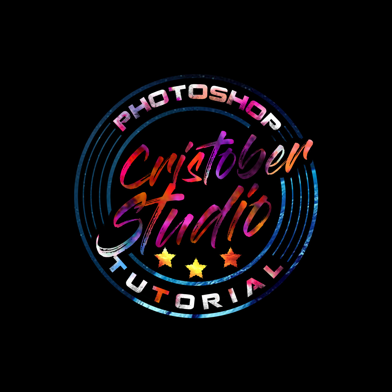
Those are some pretty cool designs with some really fun coloring. Well done.
Due to them being created in Photoshop and most likely in RGB color format, your best use for them would be any web based platform. To print them, say for a sign, banner or backdrop, would require them to be converted to CMYK which would make your colors look a bit different. If you haven’t tried it yet, convert your file to CMYK and see what it looks like.
I agree with PrintDriver about having a vector version of the logo. Every business should have a scalable version of their logo.
Keep up the good work. I really like the concepts.
If you have a black & white version, you can present it. Actually, it should be tested by the one color, and how it looks. However, the logos are well generated.
These designs are really creative, excellent color choosing and fonts over here are used, all made the logo design very unique and classic for grab the attention of visitors.
The “colors” are actually raster photos of tropical sunsets captured by a logo mask.
Raster photos in logos = bad idea.
Thank you for this post, I got to know many things more about illustrator and Photoshop difference and I will make sure to use this in right way.
Good start.
The colors are a bit busy for my liking and some of the elements (like the “stars”) seem a bit crowded.
Compositionally I think you’re on the right track. Definitely look into Illustrator for creating Vector logos ![]()
I totally agree. These should be presented in black and white and color could be added later.
I think the original poster is long gone.
well we all have to start somewhere
True, but it’s important to start down the right road with a destination in mind and a good map in one’s pocket.