What is the best posistion to place text in this flyr?

Depends on the text. The amount, the importance, the font, the reason for the flyer, etc.
Why don’t you try placing some text and ask for comments on your choice.
No one will do your work for you.
You’re asking us for something. Our time and attention have value.
Since you haven’t bothered to communicate with any politeness, personally I’m not going to bother answering your brief and rude request.
I’m sort of sitting around the house waiting for somebody to show up to head out on a motorcycle ride, so I’ll bite (at least until he arrives).
Your type is awfully difficult to read.
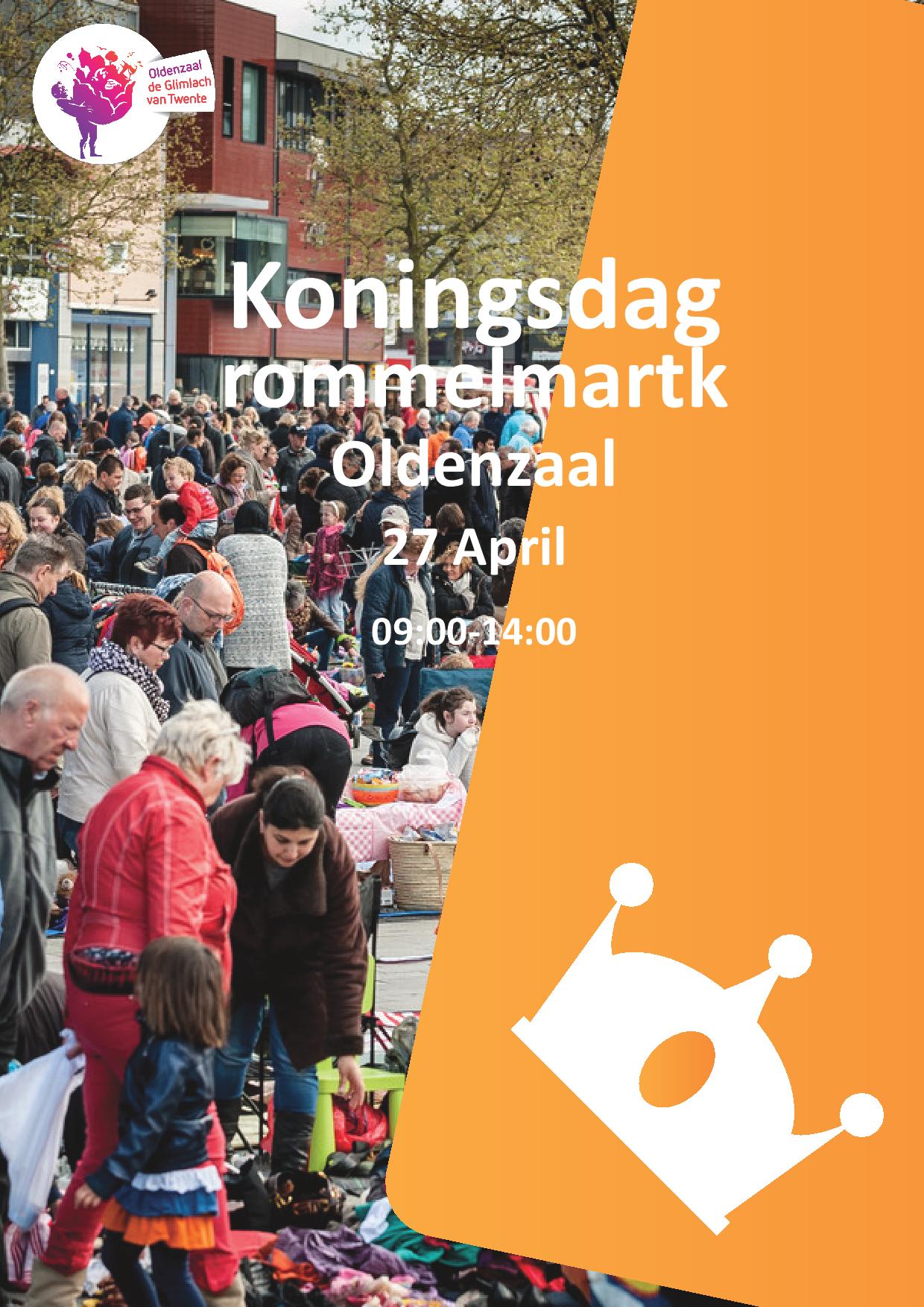
Generally, it’s not a good idea to place text over photos unless the background provides sufficient contrast with the typography to make it easily readable. In this case the background is so busy that it makes placing type there very problematic.
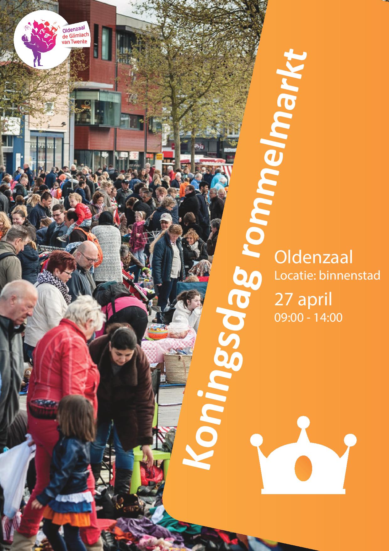
The best place to put type is probably in the orange shape. Do you have any flexibility is changing the shape or repositioning the crown? You might be able to move the crown into the photo if you darken up the background behind it just a bit.
A possibility might be to run the word Koningsdag vertically quite large along the right side in a dark color picked somewhere from the photo. The word Rommelmark could also run a bit smaller, vertically, in a lighter face and in white. This would leave the bottom of the orange shape for the city, date and time, which I would run horizontally flush right and aligned with the top of the x-height of Koningsdag. You’d need to reposition the crown a bit, however.
I could show you what I’m thinking, but that’s against the forum rules. I’m certain there are other solutions that are even better.
I should probably try to be nicer… ![]()
But that would be quite the challenge.
I suspect you’re not all that mean. ![]()
![]()
![]()
Maybe not mean… but I’m good with boundaries.
I respond much better to those who have made some effort to help themselves, and have taken time to explain why they’re asking for help.
Some of them seem like they view this group as some kind of coin-operated advice vending machine. And those deserve a different kind of “feedback.” ![]()
And maybe move the crown so that it fits snug in orange corner.. I don’t know. Play around with it.
I’d put the text on the orange shape. Otherwise, I don’t see any reason for the shape to be that big. But as PrintDriver already said, depends on the text. Maybe right alignment would work but we won’t know until you try it. And maybe make the crown smaller and move it to the upper right corner so to take advantage of the space on the bottom as the shape is much bigger there.
Another solution would be (although not really recommended) to add a very distinctive gradient rectangular shape from black to transparent (left to right) with low opacity (so low you’ll barely notice it) on the upper left corner/on the building and add the white text on top of it. But as I said, why have that big shape to the right then? That way you’ll have a very busy area on the left and just a shape on the right with the crown on it. Not sure that would work…
A general advice: You should always try a few versions when you’re stuck. We are not able to say how something would look unless we try it. Sometimes you think something will look amazing but then you try it and you realise you were wrong. Or sometimes you think something would look very bad and after you try it, guess what! It looks awesome! Always try different versions, it’s another way of gaining experience. Try a few versions and post them here. It would be a better starting point.
Hope that helps.
Just a reminder, but the forum rules prohibit redoing other people’s work. The rules do permit clarifying sketches that are difficult to convey using just words, but your example might be a bit over the line. Admittedly, though, there’s an awfully big gray area there for where that line might be.
From the forum rules:
Do not take work posted for critique and redo it. If your critique is difficult to explain in words, a supporting sketch or example to clarify your words is acceptable.
Personally, I’m not in complete agreement with the need for this rule. I think it’s sometimes fun and helpful to jump in with a few visual ideas from time to time if the original poster agrees to it. Nevertheless, the current rule frowns on it. Sorry.
It’s better, but you’re being too reserved. Make that typography take charge of the page and interact with it instead of just timidly positioning it as though you’re afraid it might bite you.
Pay attention to the interaction between the negative and positive shapes within that orange shape, and make them work together as a cohesive unit. Again, you’re being too timid about taking charge of the space you have to work with. Also, all the type doesn’t necessarily need to be white.
Also, if you want to run your type on a diagonal, be sure the angle of that diagonal matches the angle of the orange shape’s edge, which it currently does not.
English may not be the first language of the OP. He/She may not be able to communicate more than “What is the best posistion to place text in this flyr?”. ![]()
Could be, but most people from the Netherlands can speak better English than half the native English speakers I’ve met. ![]()
There’s a whole lot of tension between the main headline and the supporting copy and between the main headline and the crown. Also, the main headline isn’t parallel to the orange box.
I thought I might be within the rule-set by using filler type and not actually the typography supplied by the poster.
In any event, you have my apologies for bending the rules.
This doesn’t qualify as a “supporting example” as per the rules state?
Umm, well, like I mentioned, my opinion is that sometimes it’s fun to jump in and fix something or actually show some ideas. I’d like to do it myself sometimes. And if if were solely up to me, I’d loosen up the rules in that regard.
On the old GDF, this rule was more rigidly enforced. (It was the very first thing I got in trouble over when I joined the forum.) We’re still feeling our way through the transition to this new GDF.
As for your example being over that murky, gray line, it seemed to be to me, but reasonable people can disagree. I think I just might bring up this subject with the other moderators because we haven’t had a discussion about it. Thanks for providing me a good opportunity to do just that. ![]()