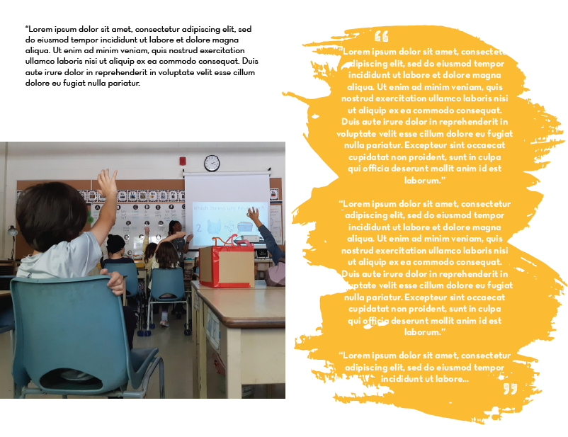
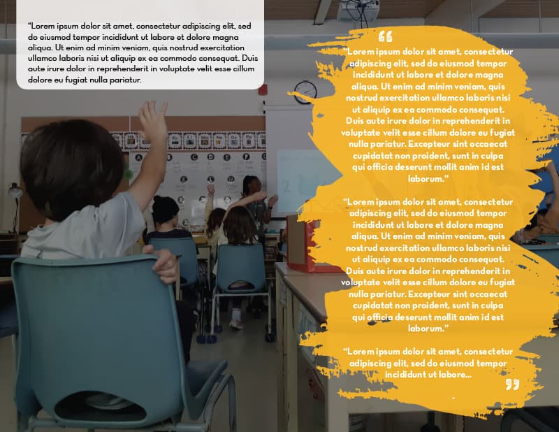
I have a photo, the intro text, and a quote. How can I place them in one spread so it looks good? I tried the attached example but my boss wasn’t fond of it… saying that it looks like we’re blocking/hiding something behind the quote.
How is the brush-like nature of the yellow object relevant to the subject matter?
I can understand your boss’s observation, but I don’t think his concerns are especially justified. To allay those concerns, however, how about adjusting the opacity of the yellow object to enable enough of the background to show through?
The reason your boss says you are “hiding information” is because white lettering over yellow is hard to read. If yellow, it needs to be darker, or lighter with dark letters.
Sometime you might want to lookup how type and background color choices affect the reader. After all, the whole point of a message is that it will be read.
The crop of the photo at the top is a better one. The bottom, with the video screen where it is looks like there are two photos there, and that you are hiding stuff behind the yellow blob. If you make the blob transparent, it will be too busy on that one and the white text definitely won’t work.
The white text falling off the yellow blob in the top one is not a good idea at all.
That’s a really long quote. It’s way too long to be a pull quote from the article. You need to have a good reason to cover all that real estate like that.
1 Like
This topic was automatically closed 365 days after the last reply. New replies are no longer allowed.