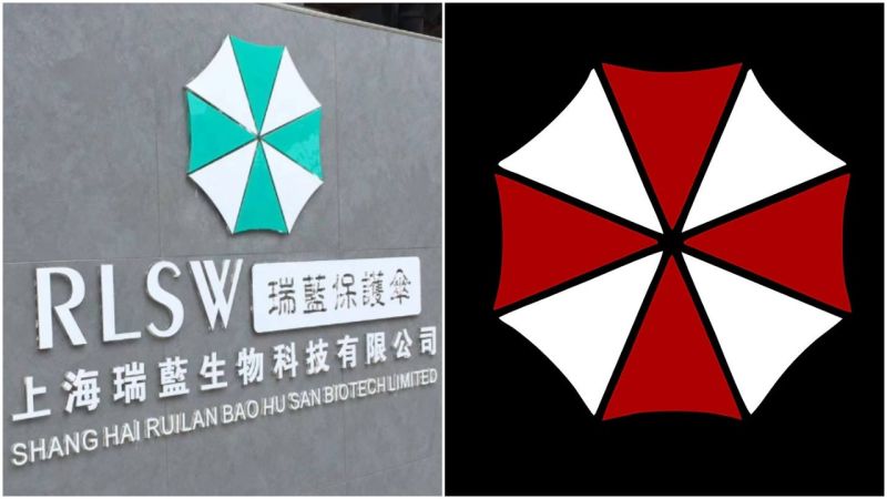
Movie fans and gamers discovered that a Chinese biotech company’s logo symbol is identical to the logo of the Umbrella Corporation from the Resident Evil Japanese horror media franchise created by Shinji Mikami and Tokuro Fujiwara. The Umbrella Corporation was responsible for the horrible virus outbreak which serves as the foundation for the story.
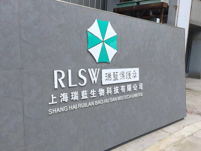
The signage of RLSW in Shanghai seems to be real, because it’s matching the logo on the company’s website. While the site itself went offline recently, a webpage showing the same logo is still available on waybackmachine.
The Chinese biotech firm RLSW Shanghai Ruilan Bao Hu San Biotech Limited ( 上海瑞蓝生物科技有限公司 ) is located 800 km from Wuhan, the epicentre of the coronavirus named after the city.
Hi Iraszl,
Nice logos on both sides. To me, the resemblance in both the logos seems a great coincidence. Someimes a designer draws a design but that looks some word. I happened to see such a design once.
Now, in this matter, the one who designed the logo later can make modifications so it can look different.
All the best.
It’s always interesting to revisit older threads like this, especially when it comes to logo design and branding! While it’s been a few years since this discussion started, the idea of a biotech firm’s logo resembling the Umbrella Corporation logo is still a relevant point. In the world of branding, we know how crucial it is to avoid unintentional associations, particularly with such strong, recognizable symbols from popular culture.
Since 2020, there’s been a rise in more minimalist and unique designs that stand out without leaning on familiar references. If this biotech firm is still using a similar logo, they might want to consider revisiting their design to ensure it truly reflects their values and establishes a positive brand identity—especially as the company evolves.
It’s always a good idea to look at your branding from fresh perspectives over time!