So I’m creating a boat name graphic and looking at blackletter fonts and see a bunch of lowercase y that are resemble a lowercase n more than y as well as w that turn into m shapes. Why is that?
I don’t mean to be flippant, but it’s because the designer designed them that way. Seriously, that’s pretty much the reason.
Blackletter is difficult to read, but it has a long, complicated history that involves lots of different styles coming together that tend to get scrunched into the broad, generic label of blackletter.
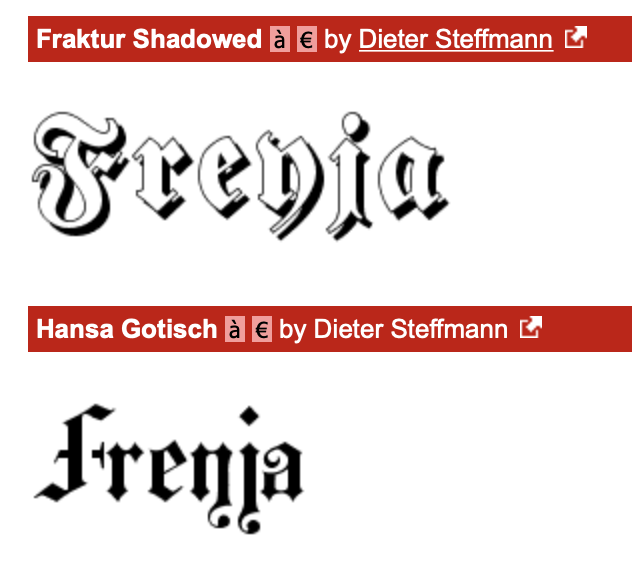
The blackletter faces that you’ve posted are variations of a blackletter style called Fraktur (which is a much broader category of blackletter than today’s typeface named Fraktur). The name Fraktur means just what it sounds like — fractured letters. The style is characterized by the thick vertical strokes being broken up into sharp, angular pieces and connected by thin diagonal strokes and point-to-point connections that make the letters look fractured.
Lowercase letters developed much later than their Roman capital counterparts, and the letterforms have never been quite as standardized as a result. Look at the difference between the single- and double-story a or g — the double-story is completely different from the single story versions, yet they’re totally interchangeable to the degree that most people don’t even notice because they’re used to them.
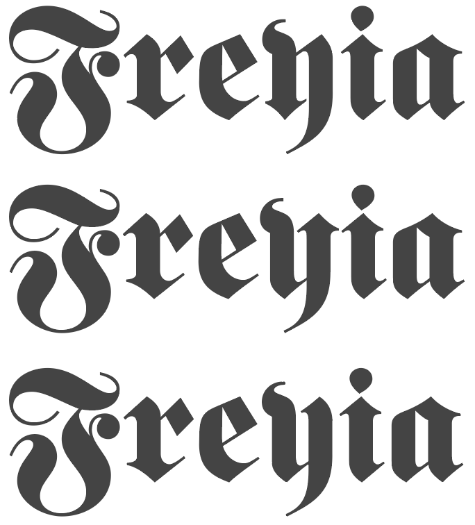
You’re just not used to seeing a y that looks like an n with a tail on it, but with a little thought it’s easy to see how some German designer at some point going on whatever convention he was used to at the time considered a y to just be two thick vertical strokes, just like an n, only with a descender tagged onto the bottom of the right stroke. Personally, I’d modernize the y a bit to make it look like what most people think a y should look like. There are plenty of Fraktur style typefaces where the y really does look like a y.
Now, about the supposed author of these two typefaces — Dieter Steffmann. These are not his typefaces, nor did he have much, if anything, to do with their design. Steffmann is an old German guy who seems to have dedicated his later years to relabeling typefaces as his own. He ripped off one of my early fonts, changed the meta data in the font file by removing my name, inserting his own, then uploading it to every free font distribution site in existence without even changing the name of the typeface. I finally gave up on fighting that battle as a game of Whack-A-Mole with the free font sites.
4 Likes
Thanks for the explanation! Sites I visited were pages on pages of the history of blackletter and I don’t have that kind of free time at work. I never expected to find a designer ripped off by the “designer” of those two. That’s shitty of him. Luckily I’m not using either of those, I was just looking for a quick example of the letter forms.
I was trying to find blackletter fonts that were similar to this one which led to me finding to the y looking like an n question.
The middle 3 paragraphs were ultimately what I was searching for. I couldn’t figure out if it was difference between languages at the time or simply stylings of the artist.
If it were me, and if I decided to go with a Fraktur typeface, I’d likely change that y to be a little more legible to modern audiences — something along the lines of what I’ve done with the two bottom ones below.
4 Likes
Just-B, I am so sorry your font was ripped off. What a bummer! And the Big Duffus probably knows that a single freelance designer would probably never have the resources to sue the guy (even though that’s what he deserves!
nk.gd — Why are you planning to use Blackletter face(s)? They are so difficult to read that no designer I know would even consider it, except and only except if they were creating a design for a period piece reminiscent of pre-WWI Bavarian style.
It’s what the client wants shrugs His great grandmother was involved in the publication.
Everybody thinks they are a graphic designer (sic)
Outside Germany blackletter faces are used to evoke a medieval feel, it’s true (and some heavy metal bands), but blackletter faces like this are still in use today in Germany, although less popular than in earlier times. I have seen magazine articles and books where a blackletter face has been used as body text.
That is my point. If one is creating a period piece or logo for a heavy metal band, Blackletter makes sense—go for it! That being said, this forum is all about helping designers (especially young ones) create better graphic design. Even if Blackletter is still in use does not make it a good design choice.
I’m not sure why, but the use of blackletter type seems to be part of a current trend. As @PopsD said, it’s mostly for certain kinds of things meant to evoke an old German look (beer labels are a good example), counter culture and bad boy imagery (metal bands, motorcycle gang looks), and newspaper masts, of course.
I’m starting to see blackletter appear for other uses too, but mostly as a design device where something unusual might be useful. I honestly can’t see it going mainstream for many things, though — at least I hope not.
I can’t remember for sure where it was, maybe on this forum, where someone with a German background mentioned a stigma it has in Germany due to its association with World War II. To me, this seems misplaced since blackletter was used extensively in Germany for most everything up until the beginning years of the 20th Century.
In some ways, what we regard as modern sans-serif type is the result of a rebellion against traditional blackletter typography that took place in Germany between the World Wars. The design influence of the German Bauhaus school, for example, can’t be overstated. The Bauhaus design philosophy, in many ways, was a rejection of traditional ornate German design, like blackletter, in favor of a clean, industrial look that grew far beyond Germany to become the universal mega-style for most everything from graphic design to architecture to industrial design to typography. The extent and ubiquity of this style is so large and universal that most people don’t even recognize it. But now I’m going off on a tangent — sorry.
1 Like
Interesting - my German friends say the Bauhaus look is more associated with Nazi Germany (maybe because of the architecture) and the Blackletter style is now seen as nostalgic and traditional. Maybe attitudes are changing.
There are two basic mindsets at work - Beyern and Bauhaus, or Bavaria and Dusseldorf. I have been in apartments where the kitchen is Bauhaus and the living room is Beyern.
Which is odd, given that the Nazi’s forced the the bauhaus school to shut down as an affront to Nazi ideals and a hotbed of communism.
That might be a good example of newer generations not being aware of their recent history.
The Nazis shut down the Bauhaus because they thought it promoted decadent, non-Germanic, Communist-inspired, Jewish-influenced art. Instead, their idea of good German design was along the lines of Albert Speer — the influential Nazi architect who, following Hitler’s lead, designed and promoted most of the overblown, decorative, Third Reich architectural crap associated with the regime.
It was the Nazi closing of the school that prompted many of its faculty members and students, like Walter Gropius, Ludwig Mies van der Rohe, and Herbert Bayer, among others, to flee Germany and emigrate to the U.S. Here, their influence completely overturned almost every aspect of design and led to the ubiquitous International Style that’s still with us in nearly everything from industrial design, to furniture, to architecture, to graphic design, to interior design, to typography.
It absolutely is.
right!? you can only influence a client so much but if they’re set in what they want, good luck. The only amount of editing I’ve done since the trace has been making pieces and angles more uniform.
Typeface choice is one of the most important decisions a designer makes. Design Basics 101 says that if a design (including the typeface) is not easily readable, then it makes everyone have to “work harder” to understand the communication. And the more one has to “work” to understand the message, the less the message will be “liked,” which means the less successful the design will be in the end.
Nothing wrong with using blackletter in that context. But I wouldn’t start with Steffmann fonts as shown in the picture. He “mass-produced” these kinds of revivals without any care for quality.
There are very good commercial and even OFL blackletter fonts available these days. The boat is probably expensive too. So no point in saving 20 dollars on a font.
For my own blackletter revivals, I always create two versions—one with the original character designs and one with more legible alternatives as Just-B showed with the alternative y. It’s not just this one letter. There are dozens of blackletter characters that can have a unique letter skeleton, which differs significantly from the roman fonts we are used to today.
Blackletter goes back to the time of Gothic art, when scribes would write the letters extremely narrow. The development split off from the roman writing style at that time and so many of the stylistic developments that happened later in blackletter remained exclusive to that style.
3 Likes