Hi everyone;
I love to share with you this book cover design that i have been working on, i love to hear your opinions and advices.
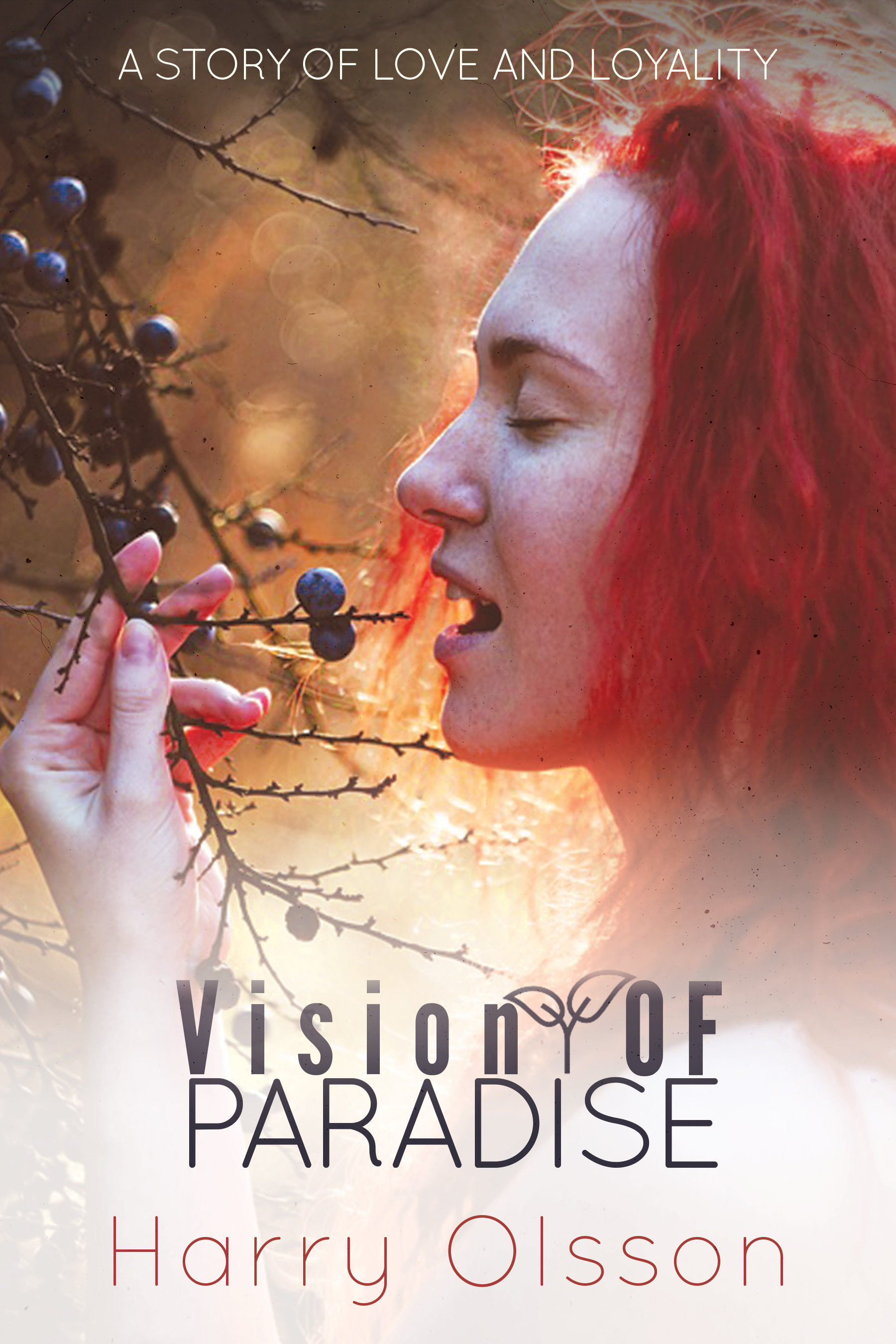
Loyality?? ![]()
That should be Loyalty
I will say it again .. correct spelling and grammar are your most important assets. If that’s wrong it doesn’t matter if you have just created masterpiece. No one will be able to get passed the glaring error and your message will be lost. If you aren’t sure of spelling, you need to ask for a second set of eyes to check things out and even a third if need be. You turn something like that in and you probably won’t be asked to create another.
3 Likes
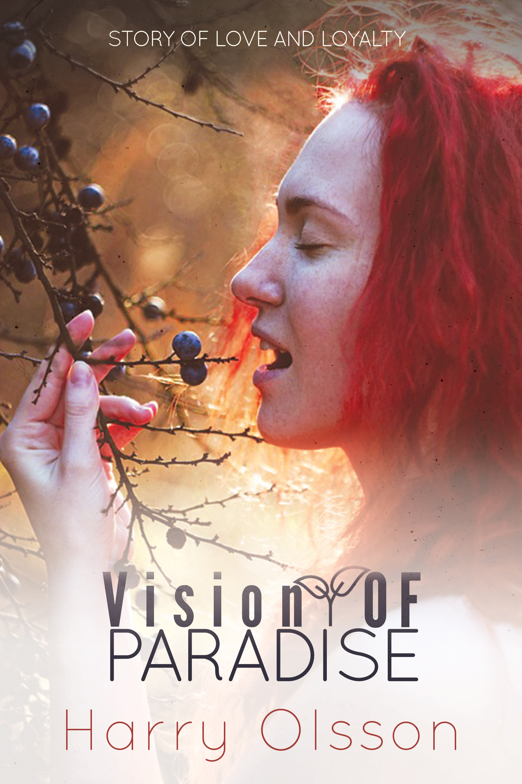
Thank you i will correct it.
I think there’s a very nice idea hiding in the cover, but it’s undermined by details that are at odds with that idea.
The typographic treatment of the title is not good. You’ve tracked out the lowercase (which rarely, if ever, works). The word OF is inexplicably uppercase. The little twig and leaves between them is a distracting and incongruent interruption — a detail that just isn’t needed. The second line is alien to the first line and uncomfortably close to it. In other words, the typography lacks consistency, rhythm and cohesion. Just pick a typeface that complements the emotional quality of the photo and stick with it. Quit trying to embellish the typography and causing it to compete with the photograph.
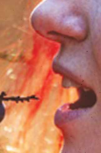
Speaking of the photo, it’s unusual. People pull berries off a branch before they eat them. They don’t typically pull them off with their teeth. People are not bears. I think it’s meant to be sensual, but biting down on a jagged stick with one’s eyes closed evokes thoughts and emotions at odds with that.
You’ve seemingly shifted the color tones to exaggerate the reds. Maybe she’s a natural redhead, but there’s nothing natural about the intensity of this particular red. The effect is somewhat jarring and at odds with the soft sensuality that I think you’re going for. That color shift is causing the skin tones to look flushed — almost to the point of looking like scarlet fever or measles. If you’re going for a sensual look, the basic elements are there, but again, you’ve pushed the photo in a direction at odds with that sensuality.
I’ve made assumptions about the emotional quality you want the cover to convey. But whatever that quality is, everything about the cover needs to support it. If you want it to be soft, warm, inviting and sensual, don’t introduce elements that are at odds with that. If you want it to be both sensual and jarring, well, those are the kinds of complicated emotions that can add up to a very powerful image, but they’re very difficult capture.
3 Likes
The type needs a lot of work. How many different fonts are you using? It looks like three or four. Either way, it’s too many. Just-B did a good job of getting into the specifics. I’ll just say that you should simplify the type.
Maybe I’m reading too much into it, and maybe I have a dirty mind. But is she literally sliding a “twig and berries” into her mouth? Am I’m the only one that’s heard of male genitalia referred to as a twig and berries. Now, if it’s that kind of novel or you meant to suggest fellatio, then go for it. Otherwise, you might want to rethink the imagery.
As a book cover this one can be works nice and i like this.
I really like how the book cover itself is composed, very well put together.
The text Vision OF PARADISE ← has inconsistent capitalization
While the typeface may typically work in most design cases, looking at this feels more like a web piece for a natural beauty product more than a book.
The typeface for the authors name also feels off, again, providing the “made-for-web feel”.
Consider exploring typefaces that compliment the books genre. For example, a fantasy book might have a typeface closer to old english with extra tails and decorative “swooshes” for accent, and a law book might have a sans-serif type face, with large black bold letters.
The composure is good, the look works, I think the colors play very well together, though I have a small over-saturation feel on my side, though it could be just my preference.
@RedKittieKat Sorry to be “that guy”, but your post should have said “No one will be able to get past the glaring error …” I’m only giving you a hard time since you made a point about spelling and grammar. ![]()
As the previous posters have done, it’s only possible to make judgements about the mechanical aspects of this design. In that sense, I’d agree the typography need a lot more attention.
Otherwise, there really isn’t enough information to evaluate whether it is a good cover for this book. Where did this photo come from? Steve called out a possible metaphoric connection to the twig-and-berries; and I should hope there is at least that connection to the story; else it shouldn’t be there. Is there anything at all in the image that connects to the story? Is the leading female character clearly described as a red-haired person in the story? If there is a reference anywhere suggesting she may be blonde, brunette, or olive-skinned, for example, this image could only be scrapped. I’ve never designed a cover for a novel, but I surely never would undertake one without reading the manuscript, and I can’t judge this one without knowing something about the story. Is there a brief?
![]()
It’s a new one on me, and I’ve been around for a while…
Ahem… that said, I agree with everyone on the typography.
And if this is supposed to be a romantic novel, I’d go back to the drawing board for the image too. The harsh reds and contrast don’t work. I like the vignette effect, but would try more pink and softness.
Eating berries doesn’t have much to do with romance. Maybe a woman staring pensively out a window or something?