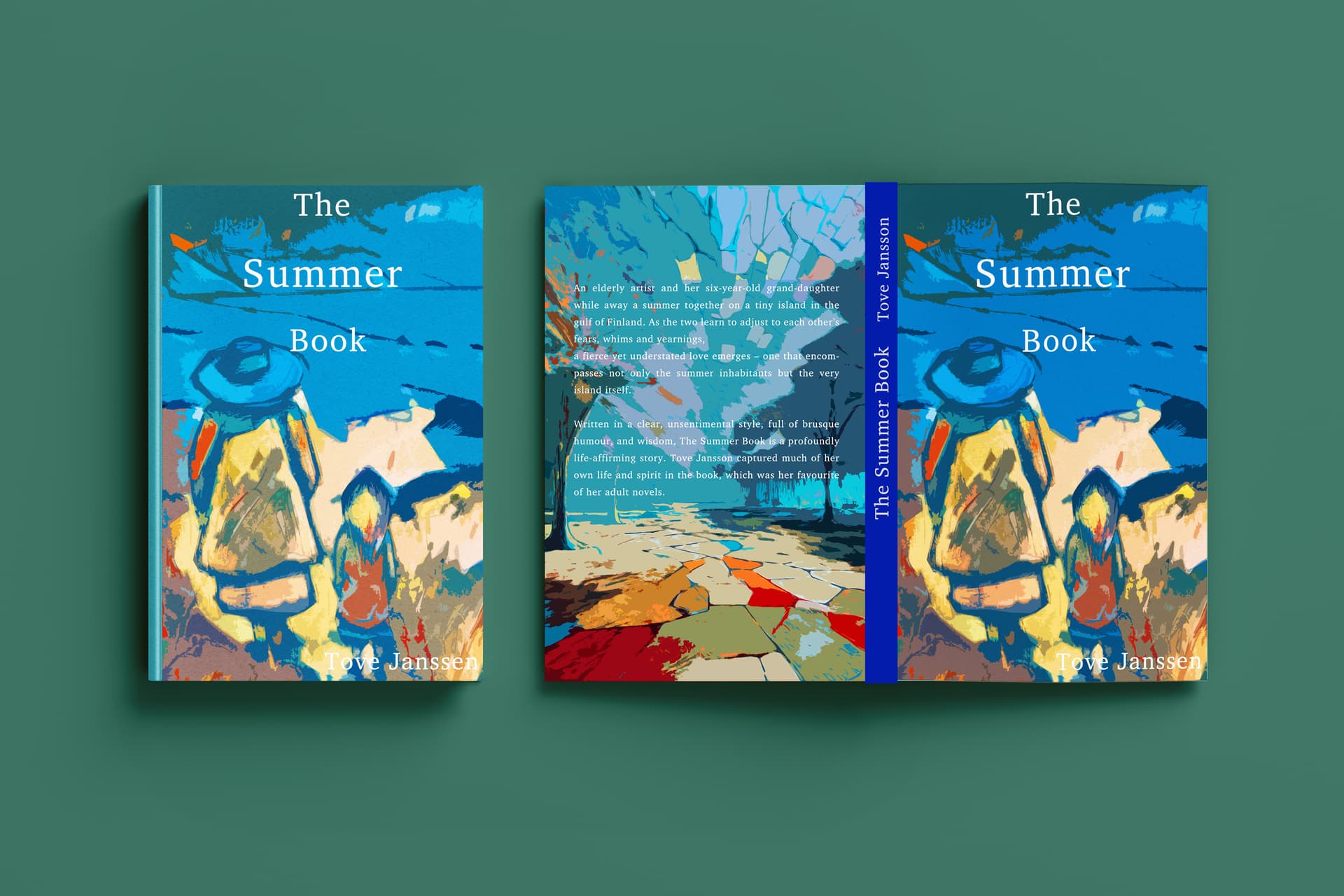
For a first-year design student, I think you’re on the right track. The illustration for the first cover is interesting and appropriate for the book about summer on Finland’s coast. It’s a bit abstract, but maybe that’s okay.
On the downside, the typography is weak and anemic. A book title should stand and not look like an afterthought. I don’t know why you chose to use so much leading with the title, but it isn’t working in this instance. If it were me, I wouldn’t jam the word “The” up against the top of the book. The author’s name fades into illegibility, tucked into the lower-right corner, and fights with the background. Similarly, the text on the back cover is compromised by the illustration behind it, making it largely illegible and difficult to read without some effort.
When choosing a photo or illustration on which typography will be placed, the type must work together with the background as a single unit rather than look awkwardly forced together in ways that compromise both.
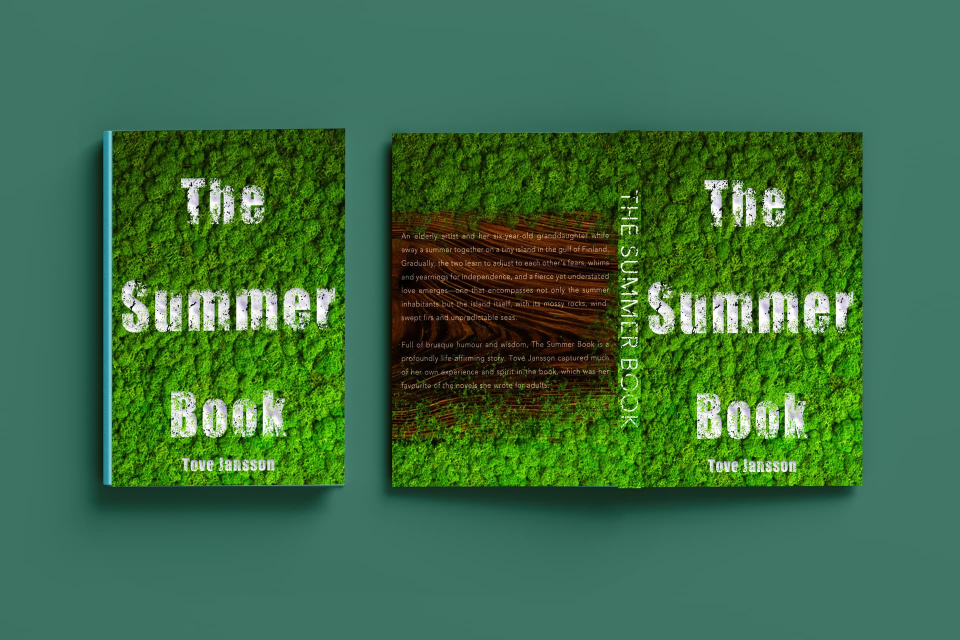
The title typography on the second book isn’t weak; it really stands out, which is good, but it might be a bit too camouflaged by the trees. The author’s name and the title on the spine are more definitely obscured by the trees, lessening their legibility. I also have reservations about placing the author’s name closer to the last line of the title than the last line is to the rest of the title.
The carved-out brown rectangle for the type on the back of the book looks awkward. At first, I thought it was clear-cut bare ground, but on closer inspection, I don’t know what it is. Additionally, as far as I understand, southern Finland is largely covered in trees. Still, the photo, at least to me, makes it look more like the Amazon Jungle than coastal Finland, and it says nothing about fishing.
If I had to sum up a general problem, it’s that you’re having trouble coordinating the typography with the background imagery so they merge into a single, aesthetically unified composition.
As I said in my first paragraph, you’re on the right track, so I want my critique to come across as helpful rather than discouraging.