Is there a formula for setting book margins in InDesign? I recently completed a project and didn’t think to change the default margins. Everything looked great on the screen (and in proofs I had printed, but they were not full page bleeds). When I received a copy of the completed book, I was shocked at how far the text came to the page edges! I’m working on another book and don’t want the same to happen. I have worked on previous books and never had this problem.
Thanks in advance!
Welcome to the forum, Ryan.
There’s not really a formula for page margins. It depends on the project. As a general rule, though it’s easy not to add enough space. Once I determine the outside margin, I’ll typically increase it a bit for the inside. If the book is perfect bound, I’ll add more. The top and bottom margins differ quite a bit depending on the project.
I suppose what I’m saying is that I do whatever seems right. The experience gained from making a few mistakes always helps too.
Look up the Canons of Page Construction.
And if you’re not sure what good margins would be for the project, typically a printers could have a sample blank file with margins and bleeds setup that you could use.
I use to dish these out regularly enough. Some even host on their websites.
I have no problem with that being mentioned. Every publication designer should be familiar with them. But the Canons of Page Construction are based on mathematical voodoo — nonsense centered around magical numbers and ratios that have nothing to do with good page design.
For example, the usual formulas in these canons, like the Van de Graaf Canon, produce huge outside margins and small inside margins, which is the opposite of what would normally be an optimal way to lay out a two-page spread.
By all means, though, look up these canons, but look them up as examples of how not to determine page margins.
I disagree. It’s almost similar to the rule of thirds for photography.
It’s good positioning for items on pages
As in the examples - everything isn’t set directly into the small areas designated by the canons - and there are 4 different canons.
Of course margins will need to be confirmed with printers. There’s no reason you can’t have smaller inner margins if the design and finish of the book require it.
If you’re looking for a reasonable starting point - then this is as good as any.
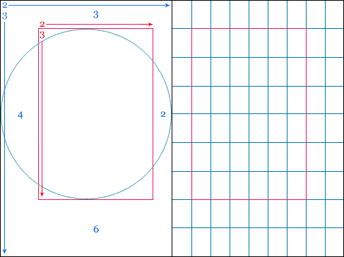
There’d be no reason why you couldn’t shift the pink box over 1 square or down 1 square.
Like anything - I never take it off the shelf and use it. You need to customise it to suit your needs.
I should have been clearer about that.
I’ve designed over 1000 books in my life time, largest being 3,200 pages.
I don’t always use Canons of Page Construction - but if there’s something different to be gained by applying a bit of geometry to the page as a starting point.
It can work.
The size of the margins is proportionally bigger with smaller page sizes. I wouldn’t go less than 12mm (half an inch) on the sides and bottom, often more at the top. I usually allow a slightly bigger margin in the spine, so make sure your left and right pages have different margins, if that’s what you do.
Also bear in mind the binding - for perfect bound books you will need a bigger margin in the spine, commonly an additional 10mm.
Those InDesign defaults were probably 1/2-inch. Throw in a bit of creep and some trim tolerance, and…
Even if it was still accurate to that 1/2-inch, a half-inch margin looks a lot smaller in print than it does on screen.
Well, the Canons are formulaic, but there is no universal right fit. Every square mm of every page is a design decision waiting to be made—by a designer. That’s you. Formula, eyeball, or instinct, if you get it wrong, you learn from it and improve. That is all.
They would have been set in Picas that’s why the measurements are odd in mm/cm/inches etc.
And creep and trim tolerance is calculated at imposition stage.
Or at least it should be.
There’s no reason for a designer to calculate creep - it depends on the stock thickness, signature range and a few other things. Creep on a 32 page signature would be greater than a 16 or 8pp section. And sometimes to create a 20pp section the signature would be 16+4 where the 4 are wrapped around the 16 or even 32 (for a 36pp) and that means more creep is required.
If it’s something new to you - then consider getting a dummy book made up - that is just blank pages, folded and stitched the way it will be finished - you can determine the margins easier then.
Or ask the print provider - any printer worth their salt will be able to give you the measurements for your margins.
I swapped signature and section way too many times there - lost count of what I was saying - take it it’s understood by people…
I wasn’t suggesting there was, but no printing/binding operation is perfect, so anticipating some margin reduction as a result of those imperfections is prudent.
I think it’s unlike the rule of thirds for photography. Using thirds is a simple, often doable technique that provides a simple grid of sorts that’s readily perceived as harmonious. Complicated mathematical design voodoo, such as the golden ratio or these page construction canons, provides no noticeable advantages at all. They’re basically magical formulas that produce nothing useful. The canons, however, are worse than nothing — they produce faulty starting points and impose counterproductive rigidity. A narrow inner margin, a wide outer margin, and a gigantic bottom margin are just plain wrong in almost all instances.
It makes no sense to use hocus pocus to create a bad initial starting point that needs to be fixed by juggling the results around enough to make them work.
In my library of books, only a single example uses one of these canon-produced layouts — Bringhurst’s The Elements of Typographic Design. Reading that hardcover book requires forcing the book open almost to the point of it being flat and weakening the spine. Otherwise, the inside edges of the text column are buried so far down into the gutter that the book is nearly unreadable. Then again, it’s sort of appropriate for that book since the author advocates using similar visual incantations and magical formulas for type design.
Even Jan Tschichold, the popularizer of these canon formulas, that have their roots in medieval manuscripts, eventually abandoned them as largely unworkable.
I just might outweigh you if we start adding up numbers, years, and relevant degrees. But there’s no reason for that when these bizarre layout formulas speak for themselves in their awkward results. As for applying a bit of geometry as a starting point, yes, that’s always good advice. An orderly, workable, and simple grid that balances the desired visual personality of the publication with the practical realities of readability and production is always a good thing. But starting with design witchcraft based around golden sections or wizardry from the middle ages is a bit like using wacky alternative medicines, then heading to a science-based medical doctor when the magic elixirs don’t work.
1 Like
I guess we’ll have to agree to disagree. Calling it hocus pocus is a bit ridiculous.
Arcane formulas that sound as though there’s some kind of higher underlying logic in them that’s applicable to design where none actually exists. In other words, hocus pocus.
By the way, I apologize for my lack of diplomacy over a simple difference of opinion. A couple of days ago, our 16-year-old beagle died, and it’s apparently taken a toll on my social skills.
Aw. Condolences, B.
1 Like
Sorry to hear this, it’s always a tough loss. Condolences.
1 Like
Yeah, sorry about that.
1 Like
Sorry to hear about your dog @Just-B.
1 Like