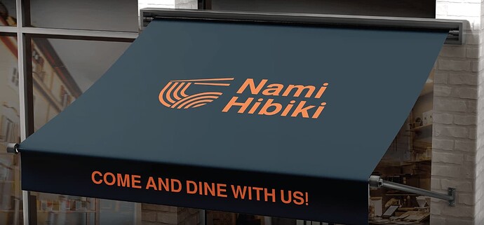
Hey, This is a new work i am planning on putting in my portfolio. Can you please take a look and give me any advice or feedbacks?
I really like the logo man, it fits perfectly for such a restaurant.
thank you so much, really appreciate it, what would you change of it? any feedbacks?
Well it’s already in your portfolio - so why are you saying you’re thinking of putting it in your portfolio???
Anyway - I’ve seen this before
And I’ve seen the bowl done with curves like that somewhere before.
probably a coincidence.
I actually like your mark quite a bit.
A number of years ago, I was doing a fair amount of foodservice work. (Fun industry to work for.) At that time, I did a logo for an Asian place that used a bowl and chopsticks. So to the point I believe @Smurf2 is making, a bowl and chopsticks might not be the most original idea, but I do like your execution.
The one thing I’d say is that the type is too big. I’m sure you aligned it so that the top of the N and the bottom of the H line up with the mark, but the type comes across as visually too large. I’ll let @Just-B chime in on the proper terminology, but some characters, such as a capital O, are usually a bit taller than other characters, such as a capital N, so that they appear to be the same size visually. I think that’s your issue here. Reduce the size of the type maybe 95% and see if that doesn’t look better.
Yeah i did a logo research check online to see if i find anything very close to it and i did not find much in it. Most of logos with bowls in have similar concept.
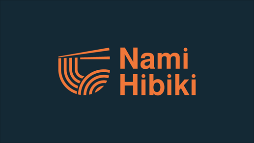
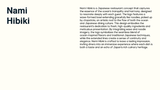
For the approach I went with was the one of mimicking the sea waves in a bowl and being picked up from chopsticks kind like noodles. Hopefully you paid attention to the description, and if so is there anything you would change?
It is on my behance but have not put it on to my portfolio website yet, so it is not in my portfolio.
Thank you for your feedback, ill work on it and see if it will make it better. thank you for being kind with me as well.
Ah I just end to find similar things and execution in places and just curious what’s going on.
The line technique is not unique, it’s very common, the chopsticks - it’s 2 lines not much way to be creative here.
I don’t get the ocean waves, barely recognised it was a bowl.
Is it unique enough, for me it’s not really.
Is it nice? It’s ok. Doesn’t jump off the page for me in originality or execution.
It’s simple enough, without a description it’s hard to know what it is.
It’s not like Nike, Adidas, or other brands where there’s global recognition.
Maybe it’s too many concepts, ocean, chopsticks, bowl.
No idea if it’s a restaurant on its own.
Maybe that’s ok.
Come dine with us is off centre in your portfolio
And not sure if it’s a real place - but googline Nami Hibiki on it’s own brings up links to porn websites.
Not sure if you know Nami Hibiki is a Japanese porn star or not.
All right I’ll do some modifications, I was looking into more specific feedbacks than critics. More like, what would you change, how can I improve this.
It seems that you have way more experience in the field so I’ll look forward to any other feedback you can give me.
The name is a combination of the word Wave (NAMI) and Harmony (hibiki), I did not know that there was a Japanese adult actor with the same name. Should I change the name still?
Since it’s not original enough what would you change? Should I emphasize the wave more? I need something that still connects the logo to the nationality or origin, such as chopsticks or bowl, what would you suggest I change it to? I still want to keep a clean minimal logo.
In the main, I quite like it. It needs refinement as others have suggested, but for me the biggest mismatch is the type. It’s not far off. It does need to be a clean sans font, but what you have chosen is too German corporate bank. The icon has a sense of softness to it. Quiet elegance. The font is hard-nosed. I am not saying that it should all be soft and friendly. There needs to be a level of clipped elegance to match the icon. Think about the restaurant, the food, the dining experience. Does the current font tell that story?
I tend to think of this as a discussion and flashing things out. I probably won’t offer any direction in terms of what to change.
But good to talk about what works and what doesn’t.
Up to you what you think it’s relevant and what you can change and make better.
OK.
I’ve held off commenting so far because I don’t have strong views. Instead, I have a bunch of initial impressions and gut feelings. I like the direction, but things seem a little off in several ways, so take what I say with a grain of salt.
I agree with the other about the typography. It’s too corporate-looking and too large. The type competes with the logo for visual dominance. I’m not suggesting that you use a hokey Japanese-looking typeface—just something a bit softer than a geometric sans.
If it were me, I would avoid orange and black—they’re Halloween colors. The overall composition might benefit from a different color for the typography or the logo, such as white.
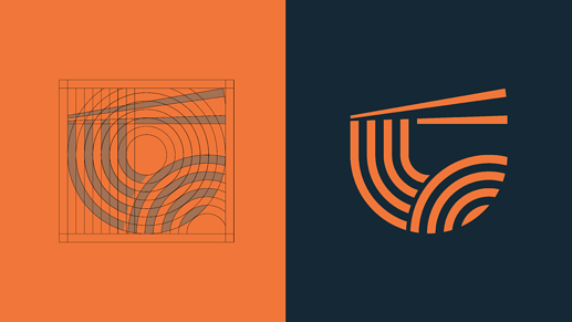
The chopsticks’ different lengths seem peculiar. The upper right side of the bowl is missing, which partially compromises the illusion.
I would likely make the negative space (line) between the two curved objects (the noodles) the same width as the lines between the individual noodles.
The following line (highlighted in white) not being horizontal looks like an error — a note in the composition that’s off enough not to be immediately apparent but still a little sour. Chopsticks need to taper, but I would be more inclined to align the top of the noodles/bowl with the horizontal bottom of the chopstick, not the angled top.. Then again, as I mentioned, the differing lengths of the chopsticks also strike a discordant note, so if it were me, I’d rethink both the size and positioning of the chopsticks.
Like the logotype, the hard geometric sans (below) doesn’t have the appropriate personality. It also shouldn’t be followed by an exclamation point, which is only appropriate for exclamations. “Come and dine with us” isn’t an exclamation; it’s an awkward sentence with an unnecessary “and” that you’ve tried to make inappropriately forceful. It reads like a command to eat instead of a friendly invitation.
