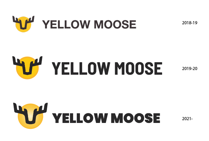
How often do you address your own brand to refresh and keep ‘modern’? What reasons give you reason to refresh your brand? We are a web design and digital marketing agency called Yellow Moose and this has been the evolution of our logo:
Recently we have been discussing the potential of updating our brand for the fourth time in four years, but wanted to get more information about the progress of our logo. There’s a lot to go through when updating, social media banners, icons, directory listings, website, fonts, letterheads / business cards…
That would signify to me that you’re not happy with it. One hallmark of good brand design is whether it can stand the test of time.
The thing is, it looks like your annual refresh is just a matter of someone deciding on a different font, but no font will shore up the failings in the original design. The moose doesn’t look like a moose. That squared nose and the angled, and angular, antlers are much more suggestive of a caribou or wildebeest.
And, at the risk of landing a true kick in the crotch, IMO, business names made up of two words that don’t normally go together are among the weakest in existence, and among those, the worst and laziest are an adjective followed by an animal. When asked for business naming advice, I’ve been quoted: “The world has more than enough Electric Frogs.” As I indicated, that’s just my opinion, but an honest assessment has to expose the fact that business names like Electric Frog trade only on the obvious juxtaposition, and can’t accomplish much beyond a momentary chuckle. Sure people might remember seeing it, but it’s that chuckle they remember, not the product.
So if you’re really sold on it, and can honestly believe it stands for something prospective clientele need and want, stick with Yellow Moose, but for this year’s refresh, redesign the graphic so that you’re not passing off a black wildebeest as a yellow moose. Pair that with a font t hat matches or complements the graphic and let it bake in the Market sun for a few years before you change it again.
I like the name and the moose. Yeah, the antlers aren’t quite moose-like, but the overall shape suggests a moose to me. The third iteration works best (in my opinion) since the weight and personality of the typography best match the lines in the logo. There are some kerning issues, however. For example, there’s too much space around the first O and too little space between the E and L.
Why do you feel the need to tinker with the logo, and with such frequency? Changing branding so often is peculiar. Most people hang on to it for years, rather than months. I think it may project an image to clients that your company isn’t really sure of who they are, and you are struggling to find your identity.
Thanks for both of your feedback.
Not particularly keen on the name either, as there is a Red Giraffe company nearby us and I’m sure a blue and green something or other not too far away. Unfortunately the business name change is not an option as we have a very good reputation in our local area, and further afield, so we wouldn’t want to risk confusing potential clients with a name change.
To elaborate on the design further, the yellow circle is symbolic of the body of the moose, and the black outline to show the head using the idea of a silhouette of the moose against a sun.
A little more of our backstory - the name Yellow Moose is now a brand of a larger company rather than a standalone business, hence the most recent change. The parent company is much more corporate, so we have softened the Yellow Moose logo design over time to attract a different kind of clientele to our parent company, hence the more playful font (Poppins).
I see no connection between a yellow circle and a moose body.
I’m always skeptical of these sorts of non-obvious and seemingly invented-out-ot-thin-air sorts of meanings ascribed to different parts of a logo. It’s similar to when I read about what different elements or colors in flags represent.
Hidden meanings are meaningless unless they’re obvious enough to be found and actually make sense once they’re found.
Not a bad logo. The latter 2 fonts are a bit better as the first one does not seem suitable for a logo. The thing that bothers me the most is why the lines on the moose image are not crisp. They seem to have a bit of a tattered edge. Other than that, I agree with other peoples sentiment that a good logo should stick and not be changed every year. However, there really is no rules when it comes to this kind of thing-- and certainly you are not changing the logo – but revising it, which is kinda cool.
Keep doing your thing but definitely should address the tattered edges on the moose head and make sure they’re crisp.