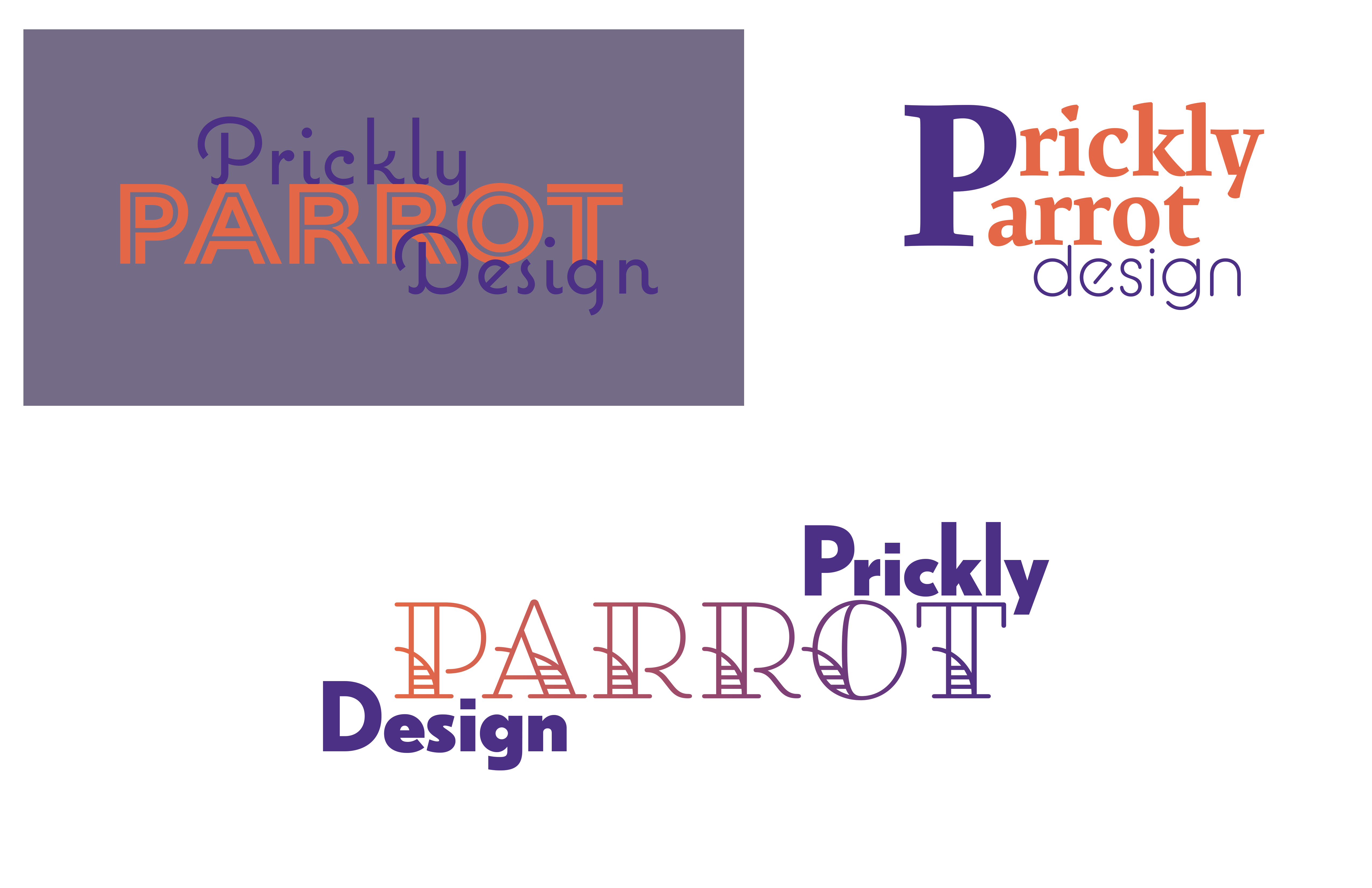
I’m currently a first year design student and received an assignment to create a fictional graphic design business name. The assignment was to use typography and two colors for the business name. I chose “Prickly Parrot Design” as a play on “prickly pear” and used vibrant colors since the business is parrot themed. Any advice welcome!
Yes, and brainstorm some actual meaning or reasons for your concepts. The specimens you posted were examples of just typing out 3 words and then decorating them.
I find myself wishing an assignment like this would disallow inclusion of the word “design”. It never ceases to astound me how overplayed that is, despite how much it weakens a brand. How many different kinds of “design” can you think of? Which one should I think of when I see this name? How would I know? I challenge you to come up with a better word to use in this business name.
If I were teaching that class, you wouldn’t get to think up your own business name.
That will almost never happen in the real world.
Take advantage of the fact as HotButton suggested.
On your designs, be careful of your hierarchy. Reading Right to Left as in the bottom example is not natural.
The second example with the big purple P shows you what happens when you mix different sizes in typography. The word design is lost. The purple and orange on the dingy purple background… always think about your contrast.