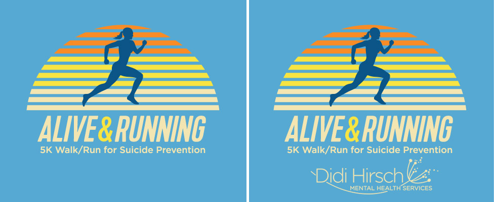
When your org has an annual fundraiser event like a 5K run that has its own title and “look”, essentially its own brand, does including the agency’s branding or logo create a clash/conflict of brands?
Do you put two logos next to each other, or separate them? I am having a hard time with this agency’s logo competing with the event branding. It doesn’t help that the agency logo has so many letters in it, thin strokes, and is not a ‘simple’ looking logo.
Here is the agency logo and here are some examples of the designs I’m talking about:
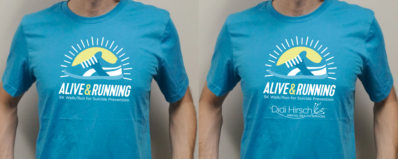
This is frequently a problem with these kinds of race t-shirts. Everyone needs their logos added to the shirt, which, in my opinion makes it a terrible giveaway prize, but that’s the way these races work.
Just wait until you get a race with 20 different sponsors and with promises made to each one about its size and position on the shirt that’s been determined by how much money each contributed. I’ve been down that road several times. With only two clashing logos, you’ve got it easy.
There have been occasions similar to yours where I’ve placed the clashing logos on the sleeves.
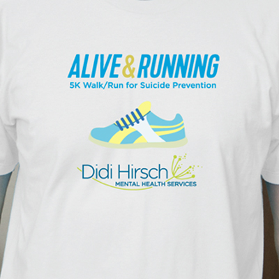
Out of the given options, I like the one with the sneaker on the blue shirt the most. Even though it’s also a bit of a “logo overload”, as you note, but the two logos combine into a sort-of harmonious circle. And I prefer it on the blue background because it reduces the colors of the whole mash-up overall.
I hesitated for a couple of seconds before writing screen printing since there are several different processes for printing on fabric, but in this case, screen printing would still be my first choice — at least for the darker shirts.
With digital (DTG), printing light colors over dark is problematic because the ink/dye is transparent. A white primer layer needs to be laid down first and the end result is often less than satisfactory, as is the durability. Some of the other processes, like cut vinyl, don’t handle detail all that well, like the fine lines and typography in this shirt.
I don’t really see any problematic registration issues. There are only four colors on the darker shirt. The design on the white shirt has more colors, and if it were me, I’d consolidate some of them.
Of course @Just-B … there are numerous ways to wash a cat. Screen printing was my first profession, and a long time ago!
I used to do up to 15 colours on flock transfer. Dye sub was another fav, had to keep that ink moving or it dried on screen, nightmare but thinner worked to free it out.
I would imagine a lot of small quantities would be DTG, (Direct to Garment).
Around the year 1998-99 I tinkered with the idea of a DTG printer, but opted to go to designer instead of production. I have always regretted that decision…maybe if I had I would be saying the opposite right now, grass greener and all that.
During my university days, I had a summer job working as a screen printer, but we didn’t do t-shirts or anything like that. It was the screen printing shop in an exhibit design and manufacturing company. As a newbie, I got to wash all the screens and only occasionally got to pull the squeegees. I’m guessing I lost more than a few brain cells from all the lacquer thinner.
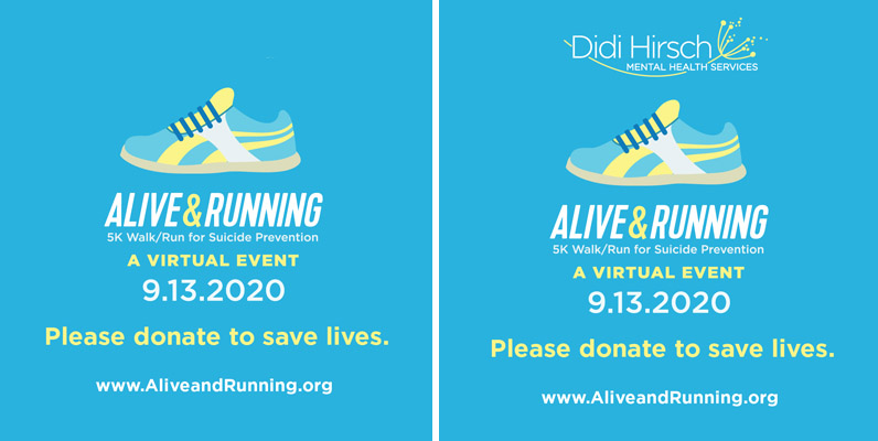
Here’s an example of a social media graphic where the logo had to be included with the event branding. I think it really adds a lot of mess and clutter
In regards to the social media graphics, I would suggest to break the layout up into different blocks more clearly. First your sneaker as a header, then all the event details in a more compact arrangement, and then a footer for your event sponsor (“Presented by…”).
If that’s still too cluttered, maybe you give the graphics a bit more structure through different background colours or design elements to break things up a bit visually (e.g. putting the event details on a yellow sash or scroll or something). That might sound like more clutter, but it could give the graphics more structure and therefore help the eye to make sense of information hierarchy of the visual.