Hi all, I am trying to choose a colour scheme for a project with the topic of gluten intolerance and Coeliac disease. Please let me know which ones you prefer. Thanks in advance!
Option 1:
Option 2:
Option 3:
Option 4:
Hi all, I am trying to choose a colour scheme for a project with the topic of gluten intolerance and Coeliac disease. Please let me know which ones you prefer. Thanks in advance!
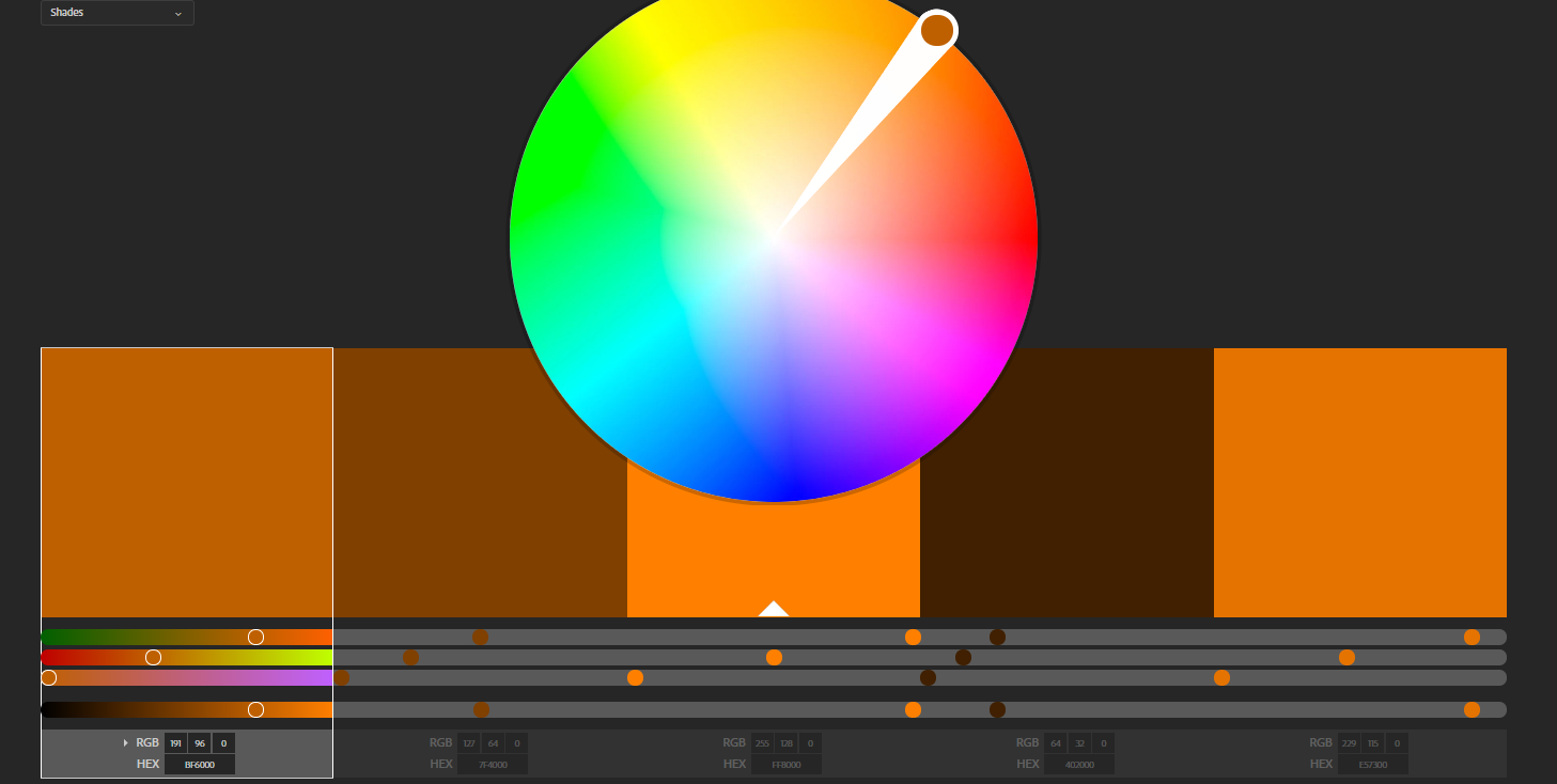
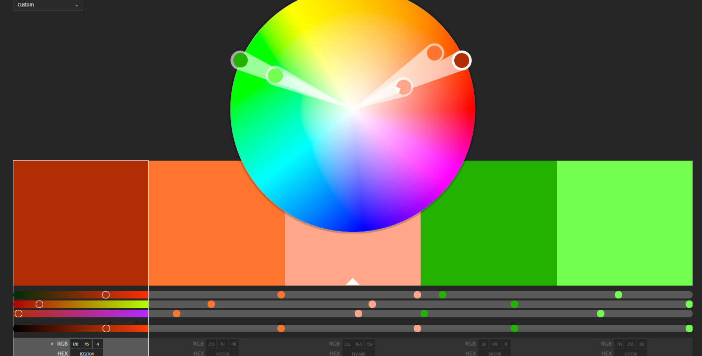
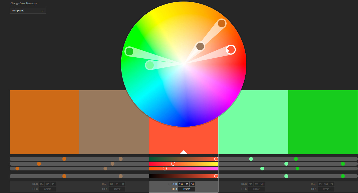
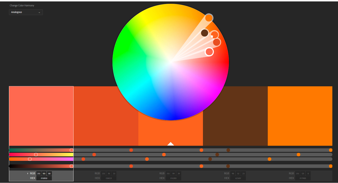
Option 1:
Option 2:
Option 3:
Option 4:
I might be inclined to avoid colors that are similar to the diarrhea and intestinal inflammation that often accompany these conditions, unless of course you intentionally want those kinds of, um, visceral tie-ins.
What’s lacking here is the context of what you’re trying to accomplish. There is no best color scheme that says gluten intolerance and coeliac disease. Colors are typically chosen to accentuate the emotional tone a designer wants a project to have. You’ve just shown us colors in the vacuum of not knowing what message you’re intending to send or how you envision doing that.
Hi, excuse the lack of info I’ve given I don’t really post anything online so I don’t have any experience (if that’s a valid excuse), all my user testing is usually done with people in front of me ![]()
So more info is as follows:
If anybody needs any more just ask ![]()
Coeliac’s disease is not all about wheat. It’s about the gluten. A lot of other grains besides wheat contain gluten.
I commend you for observing the “competition.” But maybe instead of focusing on browns, which can lead to gross relationships, what about instead focusing on the things that can be eaten. I think you started down that road with the green/orange/brown, but maybe leave off the brown part? The CP3 palette is the least objectionable, except for that nasty brown 2nd from the left. There is no reason for that color to exist.
Yes I am aware of what Coeliac Disease and gluten intolerance is, part of my project was dedicated to speaking with doctors who specialized in these conditions. Thank you for the feedback, I get what yous are saying about the browns, I think i’ll leave them out and opt for more oranges and greens.
May I ask what is your second preferred palette? Even if it is only one or two colours out of the five. I’m not going to definitely have five colours that’s still something I’m debating about as I don’t think five are absolutely necessary in this project, and in terms of the colour palette I’m not limiting myself to only using the colours shown, for example I like the first palette but I do not like the colour in the center, hence if I were to choose that palette, I wouldn’t use that colour or I would replace it.
Who is the audience? Kids, adults, everyday people, doctors, etc.?
The audience is people who both have and do not have these conditions, and are 17 or over (adults and parents/guardians of children). For example, I do not have gluten intolerance but my child does, or I am someone who would like to know more on the topic etc.
Okay, sounds like your target audience is adults who are impacted by a specific disease. I would start looking at colors chosen to appeal to this market and their likely mindset.
I’d guess mostly they’re worried, anxious, concerned and want information on a topic that impacts their life. It’s a big deal to them, so their concerns are significant. I’d start with reassuring colors with a medical flavor, like a solid blue paired with white. Maybe a peach or green accent… but I’d stay away from red/orange because those are warning colors. This market doesn’t need even more alarm, they’re there already.
Here’s one (of many) articles on color psychology.
Thank you! That’s very good advice I hadn’t thought of that at all! I’ll put that into consideration and change my options. Thank you again!
To add to what Doc Pixel said, Leatrice Eiseman has amazing books on color psychology. She is THE international color expert and head of Pantone. I actually just had her on my podcast, so to save you some time and money in getting books, you can dig into it sooner than later. You may find it helpful.
Thank You! I feel like there’s so much material out there I think i’m always missing out on something, just like right now when I didn’t even know that the head of Pantone has a podcast! ![]()
She doesn’t have a podcast. She was on my podcast.
I didn’t know either, but I do know that creativeboost has a lot of good material on her website. I have visited her before, and always find something good. ![]()
Oh, well, thanks, Doc! I appreciate that. ![]()