At the end of July our Russian football summer flows into the no less significant sport event. The sport marketing team of the ONE SGM agency conjointly with the Alexander Ostrovsky Academy will open the international women’s tennis championship, hosted under the aegis of the WTA, “MOSCOW RIVER CUP presented by INGRAD”. The creative branding agency Graphit, part of Leo Burnett Group Russia, created the concept for the tournament, title, logo, slogan and all elements of the visual identity.
The title of the tournament is bound to its location. Courts of the National Tennis Centre of Juan Antonio Samaranch are literally placed on the water, in close proximity to the Moscow river. “More than a Game” slogan prepares us in advance for the real summer tennis celebration, which is many things: sporting tournament, recreation in the nature, special master-classes from partners and invited celebrities.
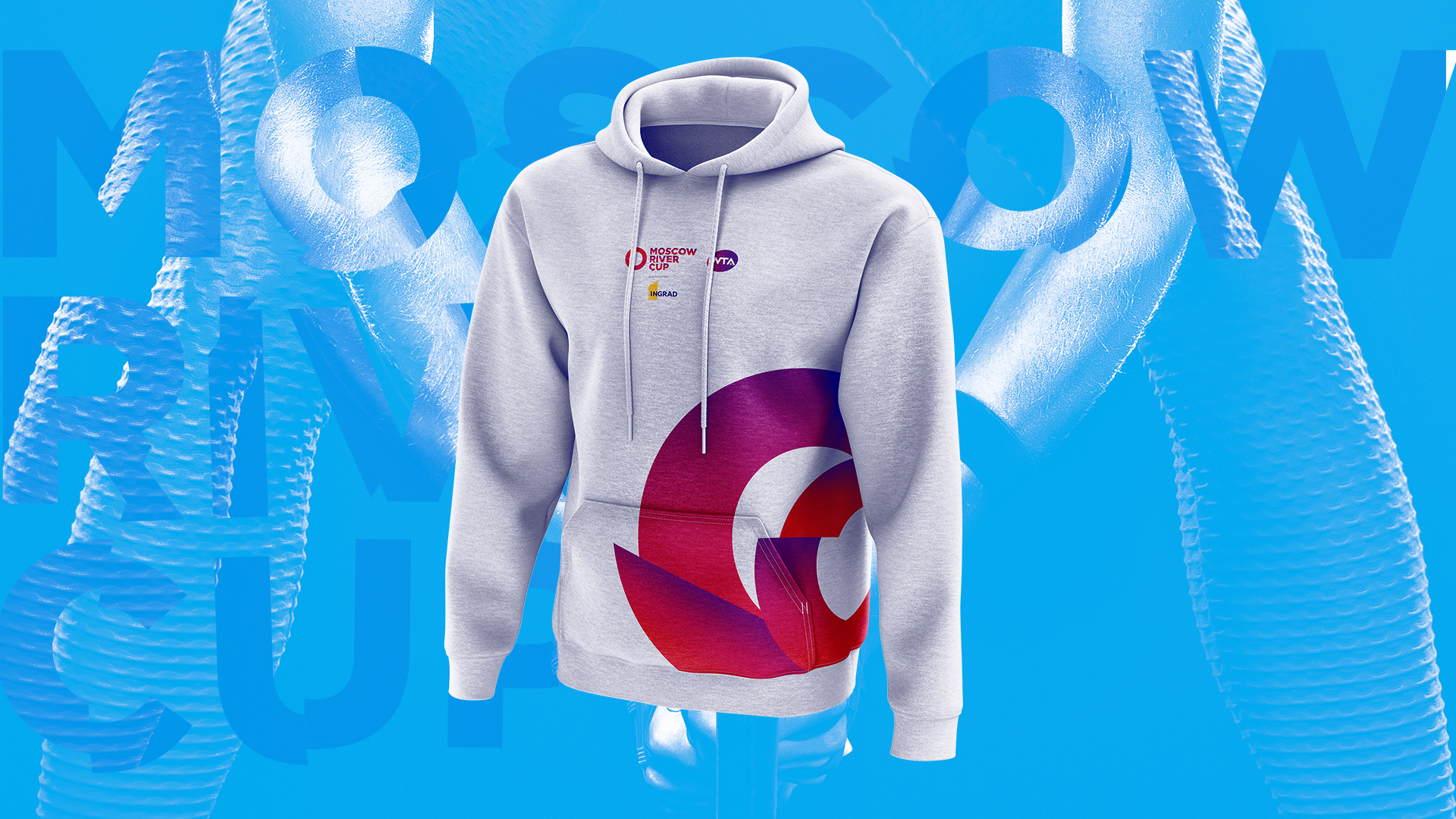
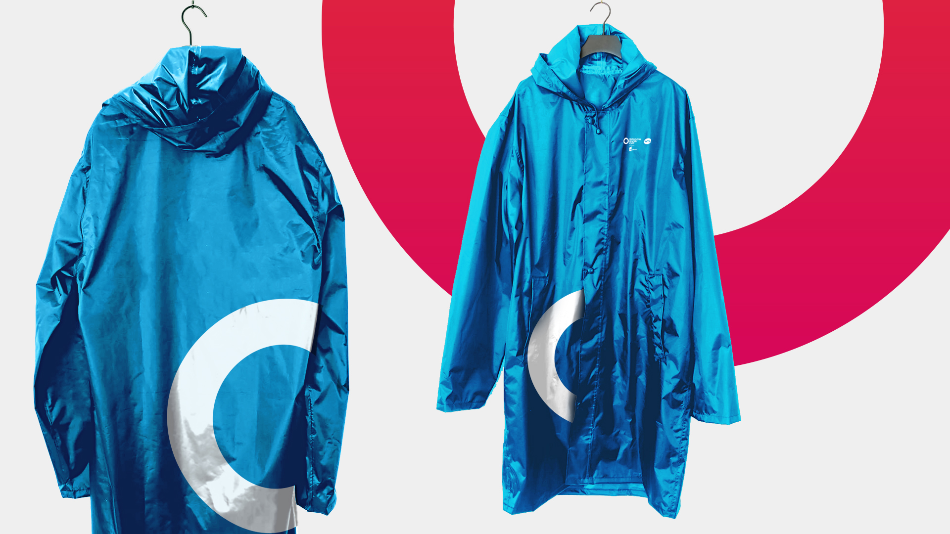
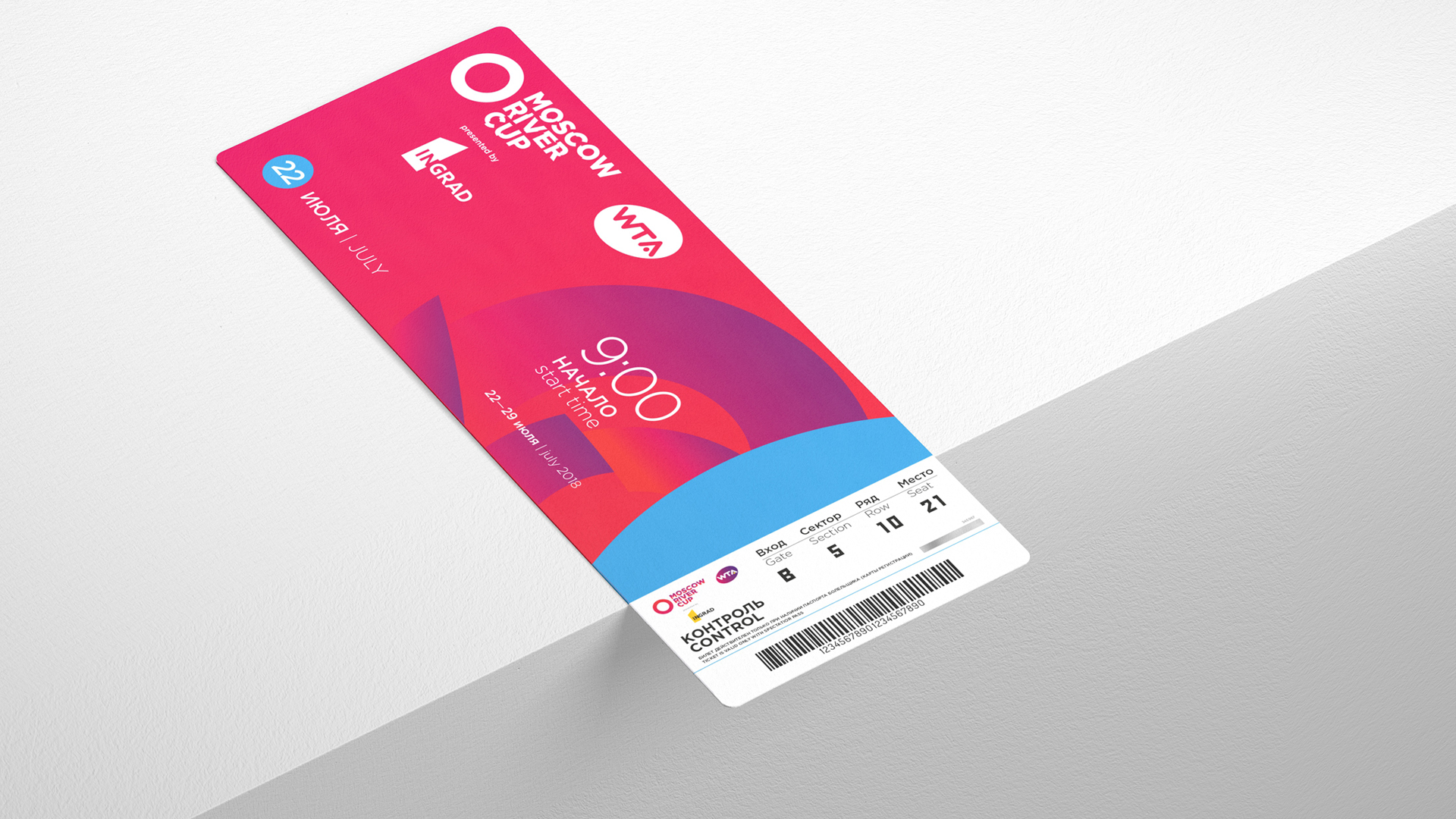
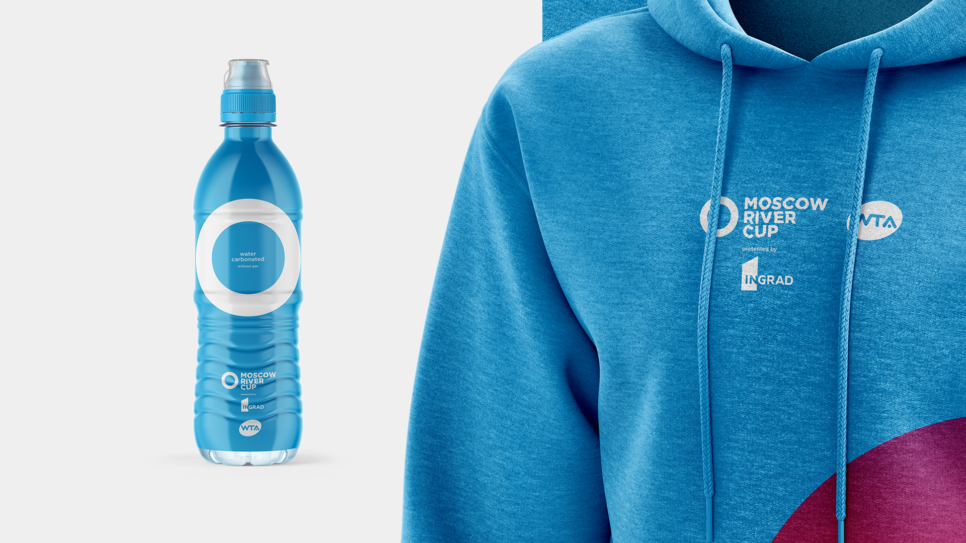
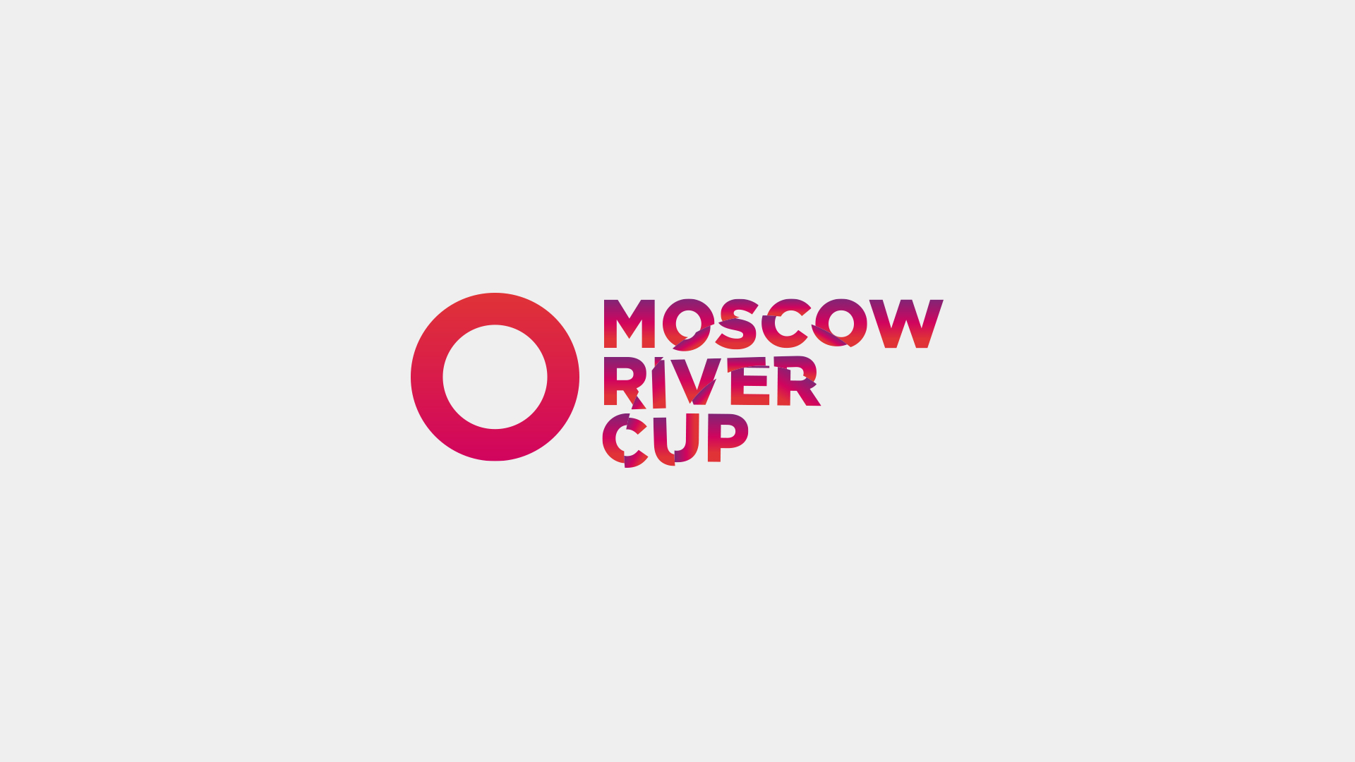
The signature colors of the championship are blue and pink-red. The shade of water is complimented by the red color associative with hot summer, Moscow, vivid celebration, while pink is women’s official color. Minimalistic logo also reflects the water theme as it depicts water circles that were left behind by the ball, which touched it’s surface. The title in the logo is seen through the drop.
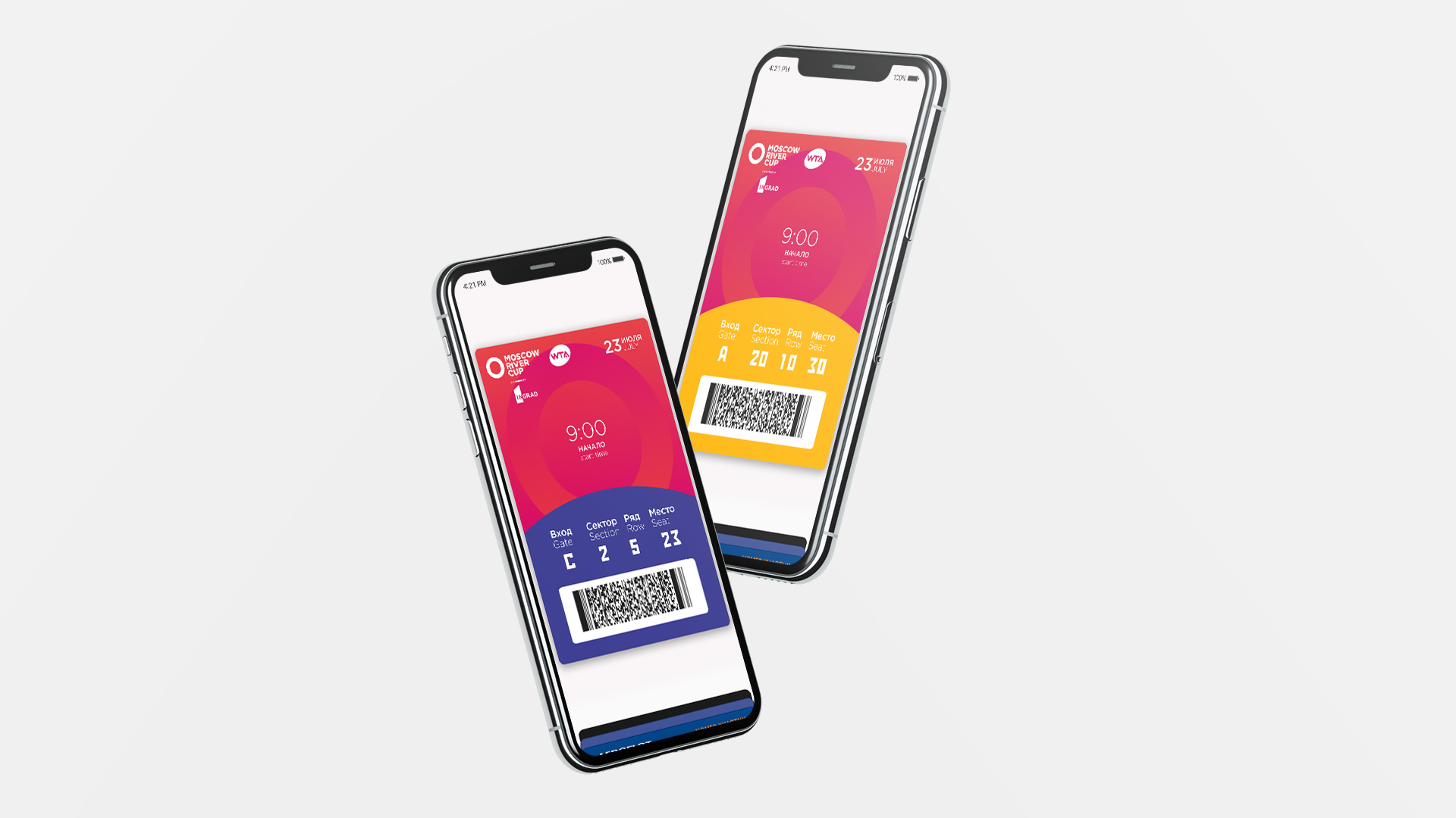
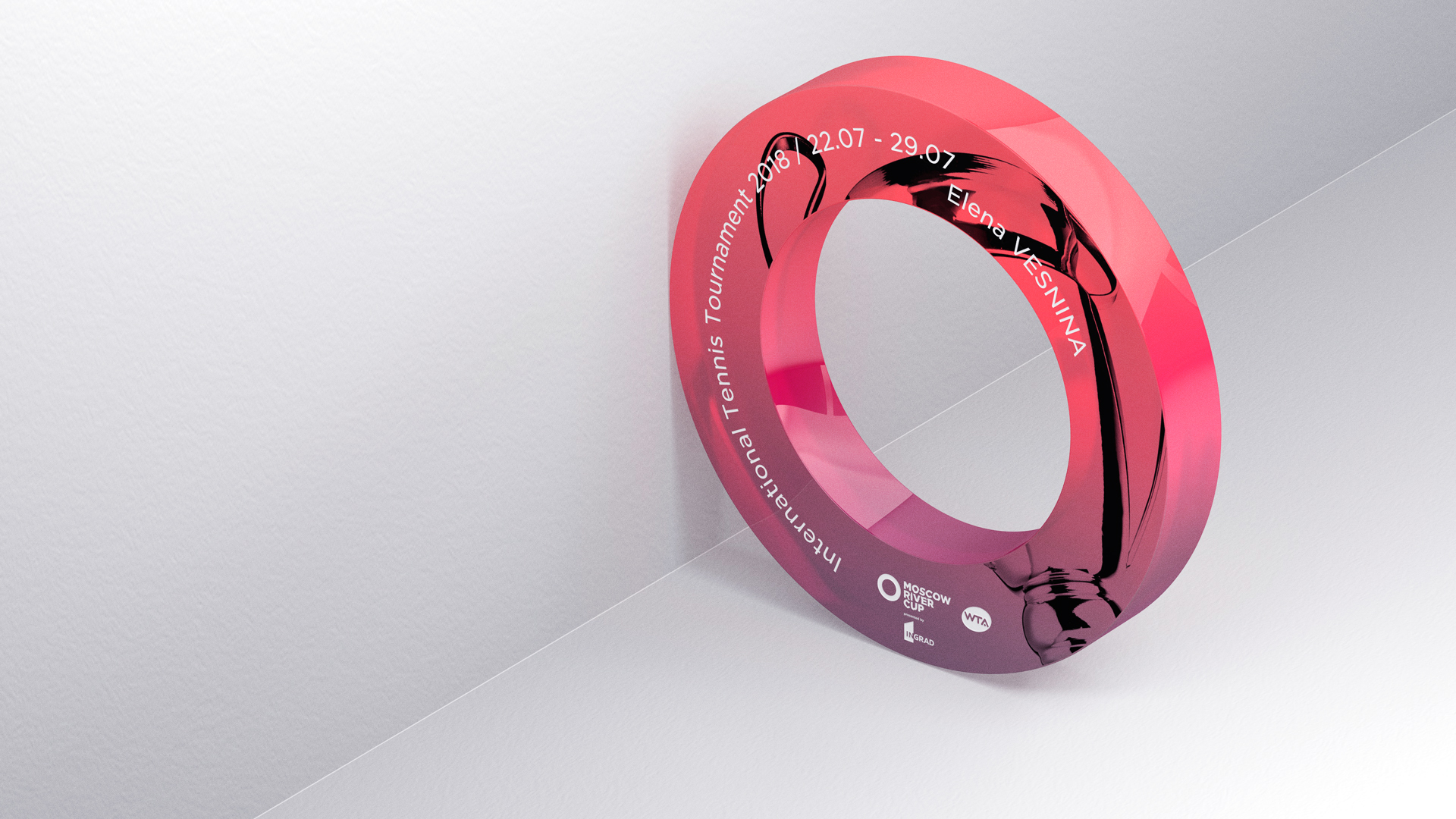
The whole visual identity of the event represent two sides of the tournament: the intensity of feelings, which any sport event has, and the freshness of summer vacation by the river. It is reflected on tickets, billboards and badges, invitations and souvenir products. The invitations for tennis players were presented to each personally and were made in the unique way, it is the glass logo of the championship, in itself reminiscent of the prize, which has its place amongst the trophies.
Agency: Graphit / part of Leo Burnett Group Russia