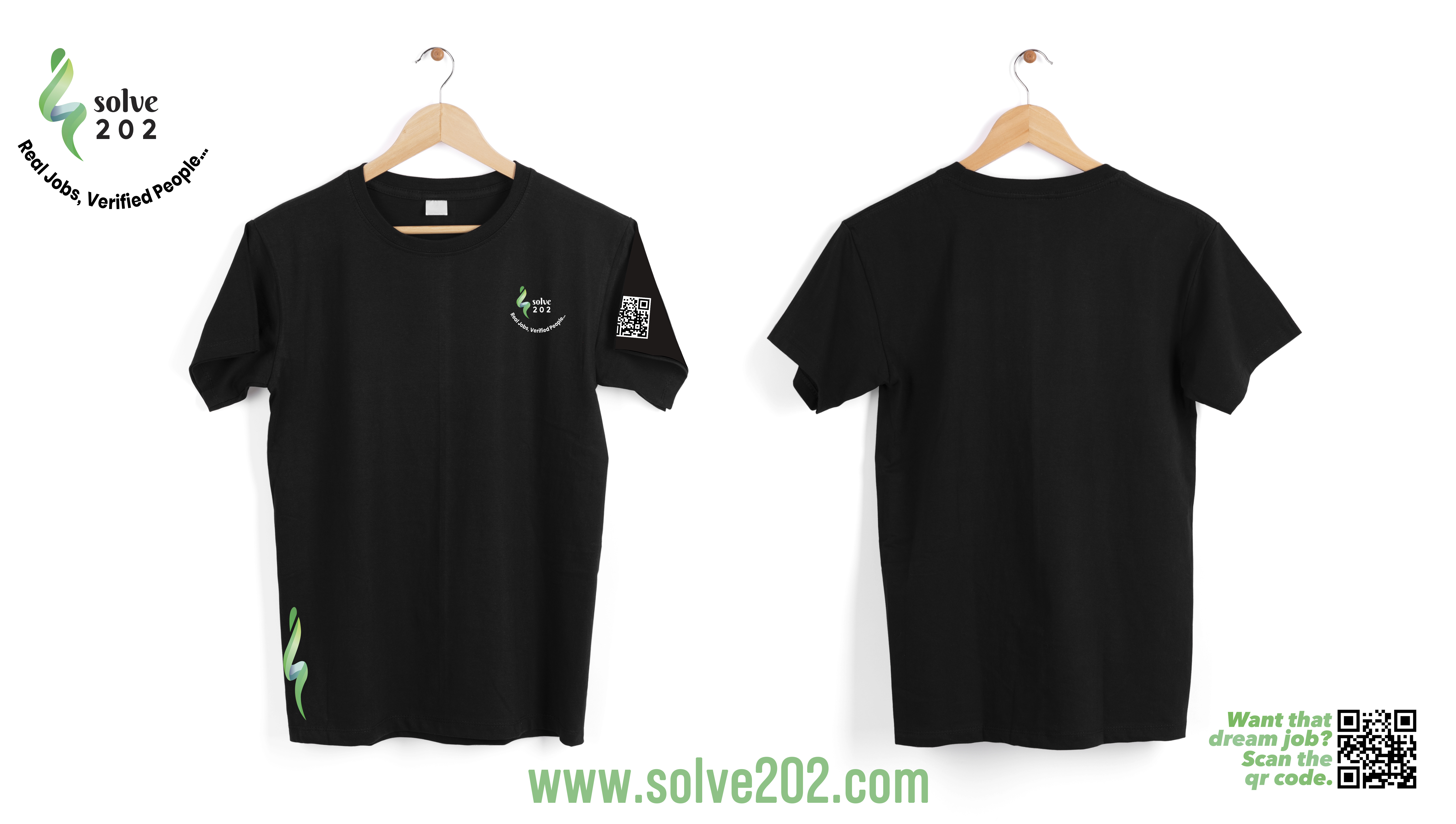
hey guys, so i am working on a brand and i did some designs for their marketing team. Please critics in the house what is your take on it
1 Like
Moved to the Crit Pit ![]()
1 Like
I like them but I argue the efficiency of moving, meaning people worn, QR codes. I’d do severe testing with different generations of smart phones and in varying environments to replicate the different struggles you might encounter when wearing it. If it passes those then go for it. You might even go the route of using a QR code that has the company’s logo in it as well since that’s possible now.
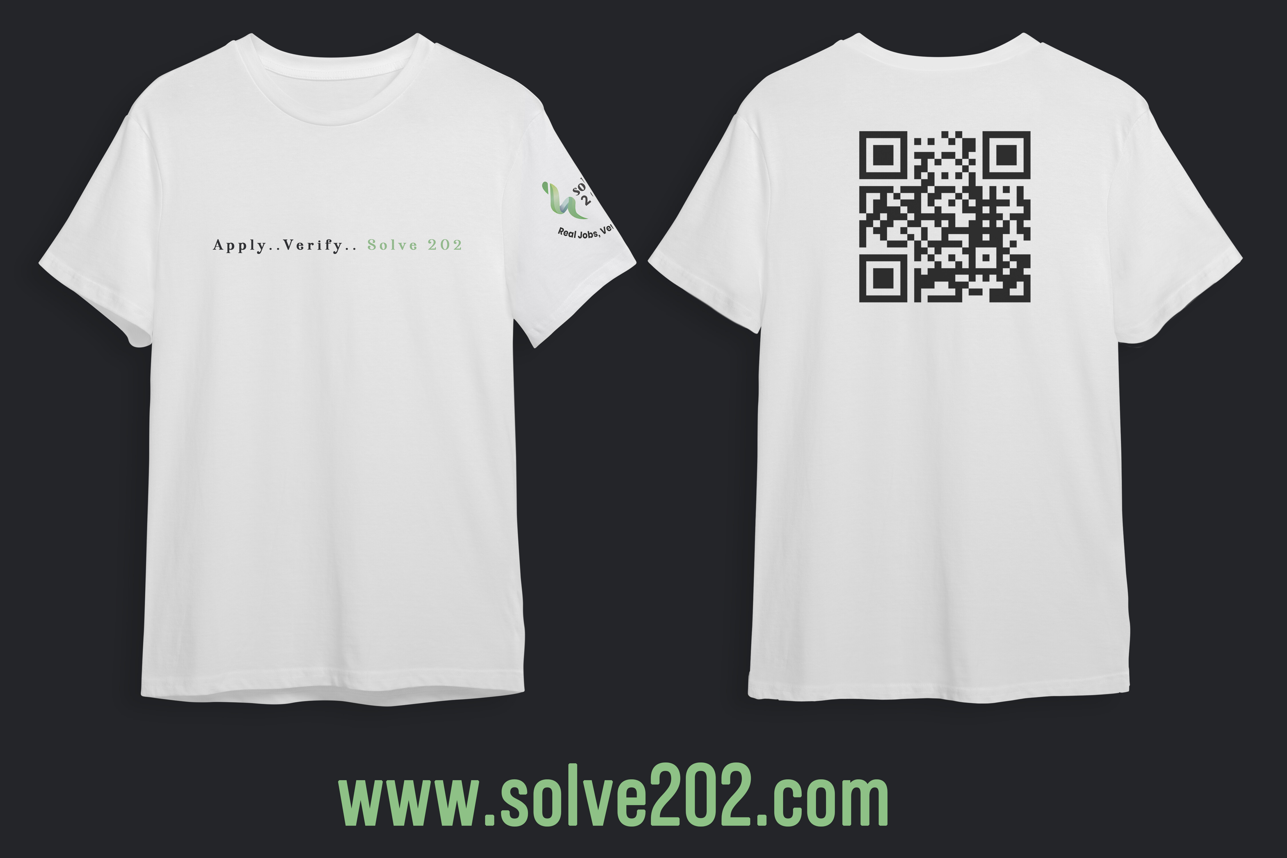
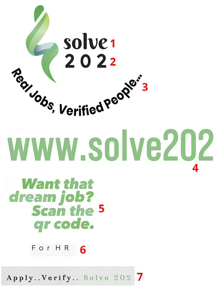
I especially like the use of .. instead of eclipses. I feel its very accurate of the motion of it describes moreso than eclipses would but I feel many would use eclipses instead. (I hope that made sense)
1 Like
When I see two dots, it makes me wonder if they meant to use an ellipsis and forgot the third one.
2 Likes
To me, the two sequential periods look like punctuation errors from someone who didn’t realize ellipses require three. If the dots were higher, as in bullet points, that problem would go away. I’m also inclined to agree with Eric Gill about never letterspacing lowercase letters.
The logo at the bottom of the black shirt strikes me a little misplaced. Many people tuck t-shirts into their pants/trousers, which would leave this little green, snake-like thing appearing to slither out.
Personally, I wouldn’t wear a shirt with a giant QR code. I don’t need people pointing their phone cameras at my back. This just might be me, though.
1 Like
I agree with what the others have said. Moreover, the two (or four) period thing in place of an ellipsis, is a particular pet-hate of mine. An ellipsis is a specific glyph and not made up of three full-stops.
The QR code on the back is bad enough, but the one on the sleeve is pointless. They are ugly things at the best of times, so I don’t see the point of making it the most visible thing on there, especially as it is a moving object!
I precursor the following with the caveat that I am not sure if you designed the logo or it is a pre-existing one they gave you to work with. If the latter. The following is redundant. If the former see comments above, with the added comment that the shirts need more focus.
Overall, I’m afraid, I find the whole thing pretty weak. Typographically it is a bit of a train wreck.
There is some small merit in the symbol, but it needs simplifying and it looks like it is falling over to the left. Even then, I say that only in terms of the aesthetics of the symbol. As to its problem-solving, I have no idea. It doesn’t say HR or recruitment. It just looks like yet another ‘logo for adornment’ and doesn’t give me any sense of the culture of the company. That is likely down to the poor typography and how it relates (or doesn’t) to the symbol.
What are you trying to say? The main sense I get from it is, disjointed. What employment sectors do they deal with? Managerial? Blue Collar? Secretarial? I get no sense of their positioning from it apart from, perhaps, definitely not high-end.
The type on a curve looks like an afterthought and creates some really jarring negative space.
The name doesn’t help (though I assume, nothing to do with you). Brings to mind Room 101 – but worse. That could just be me though.
Sorry to have given this such a slating. In itself, it’s not the worst I’ve seen, but that is sort of the point. It’s all a bit of a forgettable, logo-mill, kind of thing and has no real personality. Yet another logo you wouldn’t even notice. Even if you do, subliminally, it leaves a sense of disharmony. Not the take-away I imagine your client is aiming for.
All this is intended to be an honest critique rather than a slating, for the sake of it. I just think it all needs a lot more of a rethink to do the job it is meant to.
Hope this helps
1 Like
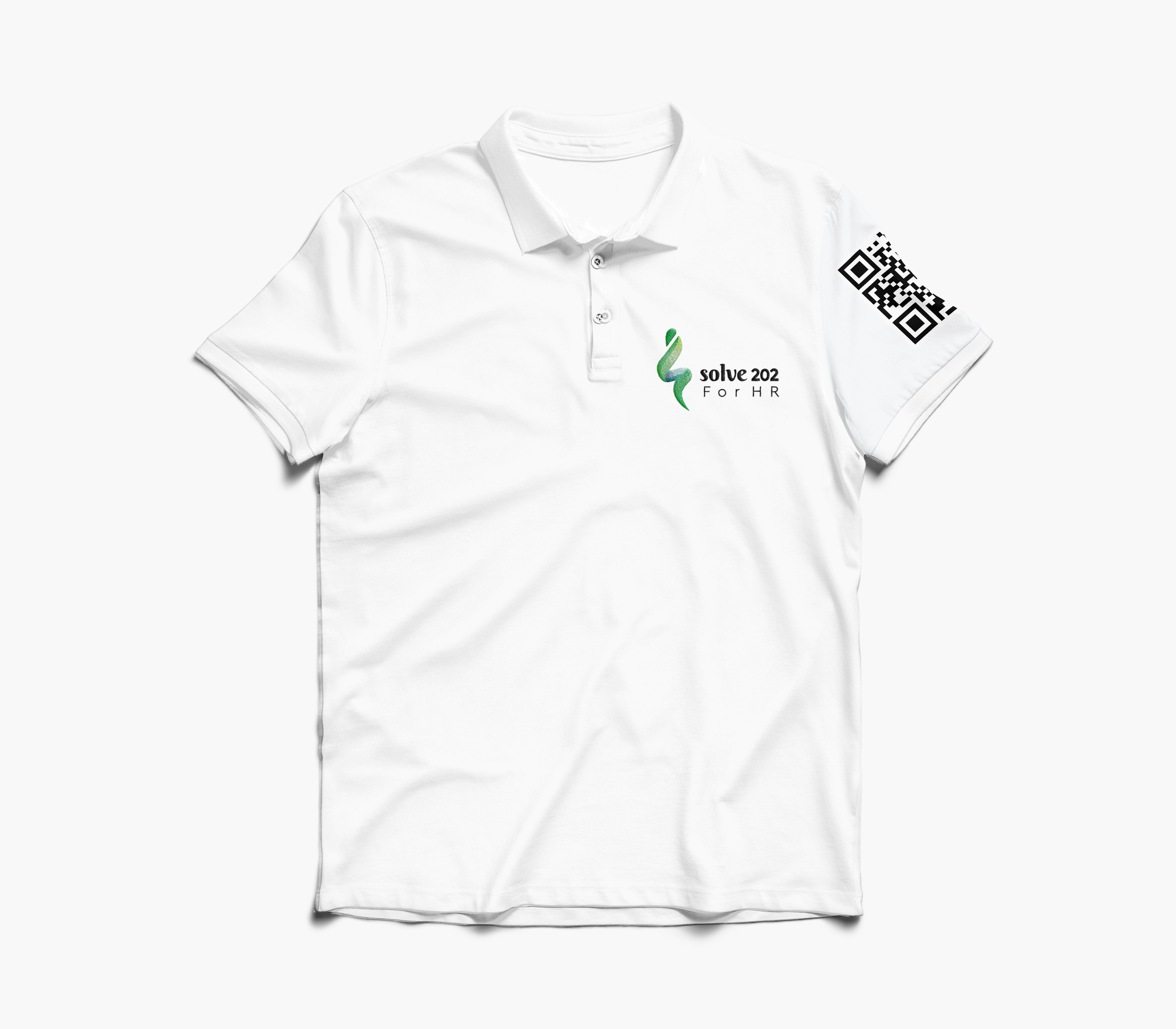
In addition to what others have said, your font choices appear to be all over the board and not necessarily appropriate. I think you need to spend some time studying typography. If you sell this and the client buys i, you’re both in for a rude awakening when you try to get a gradient logo embroidered as shown on the white polo shirt.
LOL, used the clients font, tagline and logo
I agree with Just-B. I definitely would not want a huge QR code on my back, also that the logo at the bottom of the shirt is misplaced. A sleeve would be much better. Also, if you are using photos of the whole shirt in your marketing, I heartily suggest that you include a close-up of the logo itself (which is very hard to distinguish in the full shirt photo.
1 Like
On the other hand, I can be bought. Pay me enough, and I’ll wear the dammed shirt.
1 Like
Oh didn’t they tell you? as an employee, you wear the damned shirt, or else…
Getting my picture taken for QR code is just a NO. All caps. Full stop.
1 Like
But I’m not, and I am their target.
bro, i used only 0ne font, every other font is for the company and i didnt want to mess with their style, the font with the website, want that job and real people, verified jobs are all same font and they arent going on the shirt or anything.
thanks to everyone for their words of wisdom, got one or two here ![]()