From bottom of my heart I want to thank you, you are putting your time on some stranger work and mistakes and you are correcting them so I can know the real meaning of design, next time I will definitely work with a brief to practice a design then I will post it with the brief on forum to ask for feedback.
May I ask you for a favor, I was hesitating to post this but I really need a real solution for this, recently I designed a logo and pattern for a fake brand, I know design is average but the colors are so bad, even I know this but when choosing the colors for a brand I couldn’t decide which color to choose even when I know all the color theory, colors schemes and meaning of colors too. I feel very stuck when its time for colors and this happens all the times. This was the brief of the brand and these are the designs I made…
Brush & Bloom is an art supply shop dedicated to fostering creativity and supporting local artists. The store offers a curated collection of art supplies for all skill levels and serves as a community hub with workshops, events, and a gallery. The brand aims to create a fun, welcoming, and inspiring atmosphere that encourages artistic expression and community engagement. The visual identity should reflect this vibe, incorporating vibrant yet harmonious colors and a playful, creative logo design. Branding materials should include stationery, signage, digital assets, and promotional templates, all aligned with the brand’s lively and supportive ethos.
From what I’ve read, colours that represent creativity tend to be in the realm of warm oranges and yellows (not too far into red, that’s more energy and rage, not too far into green as that’s more peace and nature). Blue is often associated with calm and professionalism, which isn’t a bad counterbalance.
The logo (regardless of colour) doesn’t scream “art supplies” to me, more “wellbeing brand”.
Despite my points above, I don’t think it’s actually far off. It IS welcoming, and likely hits several of the outlined goals, but I think it needs to be pushed a bit further.
Aside from “local” artists, who is the target market? What kind of artists? What age range? What type of work do these artists do that you want to attract? A local graffiti artist will respond differently to a local scenery painter or a local comic artist.
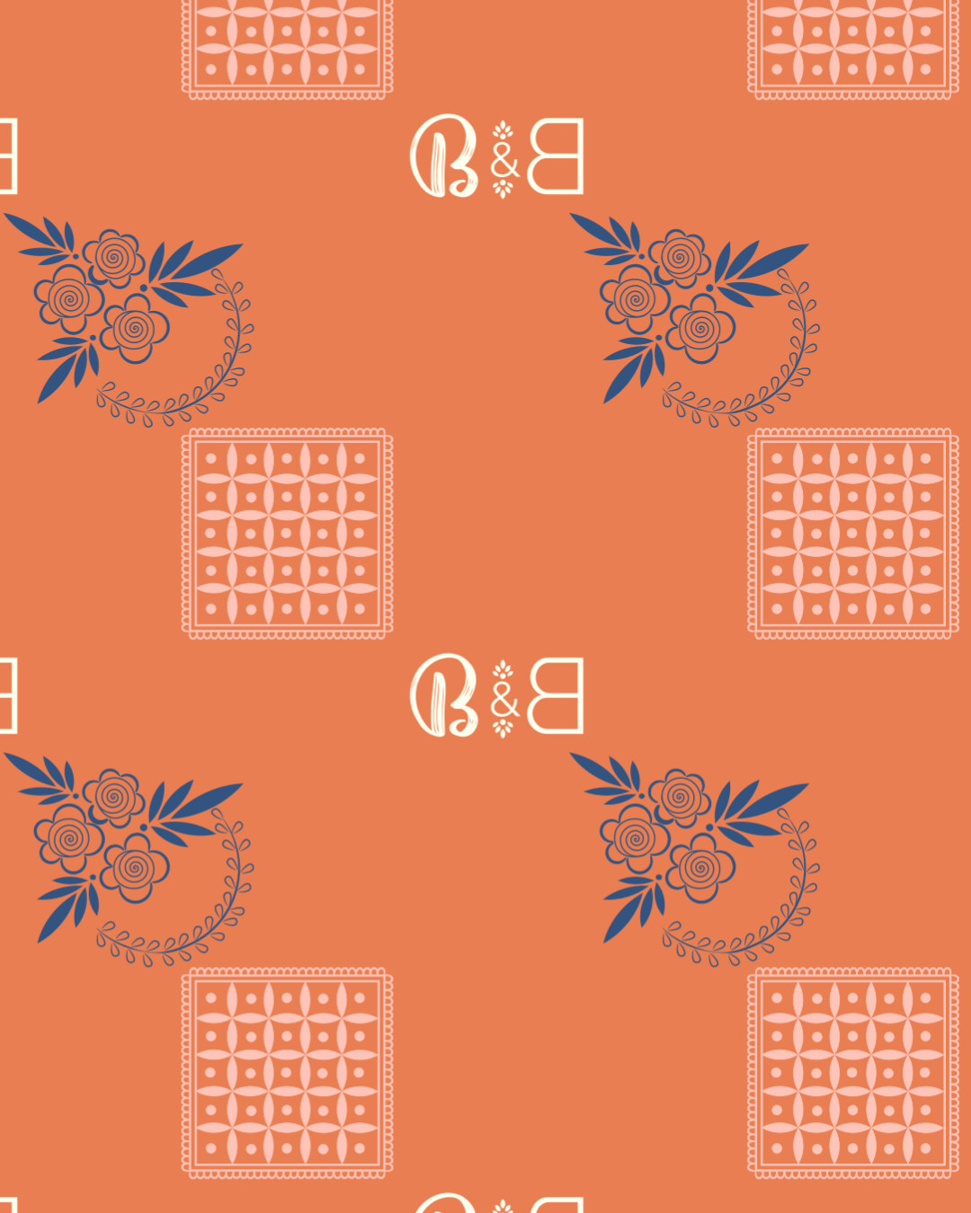
Why did you create a repeating wallpaper pattern? A repeating pattern isn’t typically a requirement for a brand identity project. What is the relevance of the square pattern composed of smaller squares? You may have a reason, but it isn’t obvious what that reason is.
When I choose colors, I often consider the emotions they evoke. The orange, blue, and off-white you’ve chosen remind me of the nostalgic appearance of old letterpress printing from the 1940s and 1950s. Whether this is fitting, I’m unsure — it hinges on whether this retro aesthetic aligns with the art store’s identity.
Regarding the logo, I’m not sure about the use of a backward B. It seems like an unusual choice without a clear purpose or relevance to the brand.
Similar to the colors you’ve chosen, the bottom logos/wordmarks suggest something from out of the mid-20th Century. Again, whether this is appropriate for the art store depends on the vibe of the art store.
If the art store has a boutique vibe, sells craft supplies, and caters to those needing traditional arts and crafts materials, the general look you’ve created might be appropriate. However, if the store caters to university art students, professional artists, photographers, and designers, there may be a more suitable look than a retro boutique style with overtones of the past.
I’ll print it, but I won’t cut it in vinyl…
It just a small consideration these days, but if you want that logo in vinyl on a glass door, those little tiny brush strokes are Not. Happening.
Otherwise I agree with the others.
Thank you for your feedback I will try to improve the logo design for sure
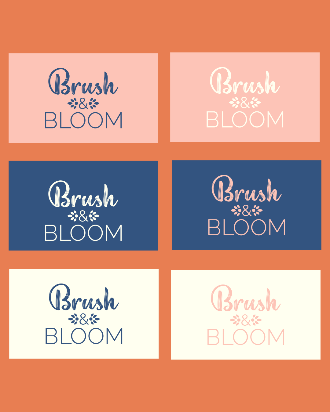
The concept I applied for the logo design was to keep it a litter bit artistic and stoke of brush to represent brushes and art and sans serif font on the bloom to balance the logo, flower leaf to include the bloom and creative side of the brand.
about the artists the brief just said artists and I assumed it to portrait or scenery painters, and all category of artists were included in the brief from beginners to professional level artists.
I tried to make different assets for the brand in form of brush strokes illustration and a submark and about the square pattern it just came in my mind to be honest, and I just summarized all these things in a single pattern.
yes, the color choice of mine is bad for this brand, what process do you apply for selecting the primary and secondary color of the brand based on the emotion of the brand.
I will improve the logo design thinking process and will do the proper research on the brief.
The more complex and intricate the more difficult it is to reproduce at different sizes across different mediums (that is print substrates or online digitally (substrates being print materials, paper/cardboard/textiles/etc.))
General rule is to K.I.S.S. (Keep it Simple Silly)
There’s no reason why the Digital version of this logo can’t be a living breathing moving animated version with as many brush strokes and thin lines as you want.
But when it comes to printing - it has to reproduce and print is mechanical process with finite limits.
So have a fancy smancy online logo.
But have a simpler version for printing across various substrates.
Like others have said, I would still use a brushstroke font, but one that doesn’t have any tiny lines in it so that it can be easily resized. I also would do a regular facing (rather than backwards) B.