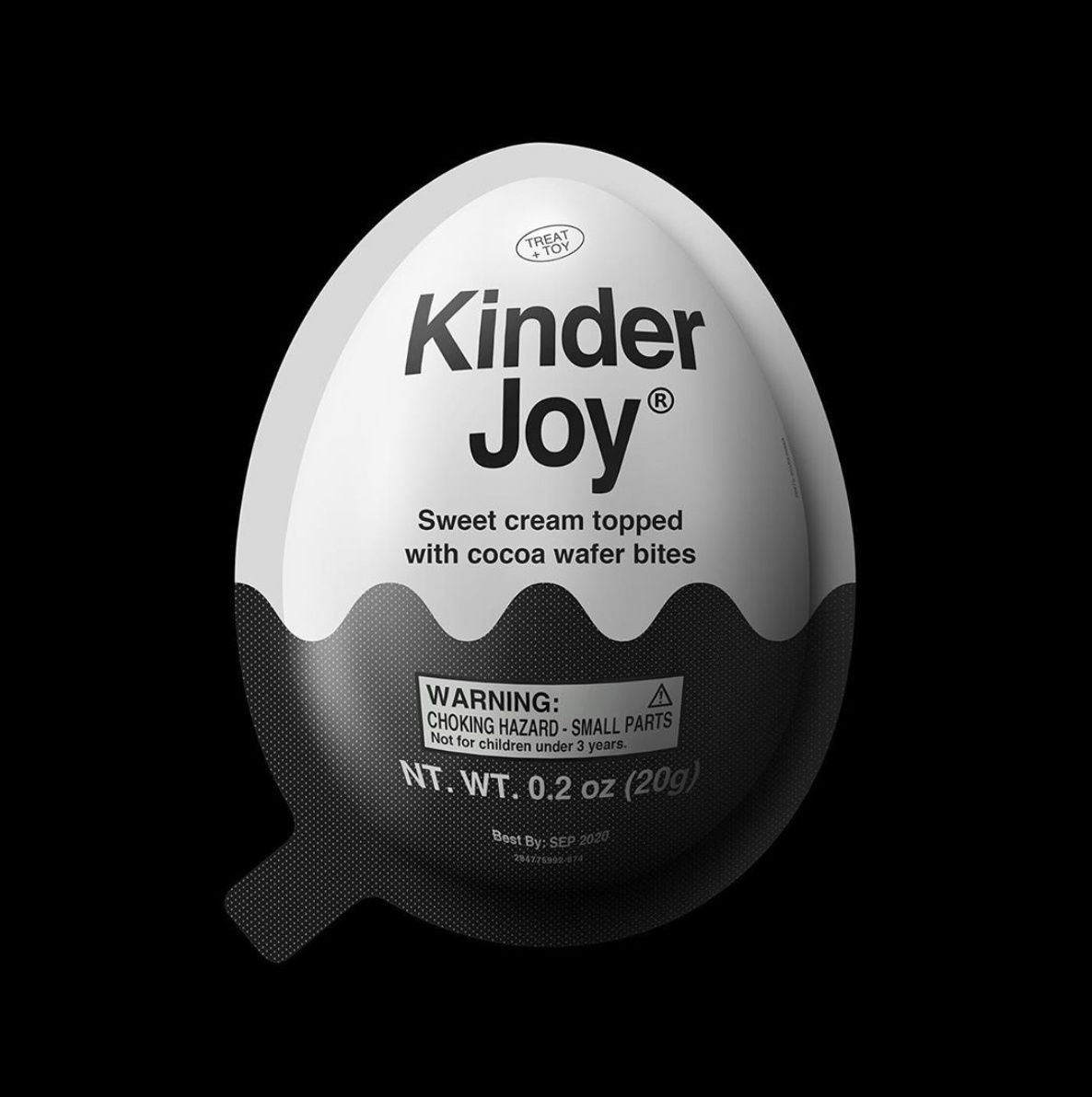
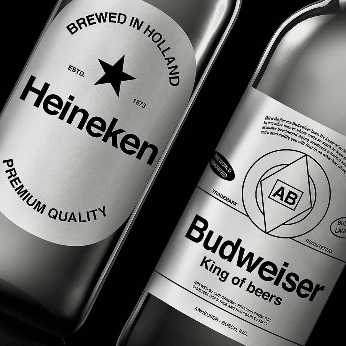
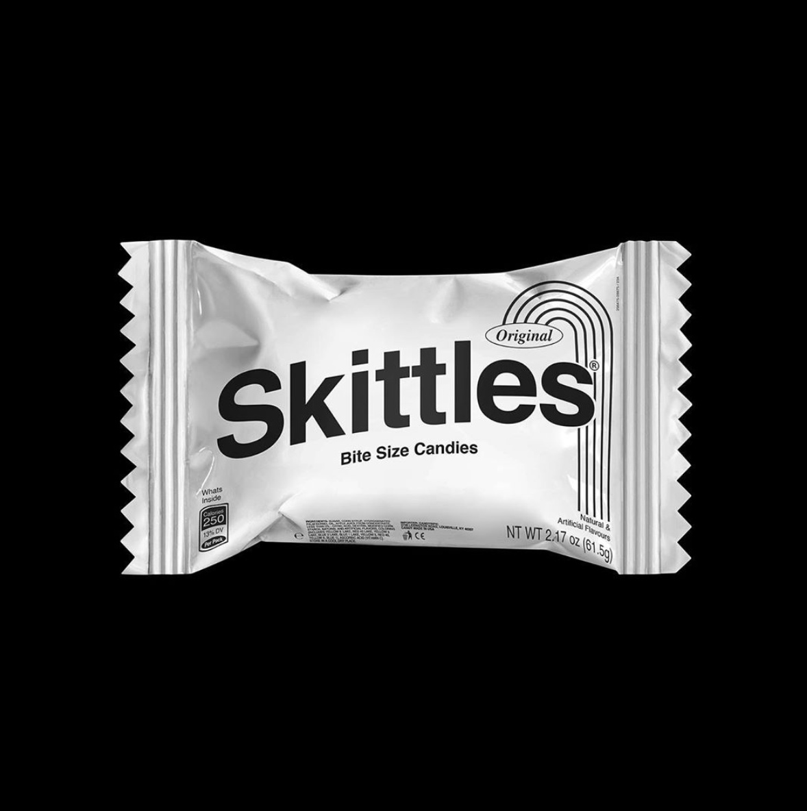
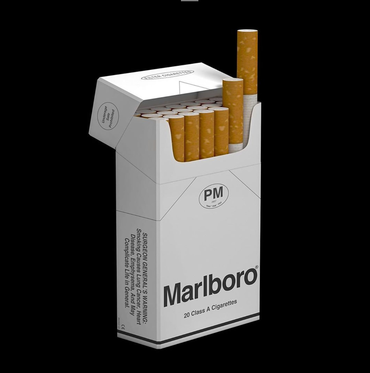
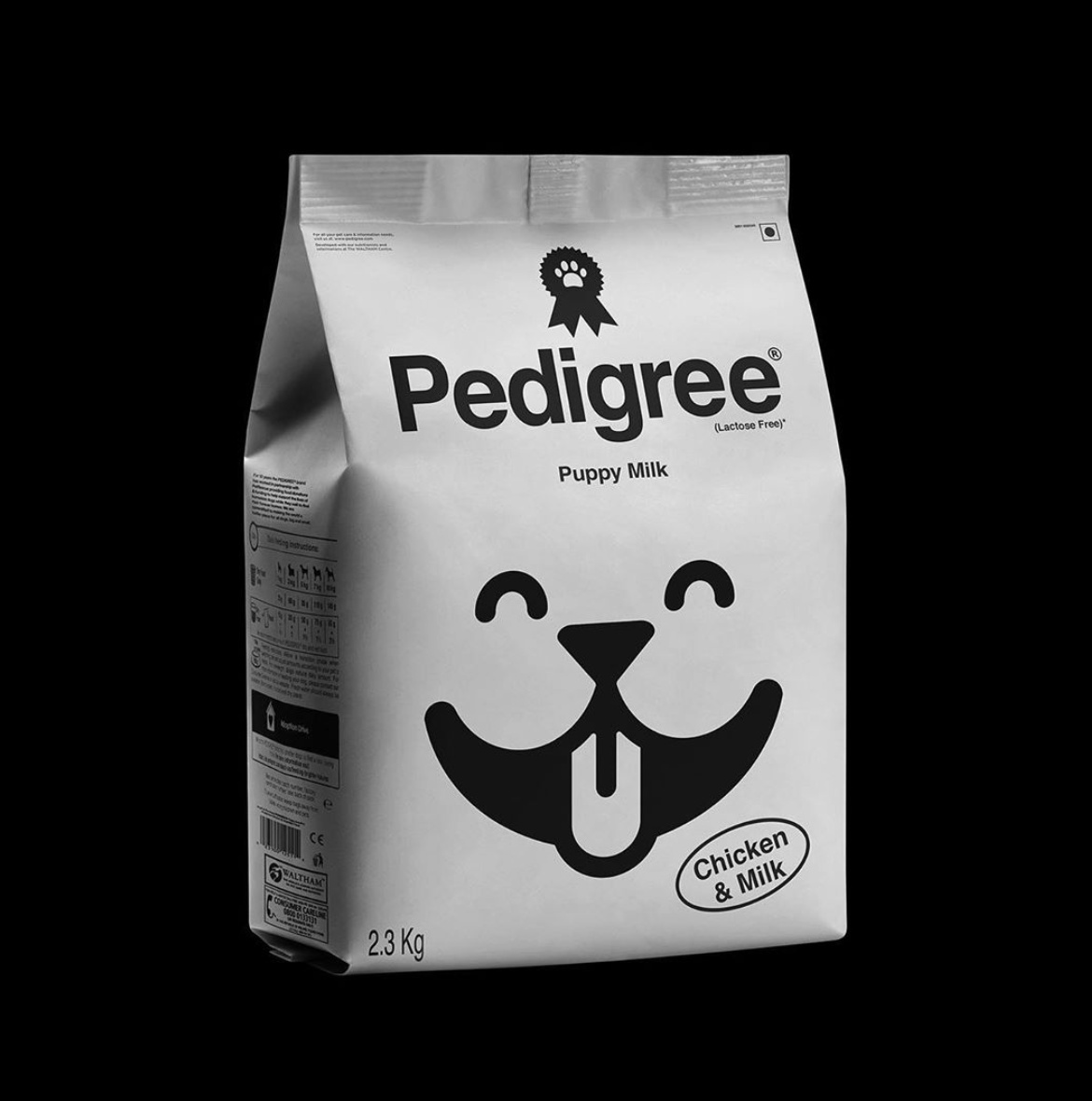
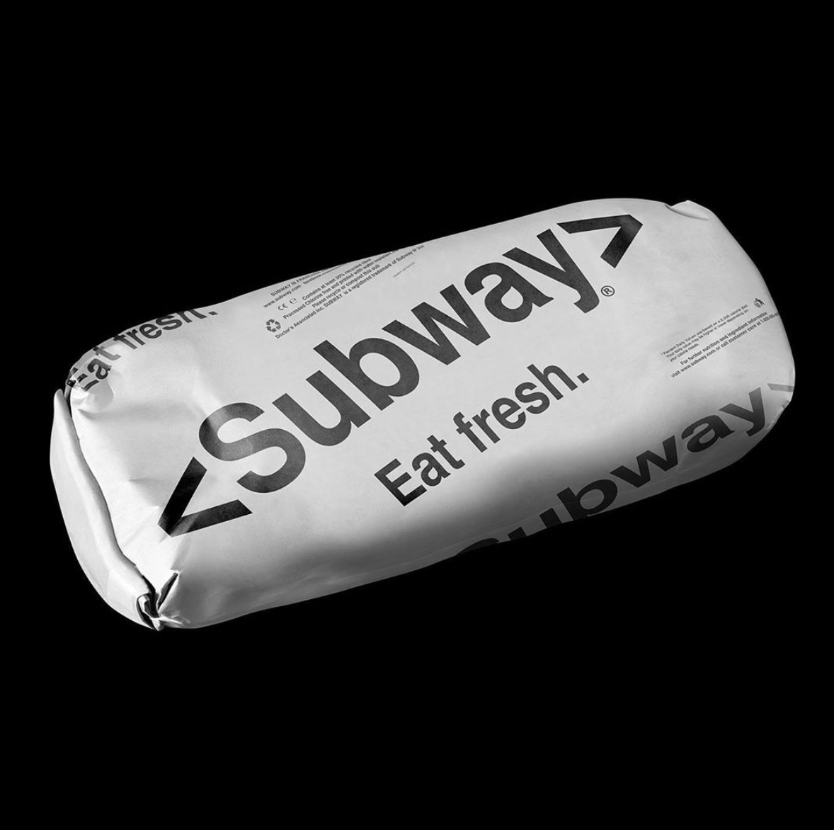
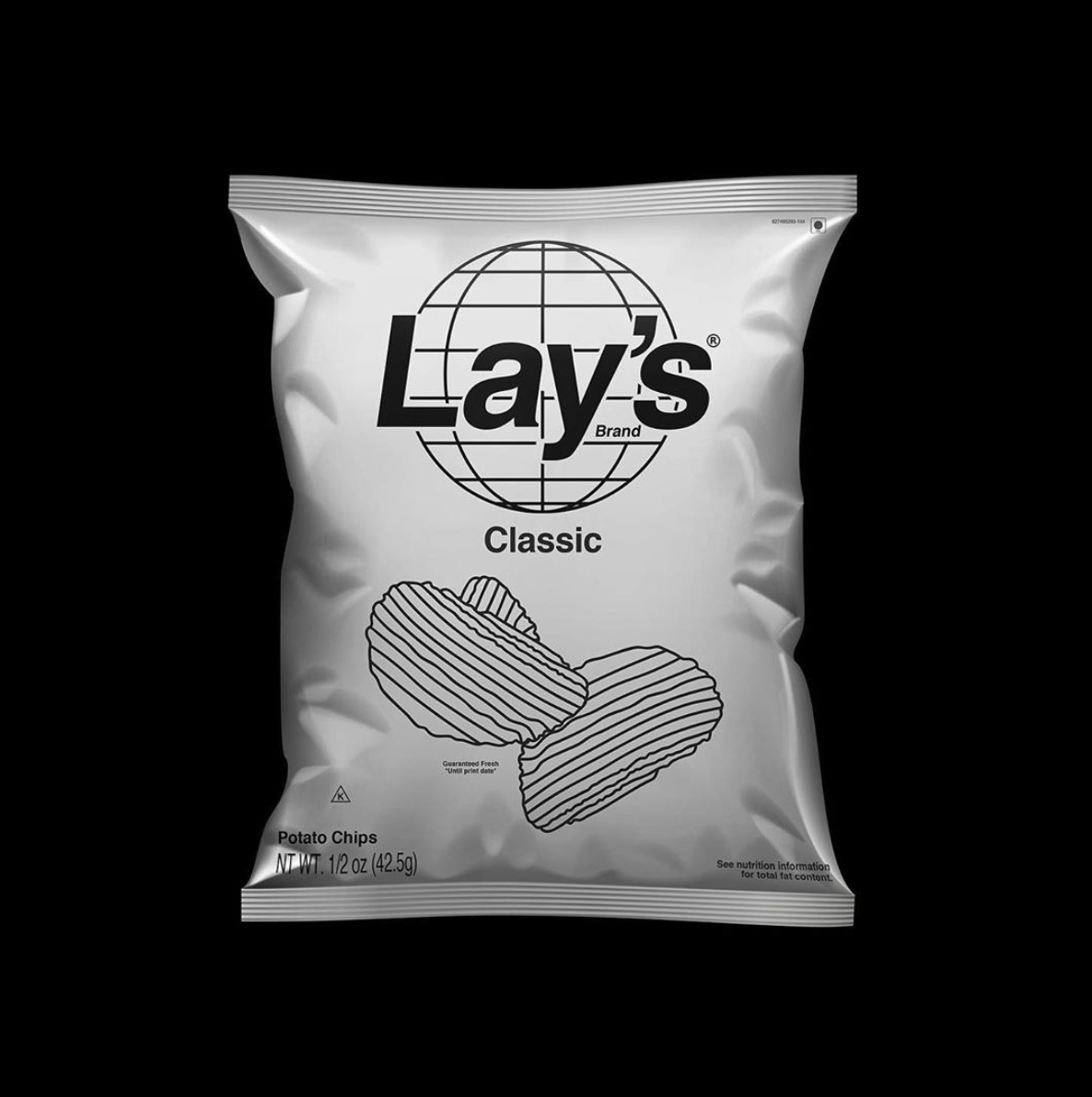
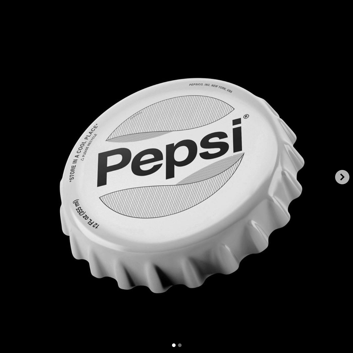
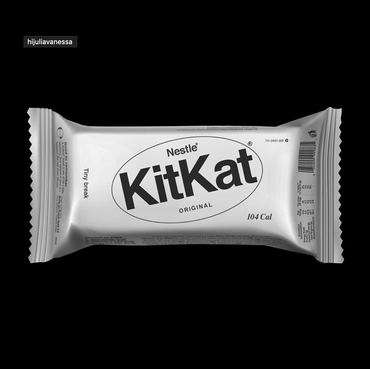
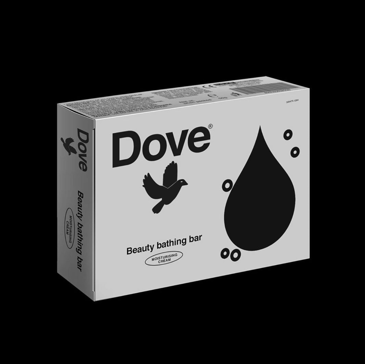
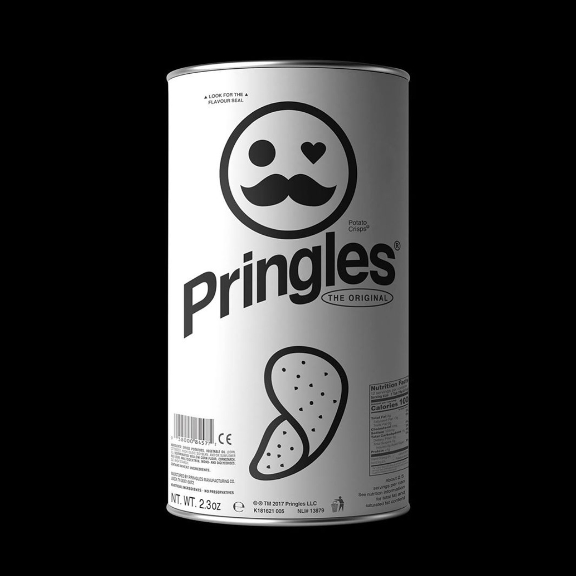
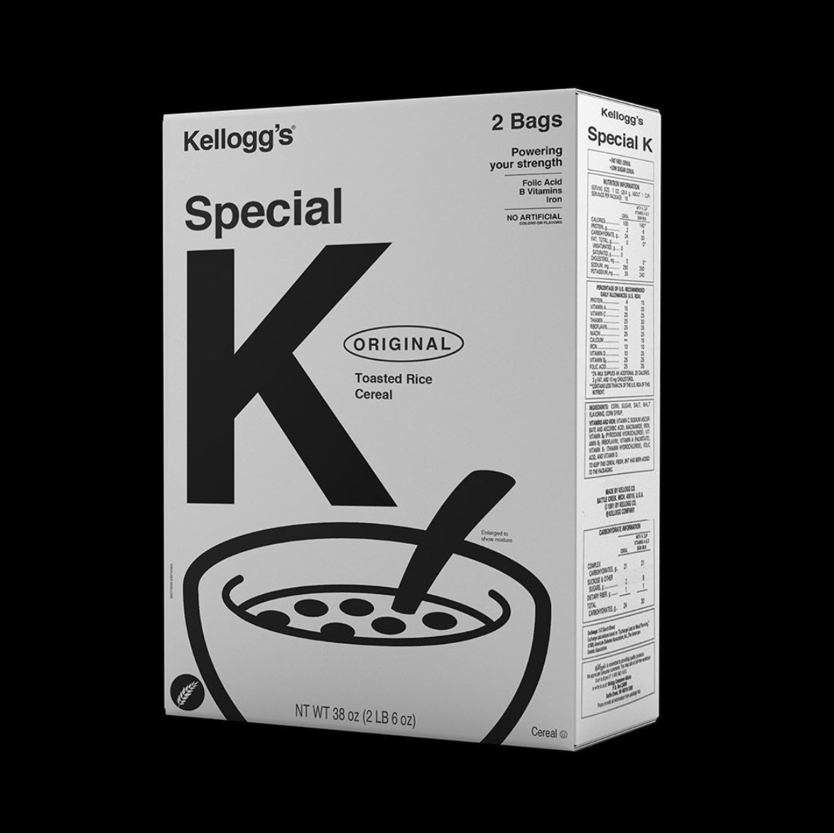
Kunel Gaur imagined how famous brands would look like in a dystopian monochromatic world. The experiment produced some rather pleasing packaging designs that would actually stand out on the shelves among the colorful overdesigned products out there.

4 Likes
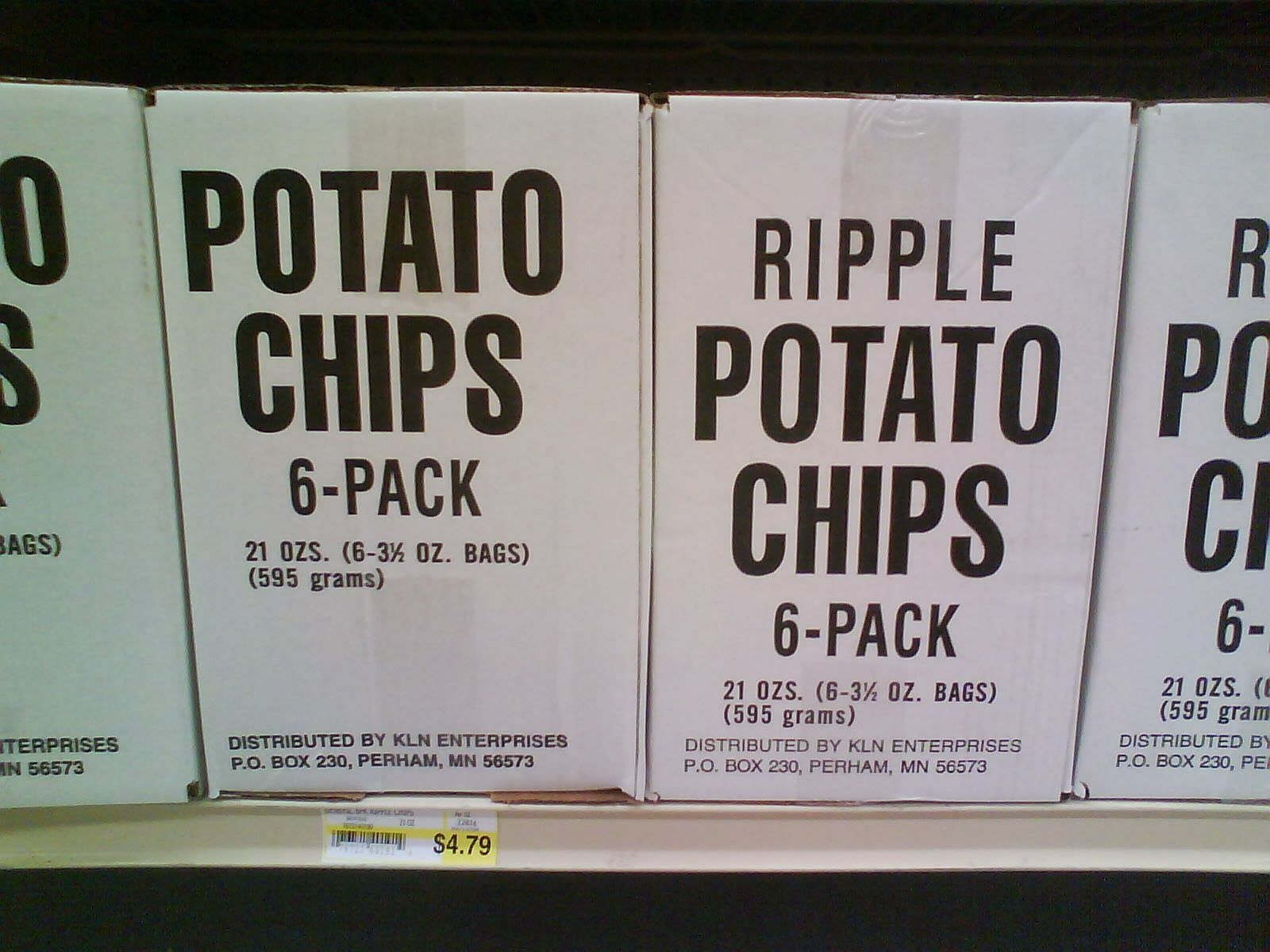
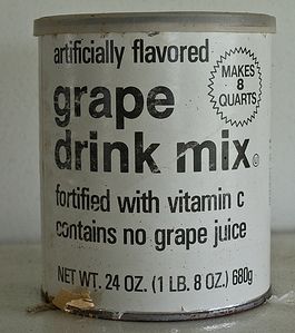
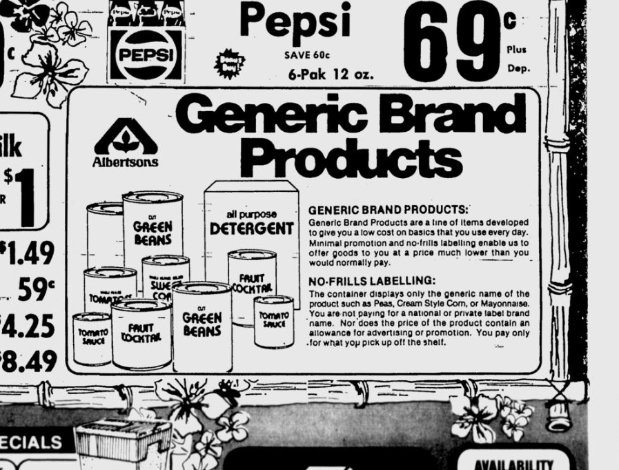
Reminds me of the generic branding of the 70’s. Our area had “Basics” I’ve also heard of No Name (yellow) and No Frills (white with a red and blue stripe) from other areas, but never seen them in person.
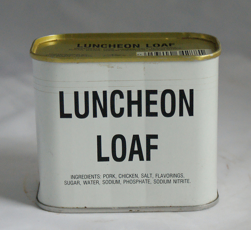
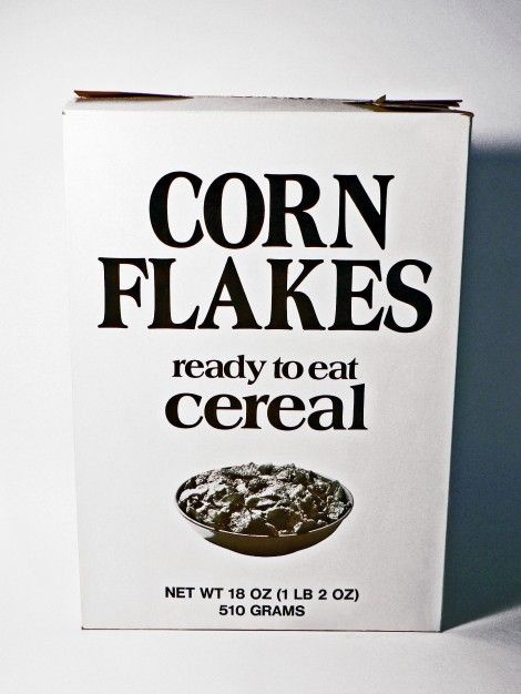
Ours was all white with black wording. I saw a lot of Basic peas, corn and carrots, peanut butter and cereal when I was a kid. Junky kid cereal was a treasured treat and always longed for since all we had was Corn Flakes for the most part .. or Oatmeal. ![]()
3 Likes
Looks vaughly like the British supermarket’s style they use on their
no nonsense value range.
Guess it might look starker to the younger generation never having lived with a black and white TV
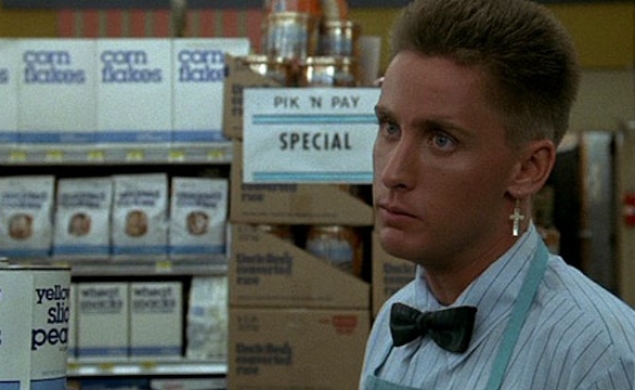
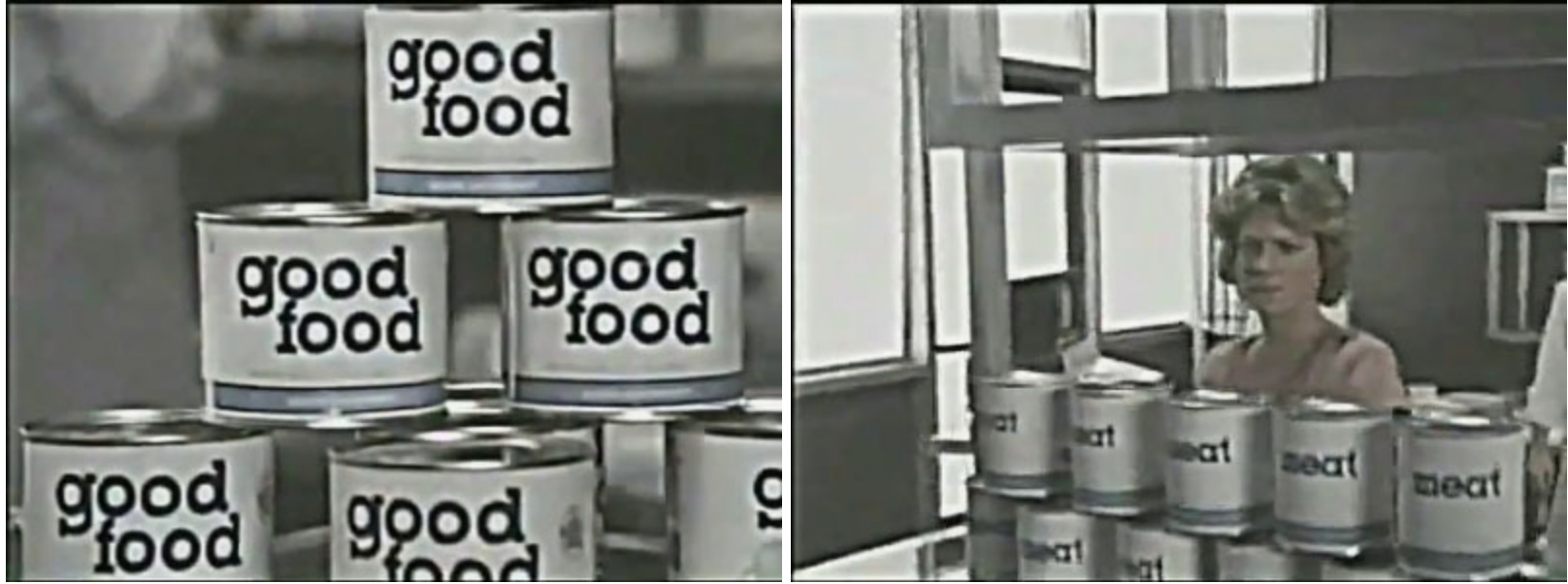
That’s what I was thinking too. There was often an entire aisle in a supermarket where everything was black, white and totally generic.
1 Like
I don’t know the TV show. What is that?
1 Like
Reminds me in a similar-but-opposite way of the packaging for the food items in the grocery store in The Handmaid’s Tale. Color images indicating the contents, but no words since women aren’t allowed to read.
I like how you’ve simplified the packaging to their base components. Great exercise for communicating the important bits and stripping away what’s not needed.
Are they supposed to look like they were all produced by the same company with the same design aesthetic? There are inconsistencies in illustration style, which is fine and expected if they’re for separate brands, but they’re almost too consistent in other elements if the brands are supposed to be distinctive (like the word in an oval). The Special K illustration doesn’t quite say ‘cereal’ to me, the blobs are too regular and simple, whereas your Lay’s chips have much more detail. Again, could be chalked up to a difference between the two brands’ styles. Very minor critiques, and I suppose there were certain limitations outlined in the brief that would account for that.
1 Like
Hi Kunel Gaur,
These are exceptional pieces of art, classic and inviting. Seeing this we reflect back the past ages. It is overall good effort. I suggest you to add colors and it will become more engaging. Focus more on symbols than text.
Excellent performance and laborious work!
Thanks
I think you might have, ever so slightly, missed the point here!
4 Likes
Hey @Naheed … not sure if you understood this post. It’s in the Inspiration thread so no critique is needed and it’s also 10 months old. Print Driver didn’t post it Iraszl did, not the artist. ![]()
4 Likes
nice analogy to commie vibe, but attributing architectural minimalism to dystopian hype is offending for all “internationalists” if we know that brutalism is left wing utopian dream, as minimalistic reflex also was never conveyed on consumer products from Cuba nor ussR even less Yugoslavia, tho maybe right after ww2 that was case … now as pop’up modern attention grabbing skim for some product line could be good seasonal trick eg. as minimal as possible labeled packaging of oats with just one big O etc.