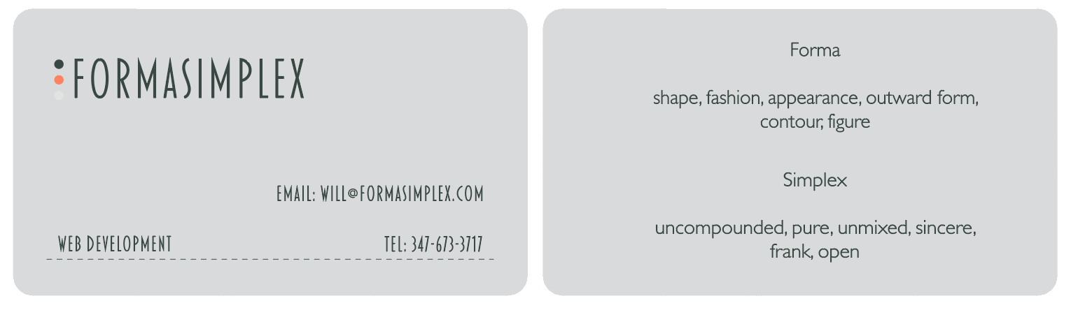
I’ve been trying to come up with a cool business card design, I’m hoping to turn into a website too. Would love some feedback on the design, some critique etc. Thank you for your time.
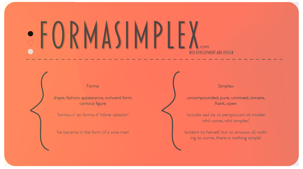
Other than Formasimplex, nothing else can be read on that card since it looks to be about 4pt type.
3 Likes
I thought it was just me.
1 Like
Still can’t read it. 7 points is still pushing it.
still not legible.
Skinnyfont at minuscule sizes over a dark gradiet = fail
Print it out at business card size.
Then ask yourself what that business card is supposed to do for you. I don’t care what Forma and Simplex mean, but your name and contact information better be somewhere prominent.
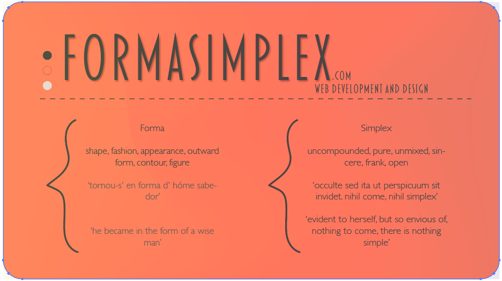
It also looks like your brackets aren’t top bottom symmetrical. It bothers my eyes.
1 Like
I may just drop the lengthy latin quote on simplex, if that is the least of my problems
They actually look to me as a person’s face looking left. You’re right about contact information. I cannot decide it is a business card or a flyer.
Nope. The problems go beyond that.
the .com and web development tags are too small too and shouldn’t be part of the “logo”
The red outlined circle is not legible against the orange
The gradient has a really good possiblity for turning muddy on printing. It’s already an off pink salmon color on the right side but that might be intentional.
There’s some sort of artifact happening just to the left of the word forma, you have a shape there that barely reads and may be a transparency effect of some sort?
I’m guessing there is a back side to this card? What does it look like?
Person’s face or not, it still looks like a mistake. Either do, or don’t, no half measures.
A flyer would have a call to action.
Gotta stop here. PD is in a very bad mood.
This is great feedback and I really appreciate it.
I was going to have the back of the card to be the information side with number and contact email.
Go hard please, it all helps
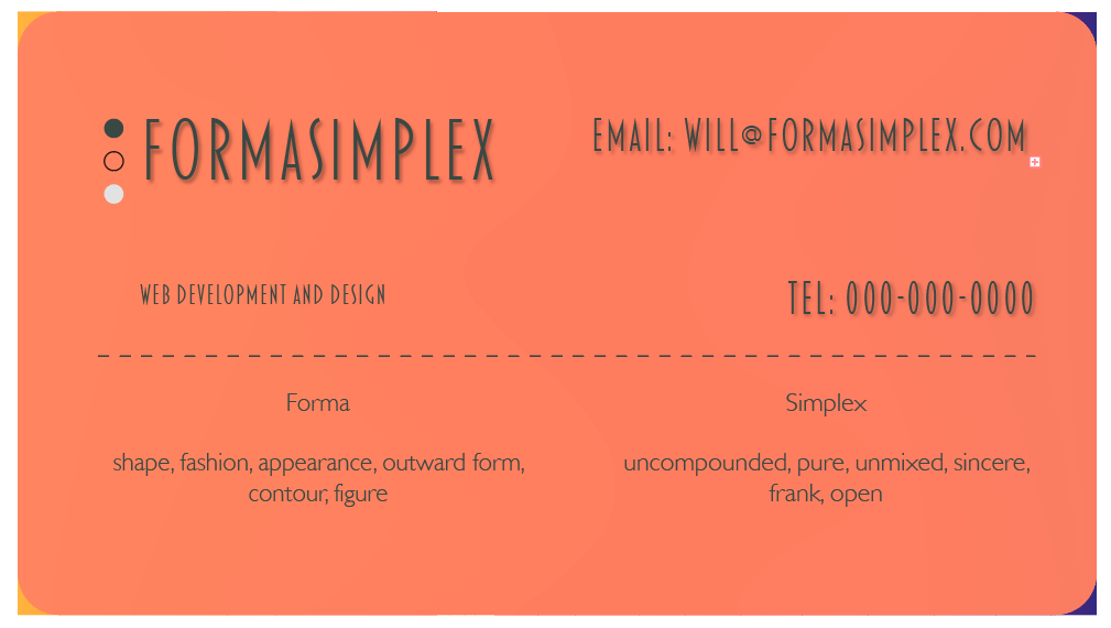
You have a text overun (that’s what the little plus means)
Could just be a line return that isn’t needed. Or not.
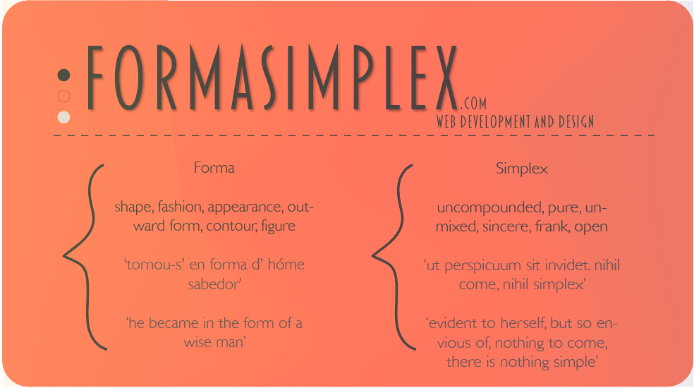
As for the rest. I’m old and looking at this at about 7" wide on a 27" monitor. As a 3" business card, I doubt I’d be able to read it.
Also there is no hierarchy that tells my eye where to go and what to look at.
Even in your most recent iteration. I’d highly suggest printing it out.
I’d ask yourself what is a business card supposed to do? I’m not entirely sure people are going to care about the definitions. In any situation they have probably already met with someone within the company and have an idea of the brand through interaction. The card is a ends to a means.
(Form + Function) = Graphic Design
1 Like
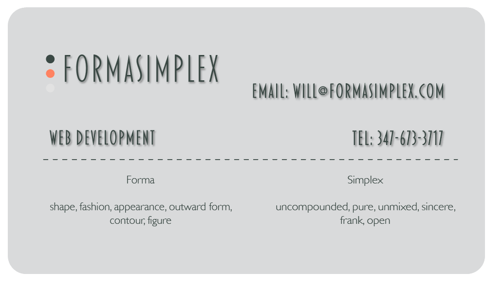
I read, this card is a mess, haha
This may just be me, but if you really want to define forma and simplex, maybe you could do so on the back of the card.
It also looks like you are trying to create a fake raised text look. It may be better to print your text with thermography or raised text to make it authentic, rather than faked.
1 Like