Hello folks
I wanted to ask for your opinion and what I could do better with the design.
Welcome to the forum Sherif.
I see a lot of assumptions here:
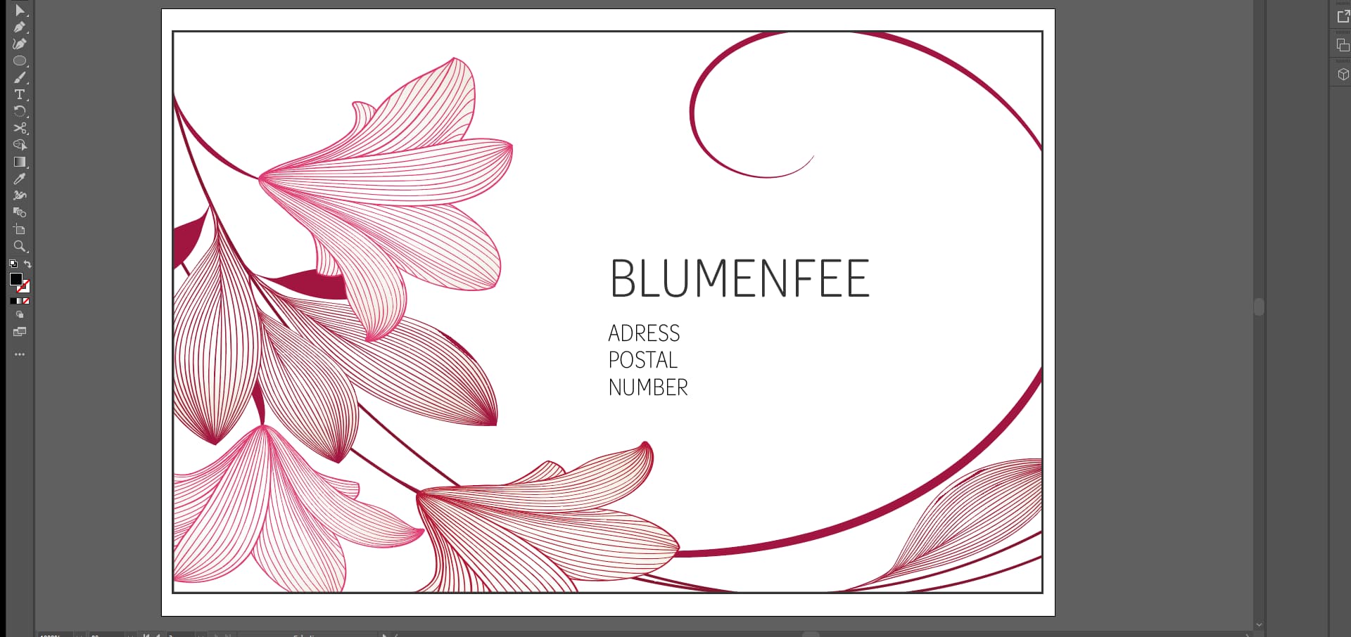
You assume the finishing will be exactly as you indicated. The white border around the black frame, which is uneven on all sides and too close to the trim as it is, will not even have a best-case scenario. A safer bet will be to do without the frame, and bleed the illustration (extend it beyond the trim). That, or adjust the frame to be evenly to, say, a quarter inch all around the trim.
You assume all the fine lines in the illustration will be printed as shown. No, they will not be. Using spot colour might help.
You assume copy is that simple. Typically it should have the store name, the name of the card holder, his/her title, store address, phone numbers (store phone number, cardholder’s phone number), fax number (yes, it does exist), web site address, e-mail addresses (a general one, and the card holder’s own e-mail address), and perhaps a tagline for the store.
1 Like
You’ll need to add bleed to the business card - 5mm should be plenty for most print shops but 3mm is pretty much standard and may be requested.
The thin lines - forget about them.
If you want a border around the cards - forget about it - the process is too finite to get 100% accurate.
Leave the image bleeding off the page and it will be fine - however, you may notice some cards are shifted left/right/up/down due to the mechanical cutting process.
It’s very complex - and I suggest refining it to simpler details.
1 Like
Whether it’s appropriate for the flower shop in question, I have no way of knowing. The card is a nice, slightly old-fashioned, feminine Art Nouveau look, which is great if that’s a look that’s right for the shop.
I agree with @Eriskay and @Smurf2, though. The artwork comes with some printing problems. If the card is trimmed by the printer a millimeter or two in any direction, the border will be noticeably off to one side or another. Even if it trims perfectly, that narrow border really draws attention to itself in a less-than-good way. As Eriskay said, skip the border and bleed the entire thing off the edge.
The fine lines are a problem, as already mentioned. In 4-color process printing, the lines will be composed of a series of small dots made from CMYK. With lines this delicate, those ink dots will destroy the effect. In addition, they’ll require absolutely spot-on perfect registration, which you’re not going to get. As Eriskay mentioned, this problem would be mostly solved by printing the card with spot inks. However, that will require offset printing rather than digital printing. In addition, printing those spot colors on a hard-surface paper might help with what’s called dot gain (the ink soaking into the paper and spreading out slightly).
Using engraved printing would be sort of cool on something like this, but would be expensive.
1 Like