Hey, currently I am practicing on bad design and remaking them like before and after image. Now I want to know can before and after image can be used on portfolio? For clarification, below is the link of the image:
I think showing before and after images is a legitimate way to demonstrate your design skills. However, you might run into copyright issues showing other people’s work as part of an effort to promote your own business.
In addition, I wouldn’t choose what you chose to redo. It’s nothing but a social media image. I’d pick something with a little more substance if it were me — a before design that is reasonably good and that you could make even better. Designing something better than what you chose to redo isn’t a very high bar to reach.
You also misspelled the word “too,” which would be an immediate deal-killer. To be perfectly truthful, your after example needs a lot of work.
2 Likes
Yup.
Not good.
2 Likes
Hello. I just google the film, and watched it on youtube.
Now on to some questions.
- Did you watch the film? Because every movie/art piece has a specific purpose to provoke some emotions to the viewer. The “before” typeface is a better match than yours, to my opinion. It suits the movie much better.
- Why did you pick a different forest photo? Every movie has some specific pallete. Watch the movie and notice that an amber/gold/yellowish color palette is used (hair, ligths, drinks, autumn forest). So the “before” image works and fits better with this pallete. The palette of your forest is off (too green).
- What you posted it’s just an print-screen from the youtube video from opening titles.
The poster is this:
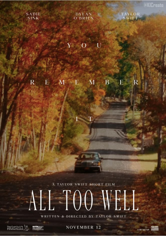
Which is a simple, clean and working poster, communicating the the feel and the atmosphere of the movie.
So before fixing something, ask yourself if something really needs to be fixed, and why.
But this is just my opinion.
2 Likes
You convinced me. Those are all very good points. ![]()
2 Likes
Did you watch the film? Because every movie/art piece has a specific purpose to provoke some emotions to the viewer. The “before” typeface is a better match than yours, to my opinion. It suits the movie much better.
No, I have not watched the movie. This is the short film, but what if it was the movie, then I need to watch the whole movie to just make a poster for the movie?
*** Why did you pick a different forest photo? Every movie has some specific pallete. Watch the movie and notice that an amber/gold/yellowish color palette is used (hair, ligths, drinks, autumn forest). So the “before” image works and fits better with this pallete. The palette of your forest is off (too green).**
The reason I change the forest photo is that I thought forest background which I choose look better. I agree, I should pick the forest template based on the movie. As there might be reason they have select yellowish forest.
Is there is any website which suggest the worst design and I redo them without facing copyright issue? If so, do let me know. Thank You in advance.
Also, thank you for pointing out the mistake which I have made like I misspelled the word “too”, I appreciated.
This topic was automatically closed 365 days after the last reply. New replies are no longer allowed.