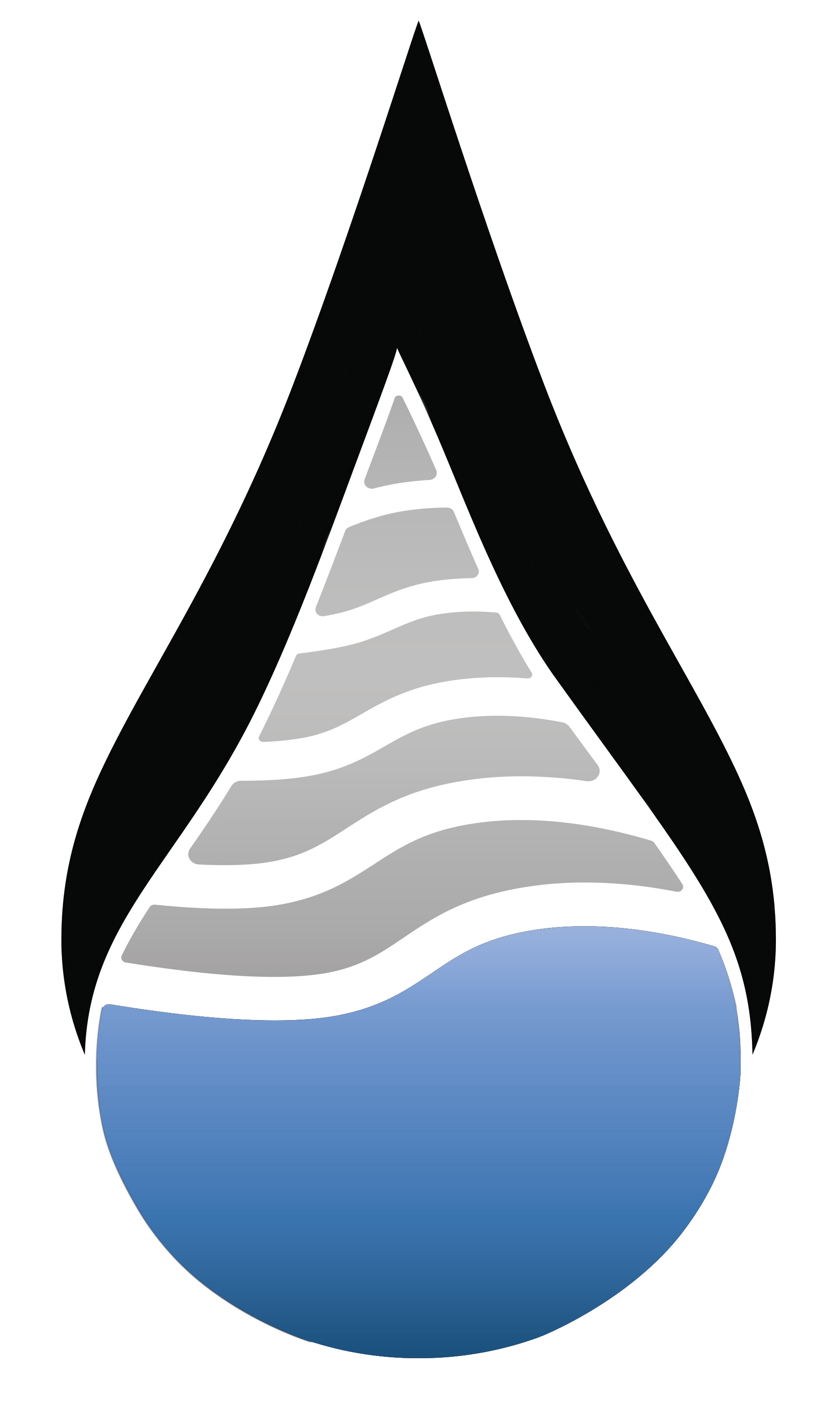
The hypothetical client I am designing these logos for are Ecolectric, Gaspower, and Watermetering.
In my logo designs, I chose light blue and grey colours for Ecolectric because it fits to convey the company’s purpose to generate electricity via wave and wind power. I also chose green for Gaspower because it is heavily associated with gas and it fits with the company’s purpose to offset greenhouse gas emissions via projects it finances based on its customers’ options. Lastly, dark blue was chosen for Watermetering due to it being the main colour of water and it also fits with the company’s purpose to promote the responsible use of water by providing systems to control its consumption, and to also differentiate the colour variation to the blue variant that I have chosen for Ecolectric.
So what do you guys think? Is there anything wrong with my designs?
I am going to be sincere with you, you are making the same mistake as before. One logo for three products, a Graphic Designer let fly the imagination in order to make something different and unique. But you just take a logo make the same thing. You should see more designs and compare with yours, you always do the same thing, use one design for every product to look all the same as others. I began to feel that you just go directly to make the same mistake.
As in your other post, two blue logos and one green one obscure the fact that they represent three divisions of a single parent company.
All three look like drops, when drops are only appropriate for the water-related company division.
They’re drawn rather sloppily, with inconsistent lines and curves. The lower droplet of Ecolectric logo isn’t even straight up and down. I suspect you haven’t mastered vector software yet. Either way, logos can’t have imperfections.
From the brief that I read to design these logos, they are required to be ‘related to the style and image of Energyflo Group as a whole’ while also having their own identities’. I interpret that as having a identical icon on their logo, but with different tweaks to differentiate them from each other while also conveying their associations with their holding company. So I doubt making them very different would be an appropriate choice like you thought.
I am going to refer one logo, which doesn’t make sense as Just-B said. This is for helping you with your designs, just to help you improve them, and you get what it is called as “Design Thinking”. For the gas design which I suppose, is the green olive oil (I wonder a green drop, is related to gas). With this colour you used, I would think you are selling more olive oil product than gas. Just get my point? Everything you do on Graphic Design, gets a meaning or a message that you are trying to do with a design.
The shared droplet container is a smart system — the three marks clearly belong to the same holding company family, which answers the brief nicely.
Where I’d push further: each inner icon should instantly say what the company does. The gear inside Watermetering reads more ‘software settings’ than water to me — a wave, a tap or a meter-dial motif might land faster. And the green layered landscape in Gaspower says ‘eco farming’ before it says gas; a flame or pipeline-inspired shape could connect better with the company’s purpose of offsetting emissions. Ecolectric’s wavy lines are the most literal of the three and feel the strongest.
One practical check: logos live in embroidery, engraving and low-quality print too. Try every mark in flat single colour with no gradients — if an icon loses its meaning at small sizes or in one colour, simplify it. Your colour story is well thought out, so keep that while making the icons punchier. Good start!
Perhaps I was less than clear. This same general logo concept, with variations unique to each division, could work well because the general concept unifies them, and the variations (including separate colors) let each maintain its own identity within the larger brand.
I see, I was referring to him just the last logo, I mean the gas with the green olive which I think doesn’t make sense. This last drop is good for an advertisement for Olive Oil products, I mean for food not for gas.