hey,
i doing a project to the Rail.
In the end, this “pocket job aid” should be on the train drivers tablets, that the drivers use while they work.
this particular page is for the speed limit and i’m having some difficulties to deliver the message correctly.
i’ve made this example for you (translated and made things up), if you could please help me think it through.
this is the scenario:
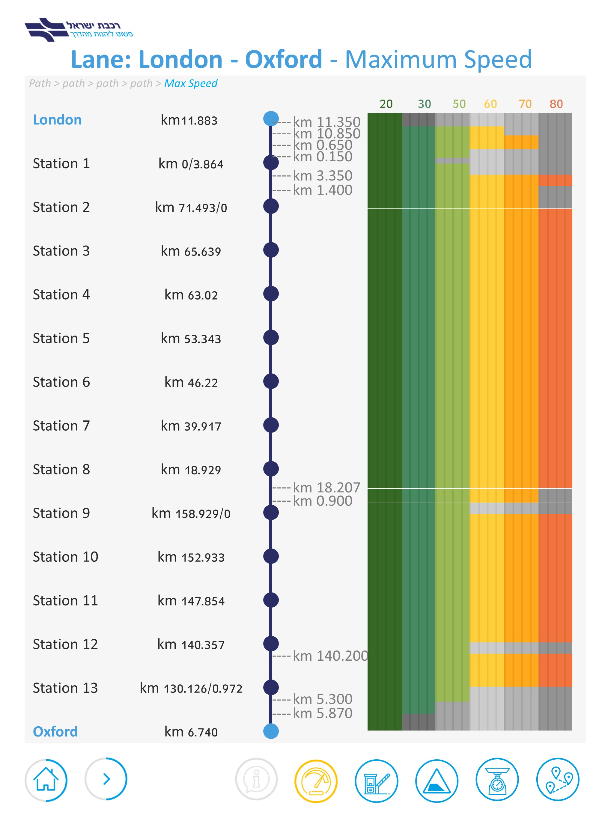
train leave from point A to point B and in it’s path there are stations it goes through.
near every station there’s its km and on the right side there’s the “problematic” graph i made.
i need to make it up that the drivers could understand the max speed they can drive at any point of the way (km/h).
i hope you can understand.
i.e - from the point of station 2 (71.493) to the point of km 18.207 the max speed they can drive is 80.
from this point till km 0.900 its 70.
we did a pilot and most of the drivers didn’t get it. they didn’t understand their max speed points.
which means the graph is not good enough.
Part of the problem may be that the colors are meaningless, but their presence sort of sends the reader’s mind down a rabbit hole searching for their meaning. That time and energy spent on distraction is counterproductive to understanding the graph. Another thing is that on the route shown there are 25 subdivisions, and for some reason 3 of them get a horizontal divider across the graph and the rest don’t. I’d say they all need one.
These things are often more obvious if the graph is rotated. The axis on the left should be along the bottom. This would make the direction of travel left to right, which makes more sense, and the speeds go up which is more intuitive. The thing stopping you doing this is the length of the labels in the left hand axis (km 71.493/0 etc.). If you can figure out a neat way round that it should work better.
Failing that, forget equal distance equivalents on the card. It doesn’t have to be to scale (the London Tube Map famously ignores geography for ease of use). It just needs to show the points where the driver needs to change speed up or down. For instance, after Station 2 the max speed doesn’t change until after Station 8. This would need less information and so the graphic and the text labels can be bigger.