So i am always trying to get to ** contest site removed ** and getting declined under the pretext of poor design quality. I am using illustrator and even though i am an amateur i don’t think its that bad. Can you please criticize my designs and if there are any ** contest site removed ** members let me know how you managed to go through the quality verification phase. Thank you
Allow me to apolgize in advance for this. That’s it; I apologize.
Firstly, there is no such thing as “perfecting a skill”. One develops a skill, and then either stagnates or continues to improve it. If reaching some stopping point at which you consider your ability “perfect” is your objective, I’m not sure how anyone can help.
Second, crowdsourced logo peddling and developing pro-level brand design aptitude are unrelated aspirations.
To be frank, the series of graphics you posted do indeed betray a shortage of strategy, competent method, and design intent. Clearly you’re doing a lot more decorating than designing, and that’s what one learns in pursuit of crowdsource success. To someone looking to break in, it appears the slickest, sickest graphics get all the play, so everything you produce gets some wierd cut gimmick, illustrative overreach, and of course a copious dose of gradient color in all the brightest RGB greens, blues, and oranges.
This is not real-world brand design, and the process by which it comes about bypasses the analytical legwork upon which professional logo design is predicated. And, I haven’t seen any member of this forum step forth and offer anyone advice as an expert in crowdsource success. It’s anyone’s guess what “** contest site removed **” would demand to elevate you past the threshold of “poor design quality”. So there again, I’m not confident you’ll get help with that here.
You could try participating in Daily Logo Challenge (google it) to improve your skills … that helped me a lot anyway - even though I’ve only got through about 1/5 of it so far.
It could also be an idea to practice / read up on some more fundamental aspects of design, e.g. typography and iconography etc… rather than worrying about what software you’re using.
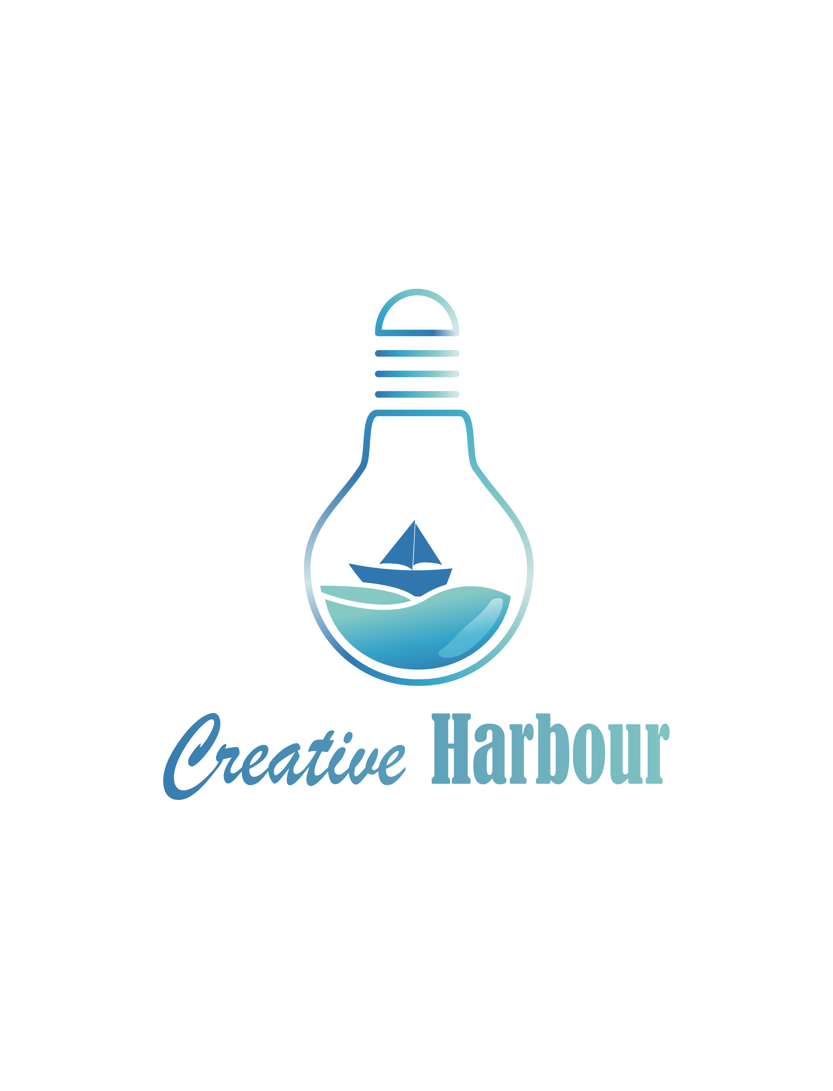
I would agree with their assessment. The Creative Harbour shows some thought in that you’re combing a ship (harbour) and light bulb (creativity); but the execution is lacking. All others look like you’re just throwing stuff together with little thought.
I would suggest that you study up on two areas.
The first is basic logo principals; logos are more than choosing a font and clip art. The second is typography. The samples you’ve posted show little sensitivity to the art of setting type, choosing appropriate typefaces, and combining different typeface families.
To me these feel like logos that were designed on the computer. When you stat with the computer, you are limited by the software and what you are able to do with it. I always, without exception, start every logo design with pencil and paper. I have a process I go through (that I’ll share if anyone wants it) where I do multiple versions and then refine it down to the point where it’s about 90% done before I ever turn on the computer. The computer I really only use to recreate the logo in electronic form and do cleanup.
It seems your approach is to combine various things that seem to fit the subject matter in some way.
Combining elements is rarely the way to a good logo. For that matter, subtracting everything that isn’t necessary typically results in the best logos.
It’s difficult to critique crowdsourced logos. Clients, in general, don’t understand logo design — not only is their taste usually lacking a bit, they’ve usually never thought through what a logo needs to accomplish. Everything from reproducibility at different sizes, to color palette printing & fabrication expenses, to how the logo resonates with their target audience or how it sets them apart from their competitors are things most clients don’t appreciate.
Instead, clients tend to be focused on what they personally like rather than paying attention to the more important practical considerations of how well it will work for them. In a crowdsourcing environment, a designer rarely has the chance to really sit down with clients to talk over pros and cons and engage in a bit of education that, honestly, needs to extend in both directions.
I guess what I’m saying is there’s no good way to judge how viable a crowdsourced logo will be given that the person picking the winner isn’t typically in an informed position to make a good decision, nor are designers typically educated enough about the clients situation and goals to provide clients with what they really need.
Hi there,
Learning process never ends. When a person after much work comes to a point that he is now “perfect” in his skill, he is the wrong. You need to put your best efforts in your design skills. Focus on design not decoration. Keep in mind, you say every thing in your logo what you want to communicate in so many words.
Think minutely, think more and more while building a logo. It is you who can make the best logo, putting your deep thoughts in action.
Cheers,
Thanks
@killswitchengage Wouldn’t waste your time doing speculative work for crowdsourcing sites. It’s not a framework that allows you to arrive at meaningful mark the same way you would if you were dealing direct with the client from the start.
Regarding your work, I think it fundamentally lacks restraint.
Don’t touch the gradients (unless you know what you’re doing - which you’re not there yet)
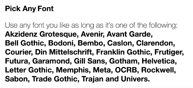
Limit your designs to 1 font for now (you can go to more, but only once you’re better)
Don’t use quirky weird fonts. Stick to this list for now, once you have mastered the basics you can you can be more adventurous:
Would recommend you spend some time on Behance or Dribble looking at things you think are designed well and trying to understand why they look good and the chasm between your work and theirs.