Althoug I decided to post this message in the “Student” secction, I’m not really a design student.
I’m a civil engineer, therefore a cadist and I’m also a fan of logo design.
I graduated in 2015 and since then I want to draw a logo of my own, but never finished this job. So I ended with this latest sketch and I kind of liked the result.
Just to contextualize, I like I the black and thick strokes as those used back in the times of old press. I think it has some sober look and fits very well to civil engeenering plans (specially considering the older ones).
The logo itself is very simple, it’s just a capital “B” circumscribed in a ring. It’s intended to be a blend of handdraw brush letter to a machine straight line concept (as in a technical drawing). Maybe it’s too simple.
So I would feel honerd to receive some criticism from you, who are experts in the field.
Although I’ve worked in/around Engineering environments my whole career, I’ve never heard that term before. So just curious; did you learn that term, or invent it?
There’s no such thing as a logo that’s too simple. That said, looking at the mark and considering the application you describe, I’m more inclined to think of this as a “chop” — a monogram, applied in the same way an artist signs a painting — as opposed to the ubiquitous face of a brand.
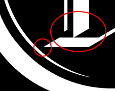
In either case, judging it primarily on its mechanics and aesthetics, I’d say that if there is a problem to be solved, it’s the fit of the B in the ring. The two shapes are not “comfortable” together. The B is crowded at lower-left (small red circle below), and the ring’s inner highlights only make it more so. I recognize the intent of those highlights, and if it was mine, I’d experiment with moving them outward, onto the ring, cutting them in as negative “lowlights”.
The larger red circle is there to indicate an area where I’d also want to refine and improve. Surely you can do something better and slicker there than those loose dead ends. Create some purposeful relationships.
Well, if I am right, that would be the first time in a long time that I actually knew something. Just ask my kids, they’ll tell you how wrong I am on everything else.
@HotButton@RedKittieKat@Steve_O
Sorry, people! I’m from Brazil and here it’s commom to use the word “cadista” meaning “someone who can draw on a CAD software” and for some reasom I was quite sure that there were the word “cadist” in English!
Thanks for the comment. I’ll give it a try.
Wow, these are very good considerations. I appreciate the technical notes, it’ll certainly be of good use.
Thanks, I’ll take a look at those links.
Do you mean the difference in line thickness?
The goal is not really announce Civil Engineering by the logo itself, just to cause an impression commitment and precision. Do you think it fits?
Thank you all for your time, I’ll make some adjustments and post a new image soon.
I was referring to it emotionally, rather than specifically. Blackletter is an antiquated letterform and the associations with it are almost the opposite of what you would want to say about engineering – in any form. Look at the history of blackletter. It is a manual letter form, from a time when scribes copied manuscripts by hand. Before the mechanical era. Before the printing press (although still fairly commonly used until the around 16th or 17th century in certain parts of Europe).
It is commonly used to evoke a sense of medieval, gothic. In the UK, at least, it commonly used for cafés and tea rooms that want to appear historic. Ye Olde Shakesperean Tea Rooms. It is never successful and always twee, predictable, saccharine and bucolic. It has its place (arguably, back in the 12th century), but not for anything to do with modernity.
In addition, the particular B you have used is quite stilted and out of proportion. If you are going to use it, find a beautiful example of the form (there are many). The differing angles of the down strokes really don’t work at all well. If you look at how Blackletter was originally drawn (loads of examples on YouTube) and how the line weights are governed by the shape and angle of the nib, you would be very unlikely to find anything quite like your B.
So, for the reasons, I have stated and, as others have said about the practical problems of line thickness, I’d suggest rethinking the whole thing, I’m afraid.