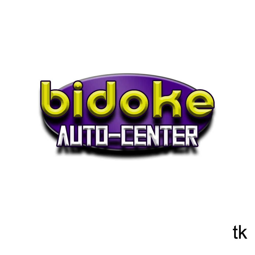
thoughts on this one its for a friend! he wanted something old school looking and simple.
If it were me, I’d remove the various 3D effects. They impair legibility, add clutter and will cause headaches going forward when it needs to be reproduced in various ways, like on a big sign on the front of the garage.
Are you talking about the 3D effects on the letters, on the oval shape or in general?
I’m referring to the bevels and the shadows.
This also looks like a Photoshop creation, and with logos, big problems ensue when, for example, a raster image needs to be blown up to, say, 20 feet wide for a sign and the resolution isn’t there. Logos should be created in a scalable vector format to avoid this problem.
I would remove all of the 3D effects, stroke around text, and drop shadow. It just seems like way too much and trying to cram every “Photoshop Filter” or “Blending Option” into it. Recreate in Illustrator as I agree with @Just-B, looks like a photoshop creation and you’ll need vector. Which is doable in Photoshop, just the harder way to do things.
Expand the purple circle a bit or reduce the white text size/nudge it up a bit maybe, it’s okay to have the “A” and “R” hanging off, but it does still need to be legible if you’re reversing out the text, so maybe just one arm of both letters bleeds outside the box, rather than 1/2 the letter.
On the same lines of what @Just-B said as well, you have to think about signage as well for this. Is it going to be a flat vinyl sign, or is it going to be a fabricated sign with dimension? How will the white lettering be represented on the sign-reversed out of the purple, or solid white physical letters?
I recently heard an interview with the legendary Tom Geismar. One of the final question posed was asking for advice on designing logos. He said, “Keep it simple.” It’s funny. You say you want something simple, then you throw in gradients, bevels, stroked type, glows, and drop shadows. Since you say you’re self-taught and still learning, There’s a lot more to design than throwing a bunch of effects at type.
Also, the type is terrible. You have two faces, neither of which are very nice, that absolutely don’t work together.
If you want to keep along this line, that’s fine. But really push the design. Consider centering bidoke within the oval. You could then move auto center below the oval, to the right of the oval or put auto above and center below. Just watch the visual weight and hierarchy so that bidoke remains the hero so that it’s read in the proper order.
thanks for the advice, i’ll take that in mind ![]()

