Thoughts on their rebrand?
Seems a little more artistic than I’m used to for a government agency.
Reminds me of a cross between a cross of https://cranbrookart.edu/ 's style and the DieHard series for some reason
Thoughts on their rebrand?
Seems a little more artistic than I’m used to for a government agency.
Reminds me of a cross between a cross of https://cranbrookart.edu/ 's style and the DieHard series for some reason
It’s awful!
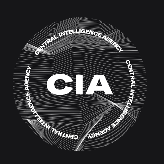
If this is the only version of the logo or seal or whatever they call it, it’s all but unusable. The fine lines are already disappearing at the size you’ve posted it. Reduce it down, and it will turn into a blurry blob. The typography is tracked so tightly, that’s it’s almost unreadable, and there’s no reason for spelling out Central Intelligence Agency three separate times in the logo.
This is the first I’ve seen this, and considering how bad it is, I’m wondering if it’s a real thing.
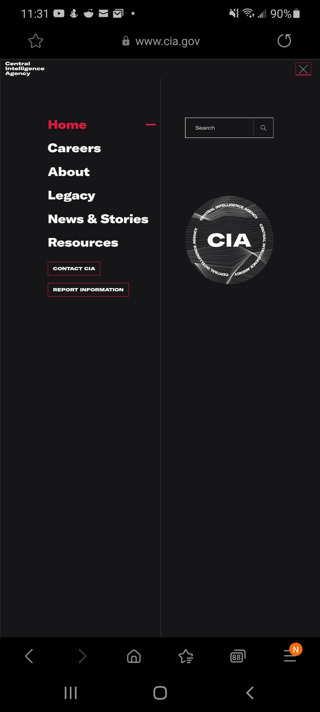
I just did a quick Google search and there’s much being written about it. When checking the CIA’s website, however, I couldn’t find the new logo anywhere — just the old one and the one below. Their website, by the way, is not at all what I’d expect from the CIA, which is another subject, I guess.
It looks like they are doing different icons for the logo…which is baffling.
Is this the state of design? Is this what we are getting when there are no regulations and everyone can be a designer…
To all my knowledge this is the real thing. I doubted it at first.
It looks like it shows up on their mobile site, but not the desktop version that I’m looking at. That alone is poor planning and execution.
I’ve done lots of work for various government agencies. They pay well and always on time, but I’ve found them to be universally incompetent when it comes to matters of design. Worse still, they typically have a bureaucratic mindset that makes them all but immune to any kind of attempt to give them anything other than plain, old, run-of-the-mill government work. Creativity and innovative solutions is just not their thing, which is what I find peculiar about the CIA website — it is almost sort of surprisingly good in some ways (other than the logos).
I’m having a hard time imagining being a graphic designer at the CIA. That would be a really weird place to work.
I had to look up a bigger pic .. I can’t see the lines all that well.
It resized when I saved it ![]() oh well it’s bigger on the site below.
oh well it’s bigger on the site below.
It’s bad enough as is .. but the fact that they are all wonky and nothing looks even is driving me bonkers!
![]()
and Twitter is having a field day ![]()
On a side note, as I was poking around on their site, they do have a job opening for a graphic designer and a video editor (separate positions). If anyone wants to take a shot at being able to tell people they work for the CIA.
I saw that, too. The salary range was $57K to $157K (pretty big range). I wonder how far that gets you in Washington D.C. or how long of a commute you’d have to have to get reasonable housing?
Yup @Steve_O, DC is expensive, not NYC expensive, but still costly. If you’re closer to the median or higher range it might not be bad. In my case, I’m not up for uprooting my family of 5 for it. But, like I said, it would be fun to tell people you work for the CIA.
Am not sure whether it’s really their logo or just a graphic for their menu, as their original emblem is still visible at the top of their page, and as their favicon.
That said, it’s a very progressive style that (and I’m only assuming) they think would appeal to an 18-25 year old audience. It strangly reminds me a lot of these guys: https://andwalsh.com/work/
It’s interesting their first call to action on their landing page is for recruitment and also shows a young person. ![]()