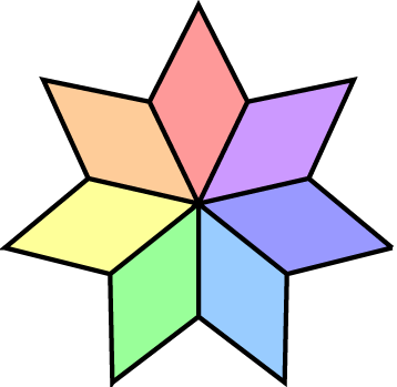
Try making this shape from scratch:
Without using Transparency!
Even better, pretend it’s a logo. No stroked lines, All filled shapes, and no intersecting lines!
Post your wire frames (outline view) and I’ll grade you.
![]()
DZ, that’s a sloppy pointed star. Not sure what’s going on with the yellow and green tips (loops?) but the darker-blue-violet is not joined.
I’m not exactly a newbie to Illustrator, but I’ll play anyway, if that’s OK.
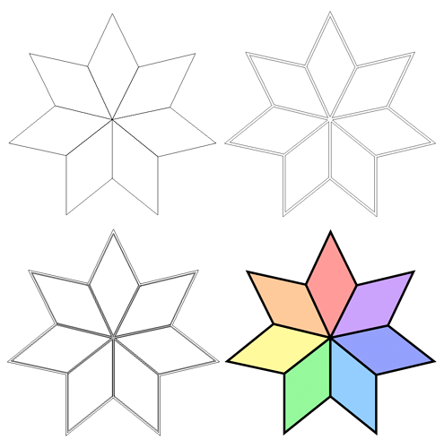
Taking PrintDriver’s extra conditions into consideration, I took it one further by spreading the color shapes by a couple of points in order to trap the colors into the overprinted black border shape.
Top left: Outlined drawing
Top right: All shapes separate including the black outline
Bottom left: All shapes separate with the trap added
Bottom right: color version
It was supposed to be for beginners. It’s too easy for B, who’s been at this since before Adobe was founded.
If any of you advanced Adobe Illustrator users are looking for a challenge, here’s one. Try doing something like this without laying a single rasterized pixel. I made this file back in January of 1999:

Sorry for spoiling the student exercise. Part of my reason being that this is a good exercise for demonstrating a minimum level of skill needed in Illustrator for professional work. It doesn’t look difficult, but it involves a bit of math, a combination of tools and a good deal of figuring things out before just diving in. These sorts precision shapes aren’t freehanded or traced — they’re planned out before the first click of the pen tool.
No apologies necessary. It gave me an excuse to reminisce on good ol’ days when I had time to do this kind of stuff.
I’m a senior artist too. Don’t want to spoil it. But it’s an easy rendering with simply drawing one piece. I’ll say that much.
And PrintDriver, you of all people pretending this art for a logo? ![]()
All the cula’s… the cula’s…
I can just see the right side printing all the same lovely shade of lavender..
Hey, I charge by the Pantone match. Of course I like logos with lots of Pantone colors.
You want me to screen print it? I charge by the screen too!
![]()
I am coming to embrace the current climate of lack of technical skills with an entrepreneurial spirit (when I’m not too busy whining about it.)
Just-B can you give a bit more explanation please, from what i know, trapping is an automatic process that the printer will take care of, …and if you’re doing the trapping here manually, how are you doing so? are you putting a black stripe between the shape fill and the border?
This was a couple of months ago, and just an exercise for the sake of doing so.
Yeah, printers typically take care of the trapping, but there are instances when I do it myself anyway when I’m concerned about something or other. When designing logos, for example, I’ll sometimes overlap the abutting shapes just a tiny bit just in case. It’s an old habit from back in my newspaper days when computers didn’t do all the work and I couldn’t count on the film strippers to consistently spread and trap the way they should.
I can’t really remember how I spread the colors on the shape here, but it was likely just a matter of stroking the colored shapes by a point or so, expanding and consolidating the strokes back into the main shape, then setting the overlying black border to overprint (which, once again, computer software would typically do anyway when it’s just a solid 100% K).
Its not easy to get rid of the old habits.
thank you ![]() this was helpful
this was helpful

