So the wedding happened last April?
lol @ the title
yes please
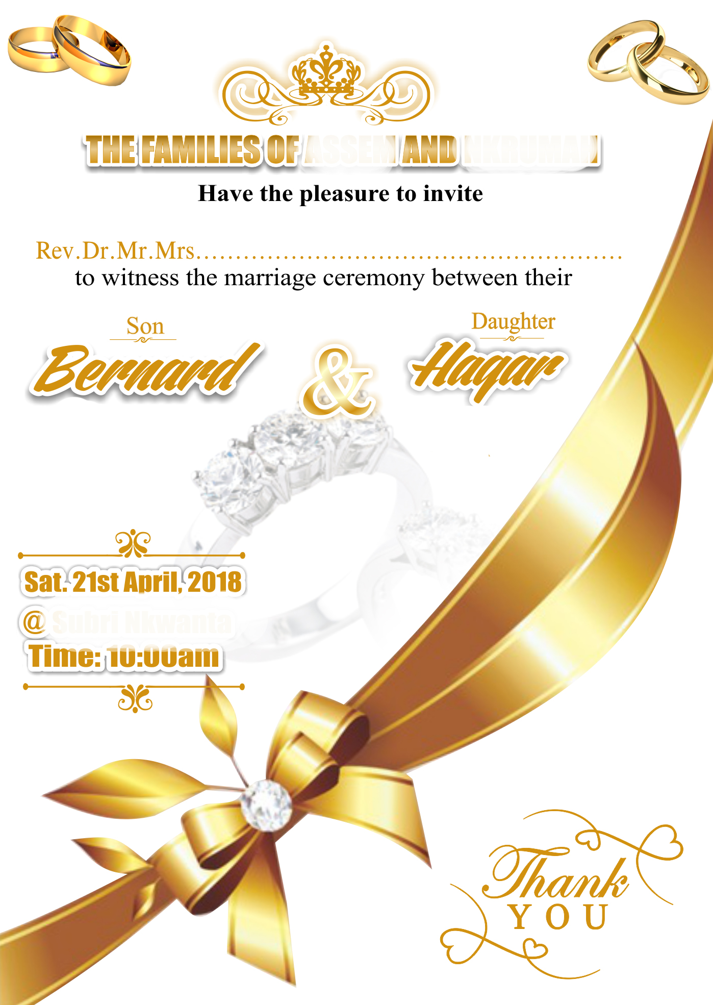
No Hierarchy, Composition and Flow are scattered. I keep getting drawn to the large golden ribbon dividing the page. Different type effects causing confusion. Too many font styles. Lots of different “golds”.
It may be the smallest of the mistakes, but “Thank You” does not belong on an invitation.
You are also using a lot of different typography styles. You may want to narrow it down to two or three. Between the gold, black, script, serif, san serif.. it all seems to be too much going on. Remember, less is more!
Impact, Times New Roman, Edwardian, Some Brush Script…
Far too many typefaces.
At the size of a 5x7 Invitation, this will all be far too small to read.
Plus the design is very informal. It looks like an advertisement for a jewelry store, Not a formal Invite.
I’ve been quiet on this one so far since I really like to have at least something good thing to say. This morning I’m feeling a little less concerned about that. The OP did ask, so I’ll just blurt it out. This is — as unfortunate as it might be — just plain awful.
Gold everywhere? Geech! This would put Donald Trump’s kitchy Manhattan penthouse to shame.
You have a single sentence spread over multiple styles, lines, typefaces and fill-in-the blanks. Then, you’ve decorated it up with various reflection and shadow effects. I don’t think I’ve ever seen a sentence so badly mangled.
Why do you have “Rev. Dr. Mr. Mrs” preceding a dotted line where the name will be written. What are you planning — circling the one that’s relevant after the name is filled in over the dots? Why not just leave a blank space to write in the name — title and all?
What’s with a “Thank You” note on an invitation? What are you thanking them for at this point? You thank people after they attend, not when they receive the invitation.
Why are you using an @ symbol on a formal invitation? This is an invitation, not a cell phone text message.
The entire invitation is a disjointed mishmash of evenly distributed, gold-colored odds and ends that just don’t work. Again, I’m very sorry for my negativity, but there’s honestly not a much that’s right about it.
thanks for your advise