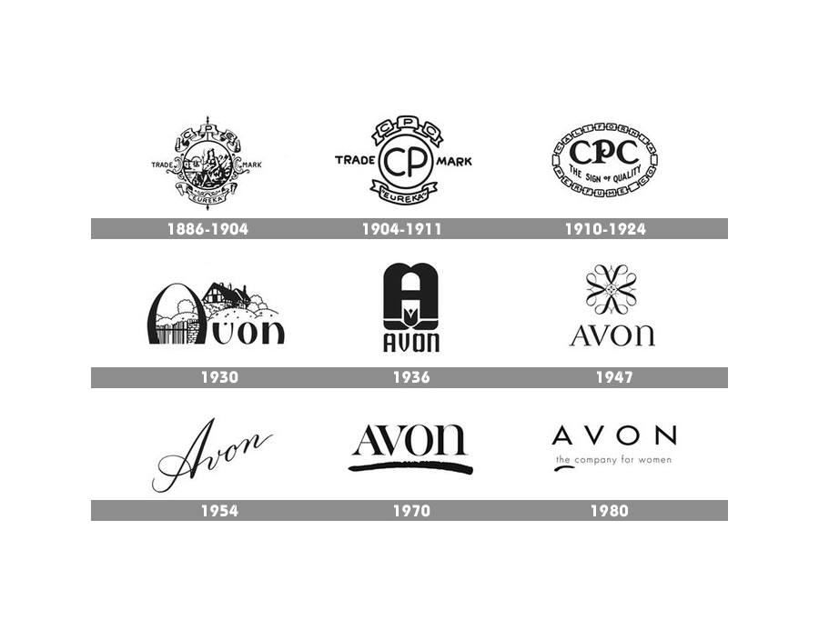
History of the Avon Logo
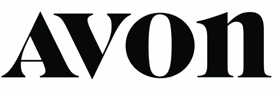
New Logo
Seems to me they’re a year, if not more, behind the trend of using serif fonts that have super thick and super thin strokes. I do like the capital A and lower case n, though.
I have mixed feelings. But I like the way the angle of the stress on the O matches the diagonal stroke angles of both the A and the V.
I had quite the opposite feeling. That O looked so out of place it’s jarring.
They should have gone back to the 1947 version.
That’s what I was referring to when I mentioned having mixed feelings. On the one hand, I like it for the reasons I mentioned, but it draws attention to itself because it doesn’t look the way an O is expected to look. I had the same reaction to the lowercase N. Or is it the uppercase A? Either way, one of them has the case wrong, which again works from the standpoint of all the elements of design, but draws attention to itself because it defies convention and what’s expected. As you said, jarring.
From their past logos, it looks like the company just reinvents itself for a new generation every 15 years or so. It kind of makes sense. Their business model may explain why none of the logos are an evolution, but rather designed as a clean slate each time.
As far as the design choices, it looks like tried to do something to stand out. Their previous 2011 logo looks exactly like their top competitors… L’Oreal and Revlon. I think the new logo looks oddly dated, but more memorable than the current one.
I hate it. My fave is the '70s one but I can see why they went with spaced thin sans for a while.
It looks like the’ve been using a lower case ‘n’ off and on since the '40s so nothing new there.
Thicker strokes stand out better so maybe that’s why - and a sans that thick would look like they’re selling builder’s supplies.
That ‘O’ though, so much better if they just left it;