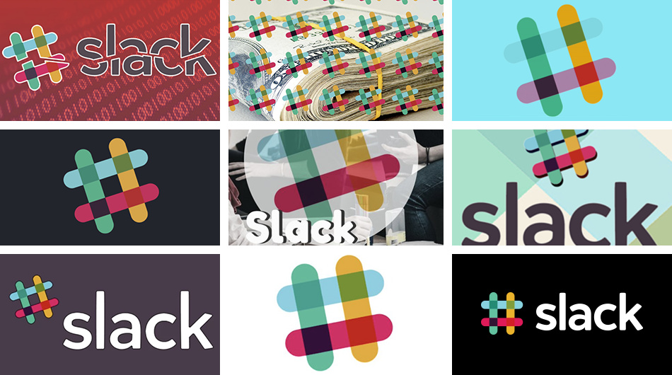
Slack, the popular collaboration tool unveiled a fresh new logo for the platform. The new logo builds on top of the old version, but feels fresh and more iconic.
Slack explains why they decided to change their old logo:
Firstly, it’s not change for the sake of change. That said, change is inevitable, and something to be embraced, etc. etc., but that’s not a good enough reason to change a logo. A good reason to change a logo is that it’s not doing the job you want it to do—and because a simpler, more distinctive evolution of it could do that job better.
Our first logo was created before the company launched. It was distinctive, and playful, and the octothorpe (or pound sign, or hash, or whatever name by which you know it) resembled the same character that you see in front of channels in our product.
It was also extremely easy to get wrong. It was 11 different colors—and if placed on any color other than white, or at the wrong angle (instead of the precisely prescribed 18º rotation), or with the colors tweaked wrong, it looked terrible. It pained us. Just look:
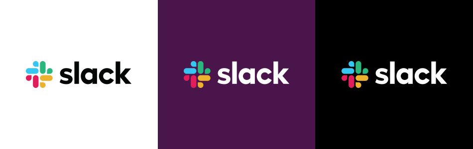
The Slack team describes the new logo as an improvement rather than an overhaul:
It uses a simpler color palette and, we believe, is more refined, but still contains the spirit of the original. It’s an evolution, and one that can scale easily, and work better, in many more places.
The old one would have been impractical with spot colors, whereas the new one only has five nicely balanced colors. The new one seems a bit more dynamic in that there’s implied rotational movement instead of a static looking hash tag. I also like the weight relationships better — it’s tighter, beefier and more substantial. Even the weight of the typeface (which I also like better) is nicely paired with the weight of the individual strokes in the logo. There also seems to have been a lack of consistency in their old logo — sometimes the colors, stroke weight or angle differed. Seemingly, they’ll be paying more attention to that now.
Lastly, it’s a huge improvement that’s mostly been accomplished by making refinements to the personality of what they already had. A better logo with very little brand recognition loss. Very nice!
Impractical with spot colours, well they seem too have managed for the what, 4-5 years they have had the logo? lol
Whats the point of a logo? to inspire? to explain? no, it’s to identify! IMO their has been a great loss of brand recognition. They should have just refreshed the hastag symbol IMO.
To be able to own hastag as part of your brand is huge, they just threw that away for this muddled collection of paracetamol tablets and rain drops. Also you actually use hastags in slack, I know because I use it to communicate with one of my clients and his team on project.
They mentioned the number of colors as a primary reason for the change — not just spot colors, but the difficulties in general with having a logo composed of lots of different colors.
A logo that explains much might be difficult. One that infers something or poses a question can be more interesting. A logo should certainly inspire in addition to identifying, however. I disagree that significant brand recognition was lost. The new logo is stylistically similar (including the typography) and I’m not at all sure their visual branding was especially well-known anyway except by their already-established user base.
The trouble there is they didn’t own the hashtag. Twitter, Facebook and Instagram pretty much co-opted that symbol to the point where visual references to it became generically synonymous with them — not Slack.
They mentioned the number of colors as a primary reason for the change — not just spot colors, but the difficulties in general with having a logo composed of lots of different colors.
Oh right, so when you originally wrote that, you knew they had cited that as a main reason, but instead you put it across like it was just something you had figured out for yourself, nice.
In any case, my point holds true, they HAVE managed with the old logo for 5 years and HAVE been hugely successful in that time period, lets see how the next 5 years go with the new logo.
I don’t think it’s usually the graphic itsself that will inspire anything, except for us designers who look at it and want to understand the reasoning behind the design, for most it’s just something by which they can identify a product or service. Any feeling or inspiration a person gets from a logo, doesn’t come from the logo itself but rather the experience they have had with a particular branded product or service, or in the case of huge companies like Nike, the millions of dollars spent on marketing/advertising. What was the Nike logo before the millions of marketing/advertising dollars were spent promoting their products? Nothing.
I disagree, the most recognisable hashtag in the world was slacks logo.
Geech! What’s with the seemingly angry accusations?
I didn’t present it as something I alone figured out — the multiple-color problem was one of the main reasons for the change and clearly spelled out in the thread’s first post. I elaborated on those already-mentioned color issues by specifically pointing out the spot color problem.
I was just reading an article panning this logo that not only pointed out the dickishness of it but also that the negative space forms a swastika. It’s reversed from the Nazi swastika. Not many people would notice the difference though.
Could be it’s just me, but a swastika seems a stretch. I can’t even see the “dickishness” thing when I search for it. Again, just my personal reaction, but I think it’s one of the best logo makeovers I’ve seen in the past year.
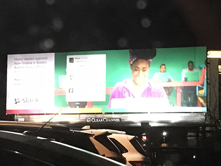
I made a special trip on my way home to photograph a billboard I saw for this company. It was really really bad, violated all the rules of billboard ads.
Alas, someone else musta figured out it wasn’t an effective design and it had been changed sometime in the last 48 hours. It was only up for about a week.
Here’s a blown out image taken at night a few days ago.
Those little screenshots had words all over them regarding the “approval” process.
Too many words. No call to action. The eye has to track backwards to see the (old) logo etc.
They’re out some money there.
I’ve never worked for a billboard company, but I’ve designed a couple dozen of them over the years. The common sense rules aren’t hard to comprehend. There can be no complex messages or small type that can’t be quickly read and fully understood during the time it takes someone to drive by, which at highways speeds is what, two or three seconds. They’re best at just reminding people of things they’re already familiar with.
So with that being largely the case (there are exceptions), why do, probably, two thirds of the billboards I pass contain more information than anyone can possibly read, understand or remember? They end up being wastes of money for the company renting the space?
I guess I’ve always chalked it up to the billboard companies not wanting to chase away paying customers by telling them their messages are inappropriate for a billboard and won’t be effective. Do you have any insight into this failure of common sense, PD? You work more directly with this sort of thing than I do.
Typically my answer has to be “mine is not to question Why,” Certainly not to comment on design aesthetics. If there is something there that I know will not print correctly or is into the bleed or safeties or will look weird on camera - the basic mechanics - that I can comment on, but I learned long ago not to comment on a designer’s design decisions. They get all kinds of offended.
Kinda like the proverbial frog in the pot it’s actually been a very slow but steady erosion of design skills from the point two decades ago when a billboard design followed a given set of design parameters to where we are now, where if it looks pretty on a monitor (where it’s been stared at for many an hour in the design process,) it’s thought it will look good as outside advertising. I could lament the causes, but I won’t.
The billboard company will have a design department that will help you get your message out there. But if you don’t avail yourself of their services (for which there is a fee) they will just shrug and push the button. It’s not up to them to tell a designer they are ‘doing it wrong.’
Though I have walked a few new designers through the process. But they have to ask.