I’d be grateful to receive any recommendation for a traditional chinese font that would best match this victorian style typography.
Short of designing it from scratch, one can’t match apple with orange.
Nothing’s going to match. You can’t stylize Traditional Chinese that way.
Without overthinking it, I’d say Noto Serif will look reasonably compatible, and it’s a very accessible Google font.
I would suggest coming up with the translation first, and taking it from there. Then it’s just a matter of simulating the flourishes.
We are looking at two different linguistic systems. It’s like trying to match an aircraft carrier to a submarine.
This is a good place to start;
Thanks @Eriskay @StudioMonkey. Perhaps my use of the word ‘match’ wasn’t my intention, I’m thinking more of a somewhat similar font to serve as a springboard.
@HotButton I politely beg to differ as it’s entirely possible for chinese characters to carry certain aspects of modern latin alphabet fonts. Julius Hui for example has built a career on this and is known for designing NYTimes’ chinese font. Thanks for the Noto suggestion although I’m afraid it doesn’t fit my purposes as I’m seeking a display font for a book cover.
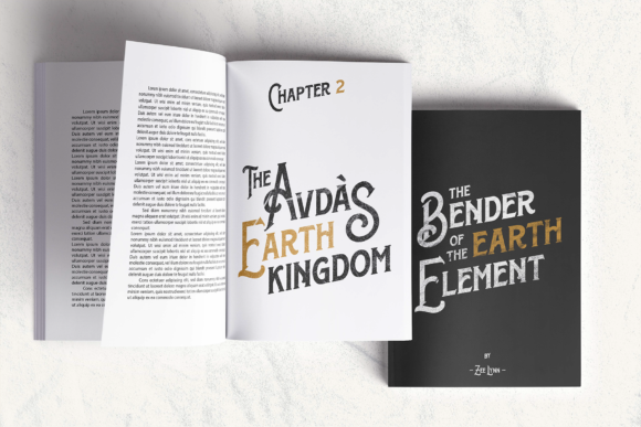
Some background – I designed a victorian style book cover which I’m now adapting for the chinese market (among 11 other languages – so I might reach out to this forum again for similar help with arabic and hebrew!)
In any case I’ve reached out to a chinese type forum who I hope might be able to help. Thanks for the speedy replies, much appreciated!
2 Likes
Just some thoughts that might or might (probably) not be relevant.
Yes, it’s possible to match typeface styles between radically different written languages — at least roughly match. Some typefaces, such as Myriad, come in Latin, Arabic, Hebrew, Bengali, and other versions. According to Adobe, the rough equivalent of Myriad in China might be Adobe Heiti.
However, even though matching the look might be somewhat doable, the cultural connotations of that look might differ.
For example, you mentioned a style of typography that looks Victorian. Since there was no Victorian era in China, stylistically similar Chinese pictograms won’t carry the same Western Victorian connotations. They might appear stylistically similar, but the associations they conjure up will likely be very different.
I suppose much depends on what you’re trying to accomplish. If you’re attempting to give, for example, a British 1870s personality to the type, a Victorian style of typography might be appropriate. However, a character indicative of the 1870s in China will not look anything like Victorian typography.
Anyway, you mentioned a Chinese type forum. You might also try asking your question on TypeDrawers.com, a popular forum for professional type designers that I belong to.
1 Like
Much as I admire your intention, here is a cultural and historical matter you might want to consider:
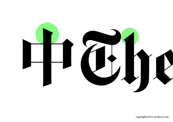
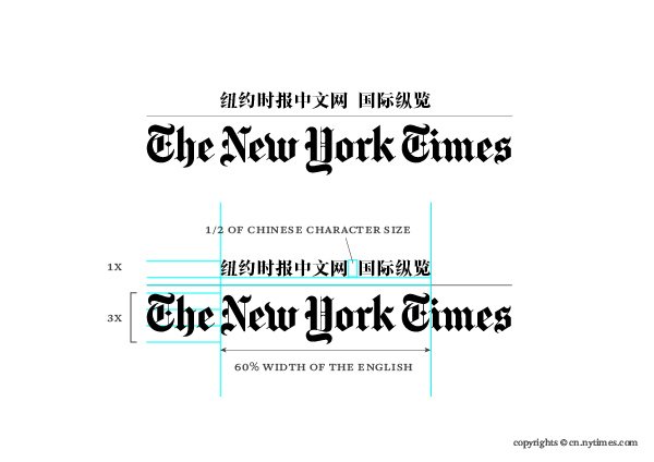
In the NYTimes example, I can tell (with my limited understanding of Chinese typography) a simplified Chinese font was used. As I recall, the simplified version has been in popular use only for the last hundred years or so (maybe less), whereas Blackletter was used since the 12th Century. While matching stylistically, culturally the difference is glaring.
@Just-B’s analysis was spot on. I’d use a Chinese version of Helvetica or Arial, and manipulate it to mimic the original style. Oh, I hardly think there is an italic version in Chinese typography.
1 Like
Sorry to dredge up this old thread (it’s right up my alley!). I lived in Taiwan for many years and for a time was designing Traditional Chinese title logos for Netflix all movies and TV series (mammoth task!). You can’t match apples with oranges, but you can definitely mimic certain characteristics to show a connection. In the case of OPs book, that’d be a fun one to design! How’d you get on, @candice?
1 Like
Candice hasn’t been back on the forum since this was posted last year. You probably won’t be getting a reply ![]()
Best to have the words ready. Because traditional Chines compared to simplified Chinese has a lot more lines too it. Can take a font like Noto Sans and alter it as the line widths are similar.