No idea, know nothing about the brand or the ethos or anything else.
They all look the same to me.
4 Likes
That one?
Or that one
Why is it in English?
From a technical standpoint, all those designs are very amateurish, so none of them will work. You should hire a professional graphic designer.
4 Likes
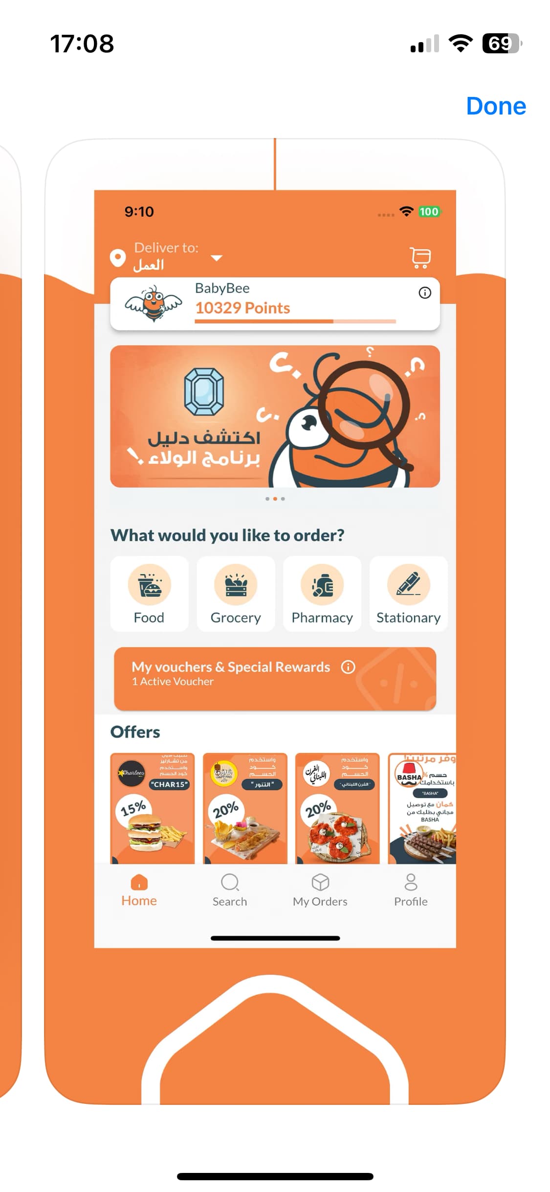
BeeOrder is the first food-ordering app in Syria, we’re changing the daily lives of Syrians by delivering a joyful ordering experience. Pioneering the industry 9 years ago, we’ve expanded beyond food to offer grocery shopping, aspiring to be the ultimate one-stop-shop for all daily needs.
With 95K users, +615 active restaurants and grocery partners, and +1,200 drivers, BeeOrder is committed to delivering convenience, efficiency, and reliability. What sets us apart is our innovative use of technology, tackling daily challenges, collecting data, and seamlessly integrating the latest tech for a superior experience.
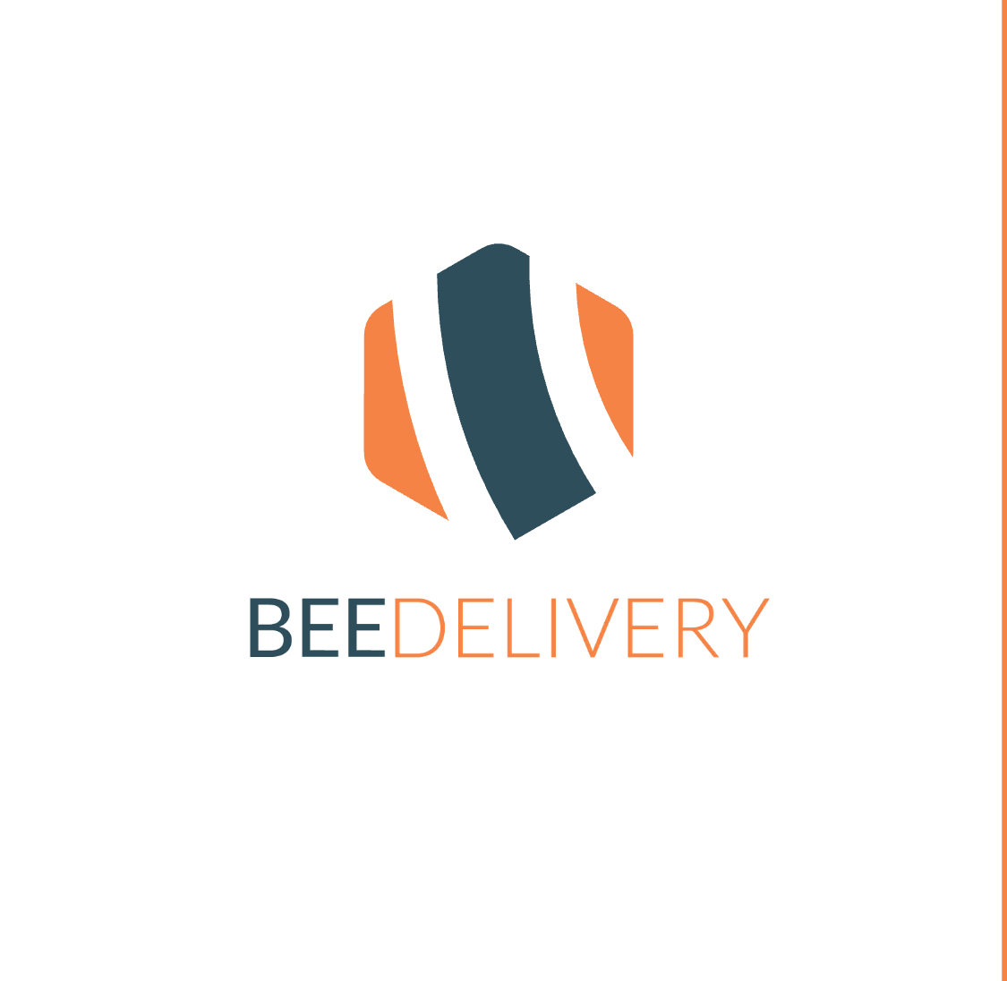
Thanks for the background it really helps. But here’s the issue the logos don’t connect to the story you just described.
It looks a bit like clipart.
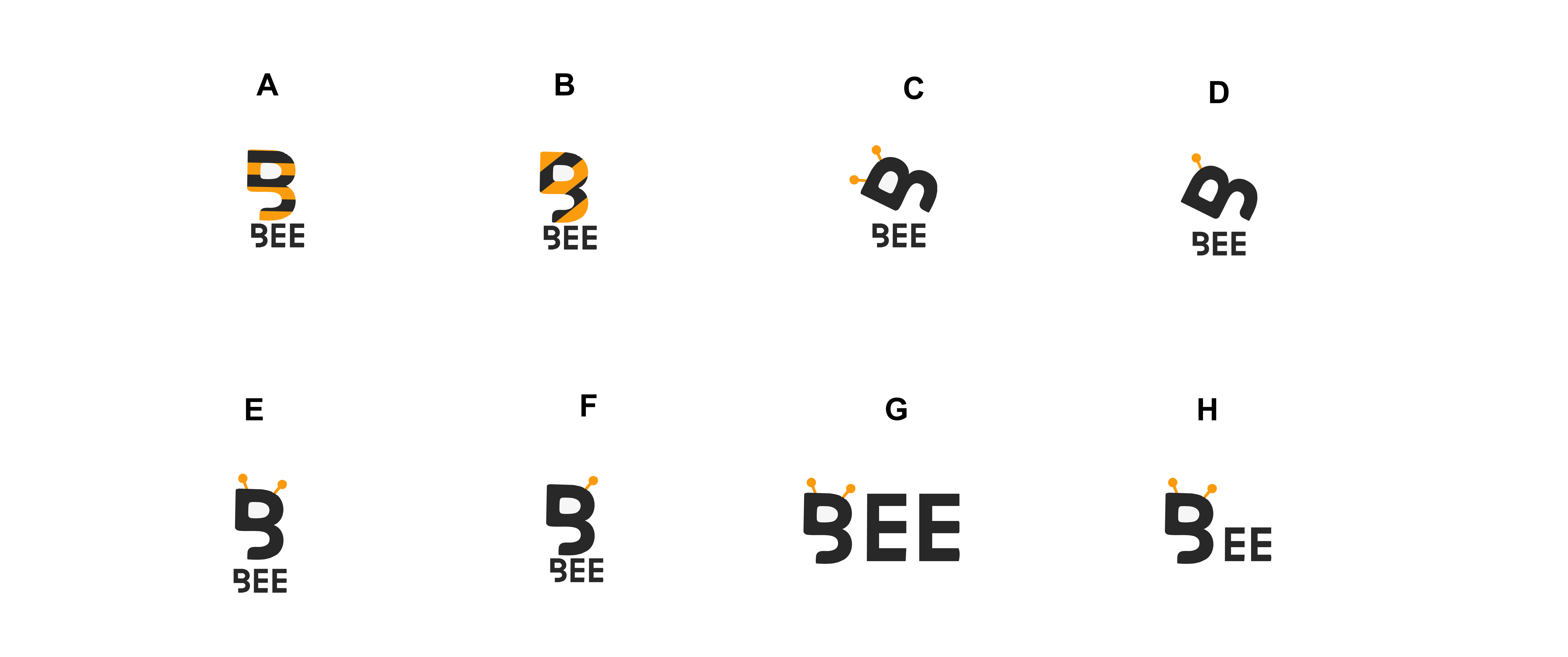
There’s a few variations of the same logo - which doesn’t give us a lot to pick from.
What other options have you got?
Why do you want to change it?
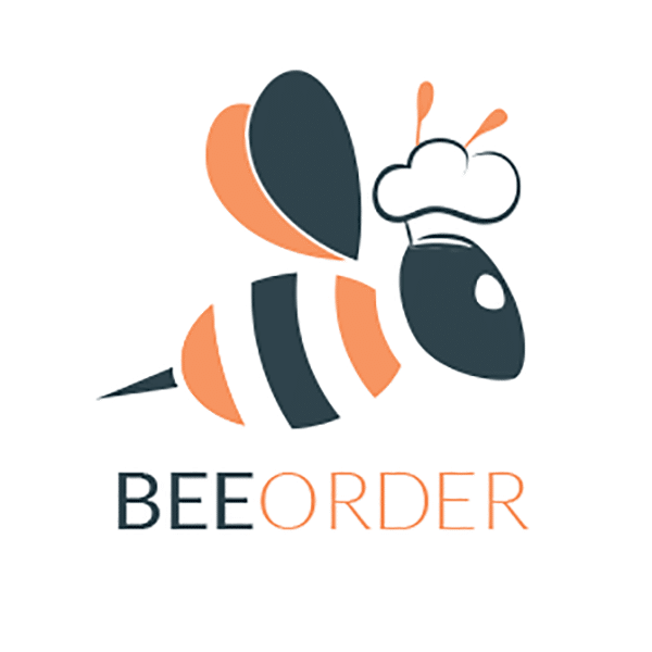
Which logo is the latest? The one on the app splash screen or the one on the website?
grok.com says E, chatgpt.com says G, no questions about ethos or anything else asked. Pro designers are safe for now ![]()
3 Likes
From the options you shared, I think logo F strikes a good balance between the bee motif and readability. The solid lines and simple shapes make it easier to recognize at small sizes, and the negative space cleverly forms the bee’s wings. It still might benefit from professional refinement to ensure legibility and brand fit, but it’s a strong starting point. Good luck with your rebranding!
Please do not ‘redo’ or ‘refine’ a poster’s work.
It is against forum rules.
Ah okay.