Hi,
I am not a designer or artist of any kind. I am just searching for some input on the topic of religious literature, especially Christian.
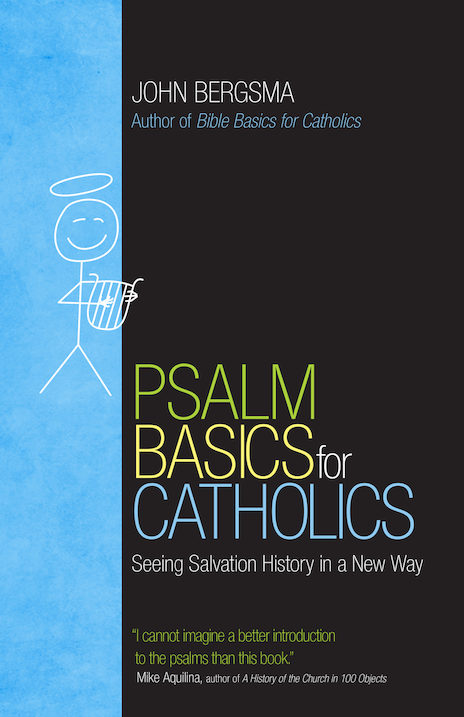
My whole life, I have been turned off by the soft pastels and overdone calligraphy scripts used in religious materials. My mom frequently gets these kinds of books for me, and the last one has me feeling so bad. I know this book is supposed to feel beautiful and uplifting with the sunsets and pastel flowers, but I can’t even stand to look at it. I also imagine this particular book cost more having these god-awful (pun intended) accoutrements attached.
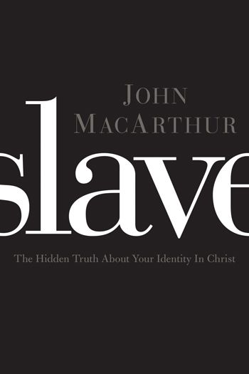
Why can’t religious books have nice crisp covers with regular, bold font? It is almost like the pastel is wishy-washy and ethereal, making me question my faith even more.
It may be weird, but I do think you can often judge books by the cover.
I am coming from a catholic background and much prefer the art and colors associated with orthodoxy. I just can’t figure out why!
It bothers me so much, that I would like some designers input on the logic behind using that type (not sure if there is a word for it) of design.
Thanks for any insights!


