Hello Again!
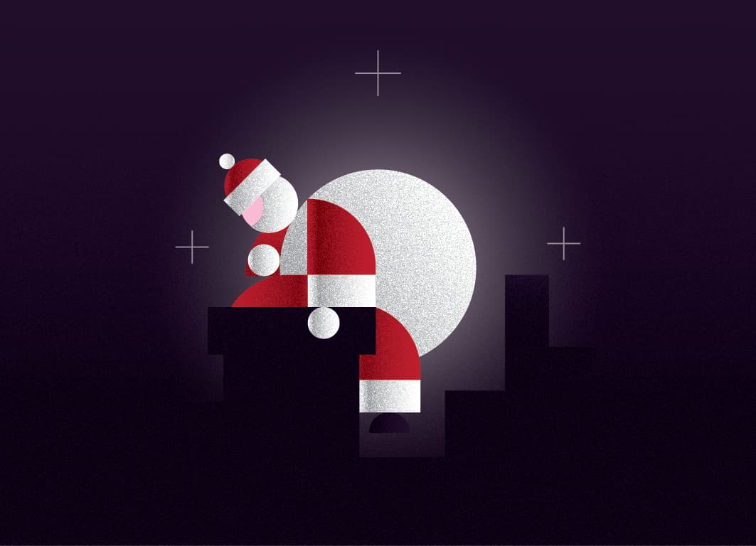
I was assigned to design a card for Christmas as a project of my designed School.
Hope you like it, and as always your recommendations and thoughts are more than welcome!
1 Like
Overall, I like this, good job. The one thing that throws me off is that there is some ambiguity with the moon. At first glance, I thought it was Santa’s bag of toys and was slung over his right shoulder. Then I saw the glow and realized it was the moon. Also, maybe look at adding four additional points to each star. On one hand, I dig the minimalism. On the other hand, they sort of look like registration marks.
Thank you for your reply!
The ambiguity was my purpose. To mix the bag with the moon. No specific reason, no secret message behind it.
The inspiration came from the “Cold moon” which is the only full moon in December, and I combined it with the Santa because of the Christmas time.
So it was intentional. It’s just a design for a christmas card, a bit weird, a bit abstract, a bit of me I dare to say (I’m in love with the moonlight ever since I can remember myself). It’s a “fun” project and the best of the designs would be printed.
I enjoyed very much trying to compose the figure and the movement only with geometric shapes.
As for the stars, I should agree that they look like registrations marks, maybe I should add some more in more rantom positions
1 Like
I don’t think it needs more stars, but to (I believe) clarify Steve’s comment, you may want to add a smaller “x” on the current “+” stars. All in all it is nicely done.
I like the ambiguous bag-moon. It’s clever and makes it memorable. However, it does straddle that middle area of making one wonder whether it was on purpose or an accident.
I also like the geometry of all the interacting shapes. Very nice! The texture is also really cool and looks a bit like a cut-paper sculpture.
The plus or registration marks aren’t working for me. They don’t look like either stars or snowflakes. Sorry. Stars like these seem to be trending lately, and they’re made of intersecting circles, which helps preserve the geometric look.

I also think the card could be cropped tighter to reduce the big sea of dark purple-black negative space.
As for printing, I’d worry about dot gain obliterating the hint of black building silhouettes. If it were me, I’d likely extend the moon’s glow just a bit or slightly lighten up the glow. Subtleties in the dark 95%-plus value range sometimes blur together — especially using uncoated paper. Then again, if it’s a school project, it’s probably not a worry.
I’m not too sure about Santa’s bright pink face either. I’d probably lessen the saturation a bit and apply the same texture to it as the other shapes.
Despite my criticisms, I really do like this. Good job.
2 Likes
I think it works really well. I got the bag/moon thing. Nice touch. I also like the repeat geometric shapes for shoulder and bottom of robe.
I’d probably get rid of the stars completely and as just-B says, crop closer. I’d do the opposite to increasing the moon glow and just drop the chimneys. The chimney he is on is obvious by the negative space. This is enough. The whole thing is stripped-down and minimal. Strip it that tiny bit more by removing the extra chimneys and cropping in. I think it will all be a bit stronger for it.
Well done.
Wow! Thank you all for your kind words!
I will design some new versions and I ll post them!
Maybe I should make the position of the stars more random?
Also I can’t crop the card because the dimensions are given from the graphic design school.
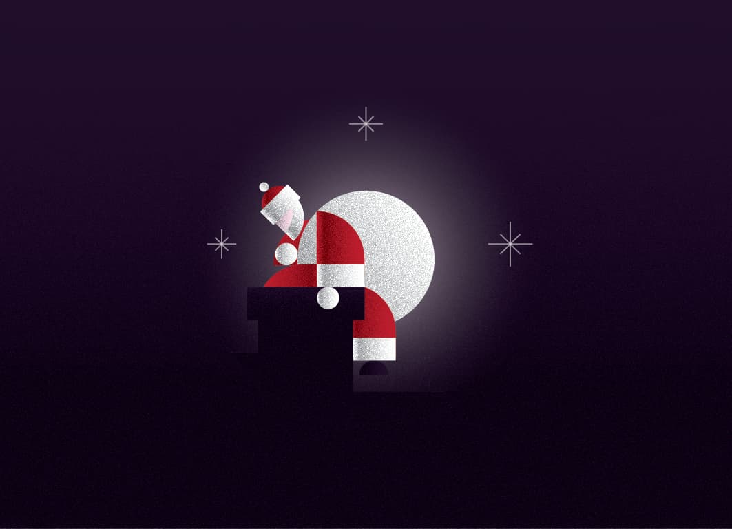
I posted another version with different head, which I rejected it in advance because it looks a bit too aggresive/helmet/warrior or something like that.


Better, but still feels like it needs a closer crop.
1 Like
By closer crop you mean to make it bigger?
Yes and no. They mean smaller (less) background, larger subject.
1 Like
I miss the other building silhouette which helped to balance out the subject. I also like the now 8 pointed stars.
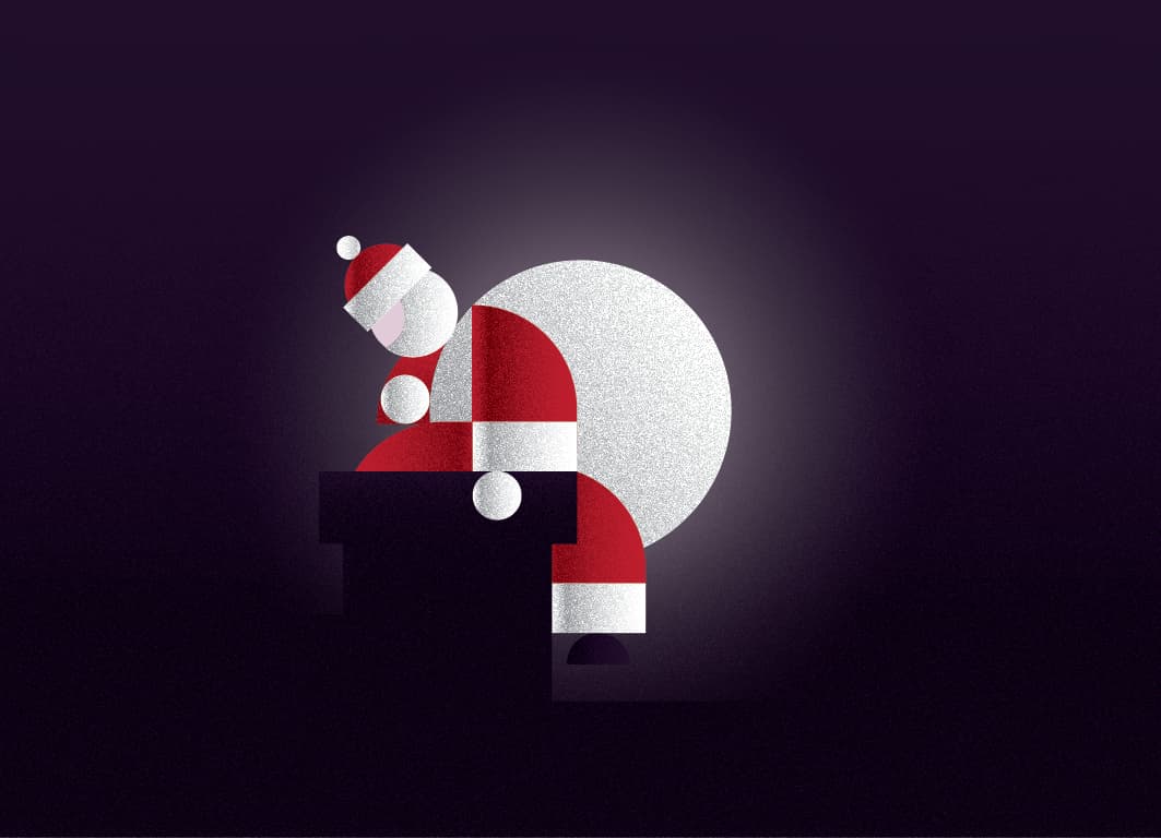
Here is with less background, but also with more background.
What’s your opinion about the new head?
1 Like
I’d crop a fair bit tighter than that.
Centering the moon instead of centering Santa and the moon together as a single unit seems odd to me. Doing so shifts the visual balance to the left and makes the composition look off-balanced.
I like the new stars better, but reversing hairlines out of CMYK printing is a recipe for a registration problem.
As @sprout said, I too would crop it tighter still (make Santa and the moon bigger).
What a nice design! Very creative! Good adjustment suggestions, too. The only thing I would suggest (which was somewhat suggested earlier) is, the bright pink color on Santa’s face looks out of place with the rest of the design. It draws too much attention to itself. A darker, slightly more light orange (i.e. flesh tone) color would be better. I also like it cropped tighter with less background (but that’s just my preference with the cropping issue. Great Work!
1 Like
Since no one else seems to have answered this particular query, I will say I prefer the more “Santa-shaped” head; the spherical one has a colder, more robotic feel. But, just my personal feeling. I love the moon/bag ambiguity, BTW.