Cinema Fonts, Display Type & Movie Typography

Hi fellas, i was trying to make a nice and inspirational collection for a long time, but now we can do it collectively.

The opening credits are often the first clue you have to a film’s theme and tone, or some scene includes some great piece of graphic design. If you imagination is triggered by something visually appealing, feel free to share it!

Here are some of my additions to the topic.

Maybe this one will convince you NOT to use Trajan. LOL.

5 Likes

Anything by Saul Bass.

2 Likes

Well, there’s always James Cameron’s $237 million blockbuster and the magnificent use of Papyrus that came as a freebie with his copy of Windows.

image

Better still is one of my actual favorites: Fritz Lang’s 1927 sci-fi movie Metropolis.

And I’ve always loved the entire animated title credits of Casino Royale.

1 Like

The Matrix by the The Wachowskis

It was my gateway movie for ‘futuristic’ treatment such as ‘glitch effect’ and I loved the raining Kana … on & on … that dope has led up to this very day creating graphics for FUIs, HUDs, etc…

thematrixmovieposter s

There’s so many others too but I thought to start with this one.

1 Like

AlmostFamous-titles

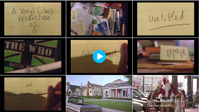
I like Almost Famous/Untitled. It’s based on the experiences of it’s writer director Cameron Crowe during his teenage years, when he wrote for Rolling Stone. The title sequence cuts between him writing out the credits in his own hand with shots of his personal memorabilia from that era. For the credits at the end of the movie, which are much more extensive, they created a font based on his handwriting. Very appropriate for such a personal movie.

1 Like

What type of collection are you putting together? It this going to be a “Top 10” type thing or a huge list broken up into categories?

There are tons of beauties out there. Fonts for Movie titles are usually based on the general theme of the movie such as a Western or RomCom.

If you just want a few of my favs. I like pretty much anything that’s readable lol :wink: I also tend to like all sans serif caps. Here are a few.

Futura

thumbnail
.
.
.
.

Akzidenz-Grotesk

argo_dd_keyart
.
.
.
.

Neue Helvetica

sq_curfew

.
.
.
.

Trade Gothic

top-free-iconic-fonts-2001-space-odissey
.
.
.
.

Otherwise I could go on and on … and on … and on … you get the picture :wink:

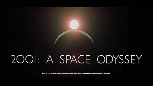
Yeah i see, you are prepared ‘wink’. Good pick. I almost forgot about space odyssey, what a shame…
About the list, i don’t know the general structure yet… have to gather more material. Obviously won’t be top ten, with so many goodness on archive. 10x

Wow! That’s so cool

Its really appealing to me, everyone upload their own choice so here is my choice.