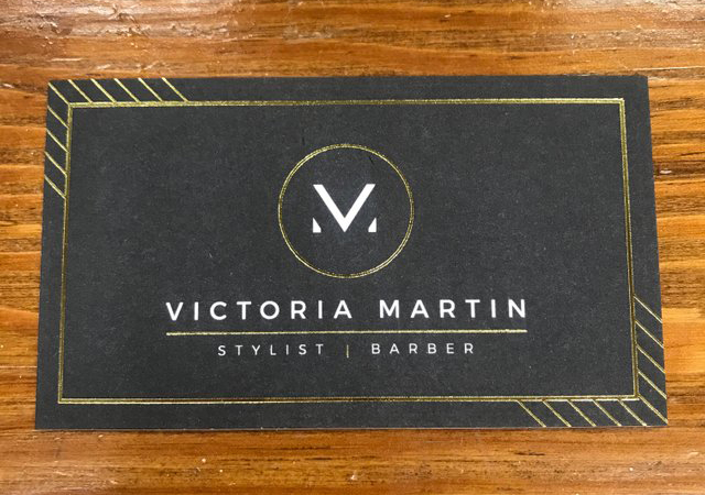
Every now and again comes an entity whose name is god’s gift to designers.
Light bulb: When naming your newborn, come up with a logo first!
The logo is good, but I’m not crazy about the overall card design.
I’d say the same. Even the circle around the logo bothers me. I might also like it better if the name font was extended a bit, more like the wider characters that make up the logo.
I like the logo a lot, as monogram logos go.
The chalkboard thing though is a trend that is ending. We have been busy replacing venue graphics that we did a few years ago in chalkboard style with other things that haven’t quite gelled into a single style yet.
Stylist/Barber seems redundant, but I suppose it really isn’t, in a mind bending sort of way.
Definitely got lucky with those initials lol
Agreed - clever combination of the ‘V’ and the ‘M’ but it would have been better in a square.
The overall style is Deco which is a good choice for a hairdresser.
I didn’t even notice that it was a card. I though it was a really awesome welcome mat at a barber salon. But as a card I feel that the gold lines in the corners do not fit. The middle is pretty clean though.
PS - maybe it’s the texture that throws me off, not the lines. Not sure.
Definitely think it would be better without the gold lines in the corners. I feel like they are pulling my eyes away from the logo and type in the center of the card.
We sure are a tough crowd to please lol … everything turns into a critique. ![]()
Overall I think it’s a pretty clever design. Whilst it may not be everyone’s cup of tea. It’s solid and I personally like it.
The title says “Clever logo design for Victoria Martin, Stylist”.
Seems like it’s the wrong tree up which we are barking.
Very nice logo, the use of the initials is done very nicely.
I Absolutely like the way you design this logo, overall good effort
