Much depends on the nature of the physical book.
If it’s a larger book where several thousand copies will be printed (a large run), it will likely print on a web press. Smaller runs will typically print on sheetfed presses.
If the book contains photos, illustrations, or colorful graphics, designers usually specify printing on coated stock. For other books, printing on uncoated stock is typical.
If the book is for print-on-demand publication with, for example, IngramSpark or Kindle, the printing will likely take place on a digital press on whatever paper is specified by the customer.
Even though you’re discussing a color standard — Pantone — ink will look different depending on the substrate material (typically paper) and, to an extent, the press on which it’s printed.
Printers’ ink is largely transparent or translucent when printed, which means the substrate will show through. Printing on off-white paper means the color of the paper will combine with the inks to produce a slightly darker version than if printed on white paper.
Printing on coated stock will produce more vivid colors since the ink will sit on the paper’s surface rather than being absorbed into the paper. Printing on uncoated stock will look duller because the ink soaks into the paper. This is why Pantone has separate books for coated and uncoated papers — the same ink will look different depending on which paper is used. As the ink soaks into the uncoated stock, it spreads out a bit (dot gain). This spread increases the size of any halftone dots, making the printing darker, which means the printer will need to adjust for the dot gain.
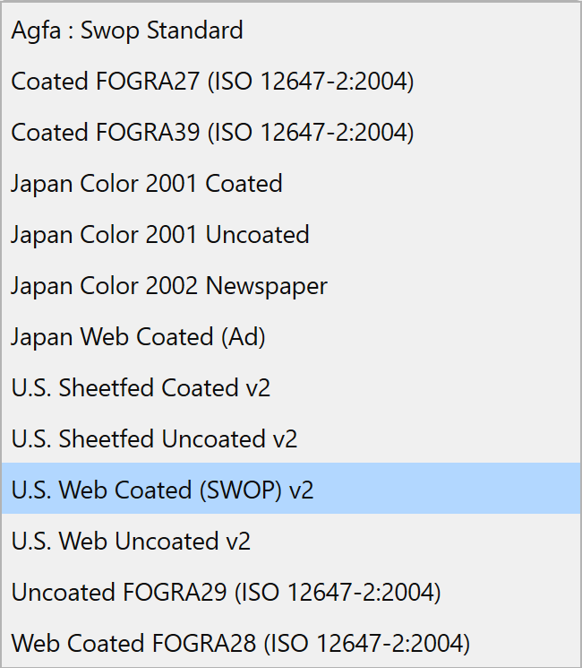
The color profiles simulate how the work will look when printed on various presses on various papers when printed by typical printers in various countries.
If I’m not mistaken, you’re mostly concerned with supplying clients with the right colors. However, all the things I mentioned above are largely beyond your control — they’re what subsequent designers and printers who use the logos will need to consider.
As @Smurf2 mentioned, with Pantone, printers will match to the Pantone standards, not to what you might or might see on your monitor.
When I’m in a similar situation to yours and don’t know how the end product will be printed, I’ll use what seems to be the most common profile. For me, this is typically U.S. Sheetfed Coated, but I don’t typically include the profile in the final file unless a printer requests it. In your case, your logos will be placed in other documents by other designers, so the final result will depend on how they handle all these things.
Adobe’s default profile seems to be U.S. Web Coated (SWOP), which I’ve never understood since web press printing isn’t the most common.