I’m new to the forums and the graphic design industry. I’m currently learning through an online course and am enjoying it so far
I just wanted to start a discussion on colour palettes. I’m designing logos for a gardening and landscaping company and am wandering what colours do you guys think will represent a friendly, inviting, community driven gardening business.
@Smurf2 is right, but since you’re a first timer here, @gdesignertiff, I give you some thoughts.
Obviously a gardening business would benefit from a colour pallet that includes some shade of green. It’s the colour most people associate with a healthy garden - “Green thumb” and all that.
Think of the “extra value / benefit” this company provides their customers. My guess would be beautiful flowers, but they might also specialize in Zen gardens or whatever.
Think of the application. I used to work in construction and that’s kinda similar, as it’s an occupation that often requires getting dirty and where workplace safety is a concern. So think of the uniforms that the staff would wear, if they have high-vis requirements, etc.
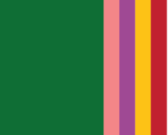
1 + 2 + 3 = I would go with a dark emerald green (where you don’t see the stains), paired with a high-vis pink (which is the most floral high-vis colour I can think of).
I was a landscraper for 1.5 seasons. The first 1.0 was for money, the second .5 was how long it took me to remember how much I hated it for the first 1.0.
Who generally works for landscaping companies? You want them to wear pink? You’ll have a hard enough time getting them to wear the US mandated Hi-viz orange or yellow. Pink is not an option in the OSHA safety color catagory…though I’ve seen hard hats that color.
As for stains, you aren’t hiding the sweat either.
And dark colors out in the sun just plain s. u. c. k.
I’ll retract my statement, switch pink to orange (due to OSHA requirements, not manliness), and add an earthy light color in the mix:
Khaki
Emerald Green
High-Vis Orange
Sounds better?
In any case, the point I was trying to make to @gdesignertiff was more to think about how colours carry certain associations that connect to the brand of the business, as well as about the actual application and practicality of the chosen colour pallet.
IMO, and it’s just my opinion, “manliness” is a consideration. While I’m totally cool with the concept that “real men can rock pink” (don’t throw bricks, that’s from some ad campaign I’ve seen over the past few years) the client isn’t probably going to be employing liberally-minded, college-educated millennials to cut grass and dig in the dirt.
If this is a garden center, that’s different, knock yourself out, but if it is a down in the dirt landscaping company, give it some thought at least. Where I work now even, given the choice between hi-viz yellow or orange, the yellow wins. The yellow also seems to be the top choice on most jobsites I get sent. I wonder if anyone has done a survey on that. LOL!
Also bear in mind those colors are spot florescent, not achievable in CMYK.
I’m not quite sure how the discussion veered off into workers’ clothing when you’re really asking about a color palette for branding purposes. Employee clothing would vary across seasons and might be high-viz chartreuse or olive-drab green or tan-colored t-shirts with a company patch or a bit of screen printing. It’s something to consider as part of the bigger package, but likely not something to drive the the general color scheme.
As for logos, truck graphics, business cards, promotional brochures and that sort of thing, I’d go back to what @OVOAO originally mentioned about pulling the colors from the subject matter — gardening and gardens.
Vegetation is dominated, of course, by green and landscaping is typically punctuated by the colors of flowers that come in most every color from pastel pinks to bright yellows to dark reds and oranges. One possible direction out of many would be to, in some way, duplicate this palette by using green as the dominant color and using flower colors as secondary accents. Keep in mind there needs to be versions of the logo that don’t have all these colors.
I think it sorta veered off in order for the OP to come up with some ideas themselves rather than have them handed over. It’s a fairly basic color palette, if you let it be. Of course the company name, landscape design focus, or local flora colors might also influence the color decision. For instance a company that specializes in water gardens may have a dominant blue rather than green, or one that specializes in xeriscaping may not use green at all, or sage green at best.
I was just throwing it in because I believe branding should not just look consistent on the website, business cards and brochures, but in the real world applications as well. After all, apart from the nice and clean sales people and/or landscape architects, the men and women who do hard yakka on site are really the face of the company. And just handing out the standard hi-vis bibs to them with the screen printed logo seems like such a wasted opportunity to me. With a tiny bit of effort you can both pull off a cool distinctive look on site, as well as include some little splashes of hi-vis as accent colours on the corporate branding, and tie the whole brand identity together.
I don’t disagree with you. For that matter, I was agreeing with your first post where you mentioned clothing. What I was commenting on were the follow-ups that seemed to veer off into the appropriateness of certain clothing colors rather than staying on track with what the original poster was asking about.
As for clothing, in my opinion, that depends on how far the uniform thing goes and how much it would cost to outfit their workers with custom-made jackets, pants, shirts, winter clothing, etc. Some big companies might want to do it if they already give their employees a clothing allowance and have enough employees to justify the expense. I suspect most are just paying their laborers close to minimum wage and would balk at the idea. Limiting it to company t-shirts and ball caps might accomplish the branding objective and be more realistic for most.
Yeah, I know, uniforms can be costly. In fact, I was also involved in the designing and sourcing of uniforms for my old company. But it doesn’t actually have to be anything over the top and big budget. If the colour palate does not treat the whole site work as an afterthought but includes it in the concept, you can also pull off a nice coherent look with standard vests + t-shirt and ball caps.