What kind of designing do you do?
Just web?
And if just web, why wouldn’t you use the default monitor setting. Every monitor is different.
I keep mine on whatever looks good to my eye, usually the default setting for the monitor itself (though I will admit to having one on Colormatch RGB…LOL!)
If you are doing print, what you see on your monitor is not a true representation of what you will see on a printed piece. Learn to spot the differences and ALWAYS get a proof.
True you can spend money and try to emulate CMYK with a good calibration software and input device, but depending on how you are doing your output, the print will vary. I do a lot of digital wide format, and I can safely say the gamut of wide format inks outperforms any CMYK press when it comes to matching a wider number of Pantone Coated colors (in the US.)
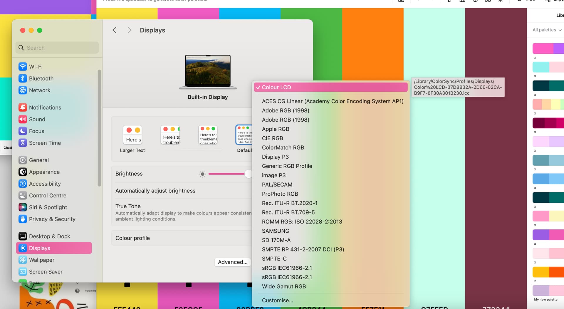
In my opinion, you should use the profile that best matches the capabilities of your display and let your design software take care of displaying the colours according to the intended output, such as web or specific print or video output. Be aware of the colour management chain with its links such as working profiles, input profiles, output profiles, soft proofing, etc.
I use the profile generated by the hardware calibration software for my external display using a calibration device.
When I am away from my desk, I use the Apple XDR (P3-1600 nits) display that fits my MacBook Pro 16", 2021 or sometimes the Design & Print (P3-D50), but with only 100cd brightness.