Combination Mark vs Emblem Logo

An SKU? A Stock-Keeping Unit. Isn’t that a bar code thing of some kind? If you’re asking about naming conventions, I keep it simple and pared down.

Acme_logo_RGB.ai
Acme_logo_CMYK.ai
Acme_logo_Pantone.ai
Acme_logo_RGB_reversed.ai
Acme_logo_CMYK_reversed.ai
Acme_logo_Pantone_reversed.ai
Acme_logo_large.png
Acme_logo_med.png
Acme_logo_small.png
Acme_logo.PDF

Depending on the job, sometimes there are more, but sometimes less.

Here’s my reasoning.

  • For professionals, the .ai files will be enough to create anything else from SVGs to TIFFs.
  • Non-professionals won’t know what they’re doing, so they’ll usually resort to the PNG, which is why I create three different sizes — always 24-bit transparent files.
  • The PDF is an all-purpose file that anyone can open and look at. Plus, it contains the vector information a designer needs if the client has lost the .ai files. I always save them as Illustrator compatible.
  • I don’t supply JPEGs. A logo should never be in a JPEG format unless there’s a specific reason. And then, it needs to be made to size. Besides, supplied JPEGs tend to be the ones that get passed around and used, which is never good. If a JPEG is really needed, it requires someone with enough knowledge to make one, which they can do from one of the other files.
  • I don’t supply EPS or TIFF either. They’re just not needed.
  • I don’t usually supply SVGs. Anyone needing one will know how to make it from the .ai files. If they don’t, they have no business working with the SVG to begin with.
1 Like

thanks for the reply…
Another term I’ve seen used is “logo badge”
I will try to upload an image…

burger king

Is this a combination mark, or a logo badge…
the text is contained in a burger like a badge…
but if you removed the “burger king” and made it
black…I’m not sure you would know what it is…

this is what it would look like,

burgerkingedit

it looks like Saturn or something…

I still do not get the point.

I feel as though I already answered this last May, but here’s another go at a response.

There is no official dictionary for these terms. No governing body deliberates made-up categories or what to call this logo or that logo.

Terms like these are invented by random people trying to describe things. The Burger King logo looks like a badge to some people, so, I suppose, they might call it a logo badge. I just call it Burger King’s old logo.

2 Likes

The structure of my logo file packages is pretty simple:

=> Screen:

===> Full Lockup
===> Iconic Mark
===> Wordmark

=> Print:

===> Coated Pantone Colors

======> Full Lockup
======> Iconic Mark
======> Wordmark

===> Uncoated Pantone Colors

======> Full Lockup
======> Iconic Mark
======> Wordmark

I name my files as follows:

full-lockup-vertical-color-coated (or uncoated)
full-lockup-vertical-inverted-color-coated (or uncoated)
full-lockup-vertical-black-coated (or uncoated)
full-lockup-verical-white-coated (or uncoated)

full-lockup-horizontal-color-coated (or uncoated)
full-lockup-horizontal-inverted-color-coated (or uncoated)
full-lockup-horizontal-black-coated (or uncoated)
full-lockup-horizontal-white-coated (or uncoated)

iconic-mark-color-coated (or uncoated)
iconic-mark-black-coated (or uncoated)
iconic-mark-white-coted (or uncoated)

wordmark-color-coated (or uncoated)
wordmark-black-coated (or uncoated)
wordmark-white-coated (or uncoated)

Each file is delivered in the .PNG, .SVG, .PDF, and .EPS formats, at 300 DPI and with at least one dimension being 8000 px.

.SVG and .PDF files can be opened and edited using almost any vector graphics editor, be it Illustrator, Inkscape or Affinity Designer.

1 Like

300 DPI means nothing at 1px x1px

It means nothing, but I can’t count the number of clients I’ve had who’ve asked for it. I no longer even try to explain it to them. Instead, I’ll save the, for example, 3000 x3000-pixel files at 300ppi, and everybody’s happy.

It’s a little like people asking for 72ppi web graphics. Somehow, people have it locked into their heads that any image having anything to do with print must be saved at 300ppi and for websites at 72ppi.

1 Like

I think Just-B answered this eloquently before, but to paraphrase his point: there a logos which will meet the criteria to fall into both the catagories of being an emblem and a combination mark.

In such a case there is no solid criteria to differentiate them.

Totally appreciate how this can be frustrating as someone who also likes things to be catagorize things too, but in such a case there is no right or wrong answer to call it either.

It’s… A Logo

1 Like

in some situations…If I was to upload a sponsor logo to a website,
and I named it logo.png because who cares it’s a logo,
but the site already has a logo.png previously uploaded
it could potentially replace the previous file,
so now the sponsor is showing up as the page owner.
not a problem at all…

Yeh if you make your naming system shit there’s a chance

Don’t be so obtuse.
Develop a naming system something along the lines of what Just B described:

Acme_logo_RGB.ai
Acme_logo_CMYK.ai
Acme_logo_Pantone.ai
Acme_logo_RGB_reversed.ai
Acme_logo_CMYK_reversed.ai
Acme_logo_Pantone_reversed.ai
Acme_logo_large.png
Acme_logo_med.png
Acme_logo_small.png
Acme_logo.PDF

As for whether something is a badge, wordmark, lightbulb or toilet seat, choose a naming convention and keep it consistent. Consistency is key.

The term “lockup” is being used with increasing frequency. In my world of print, that’s like calling something “final.” It never is, but if you send me something called lockup, I will use it and set aside anything else that is sent. Before or After. Where things are vague, a PDF proof will arrive in your inbox for verification. I particularly love the instruction “use the lockup but remove the tagline.” Uh huh…

1 Like

Never heard the terms “lockup” or “coated” until now,
I will look into it thanks.

“Reversed” is also a new term.
Is it just the same logo on a solid background?

My problem with solid backgrounds…
is people assume the background is “part of the logo”.
so they cut it out with the shape, and then place it in another
shape and it turns in to a something like this…

example of recursive reversed bw

it’s more likely to occur with none profit organizations,
with a lot of staff turn over… in which the logo files
get passed on and rebuilt, over and over and nobody
knows if it’s a decorative frame or accumulated junk.

Coated surfaces don’t absorb ink, which results in brigther, more saturated and vivid colors.

Uncoated surfaces, on the other hand, absorb ink, which results in less saturated colors.

1 Like

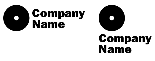
Here’s an example of two lockups of the same logo. Often, companies require a horizontal and vertical or squarish lockup. Sometimes the available space where a logo will be placed dictates which lockup to use. The term is pretty new, but it’s become quite common.

image

As Jakub mentioned, coated and uncoated refers to the surface on which something prints. As the term implies, coated paper stock has a coating applied to the surface to seal it, make it smooth, and reduce its absorbency. Most magazines, for example, use coated paper. Uncoated paper lacks this coating and is more absorbent. The same ink printed on one will often look quite different when printed on the other.

Yes, more or less. Often, colors must be adjusted in a logo to make legible and look good when printed on dark backgrounds.

image

This is one reason why I never supply clients with JPEG logos. Inevitably, it will be passed around and become their go-to logo. The result is usually a messy, blurry thing, as you said, cut out and pasted into a white square on a dark background.

When clients request a bitmapped (raster) version of the logo (they usually do), I’ll give them a PNG with a transparent background.

It’s not just non-profits that mess with their logos and use them incompetently. Almost any organization is prone to doing that when they don’t have in-house expertise in charge of the visual branding.

1 Like

thanks, this is great information,
my situation currently is that I’m working backwards.
I’m not designing from scratch but adapting what the client sends me,
in which I have little control over.

I’m struggling currently with this problem.
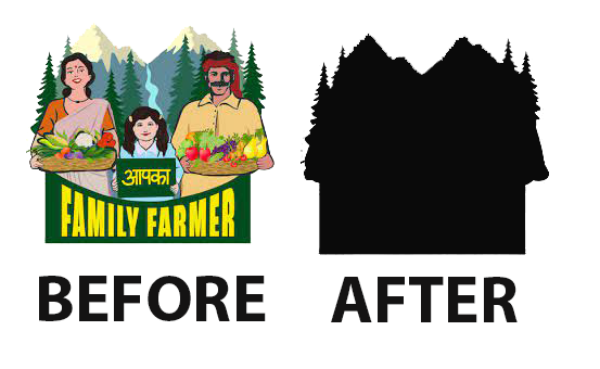
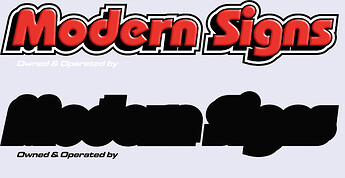
before after

the sponsor logos are uploaded first as a color PNG
and then a group filter is applied over all of them afterwards…
I then need to backtrack and identify all the logos with detail loss,
restore the layers, modify them to be filter proof then re-upload them…
but there is just so much variety in complexity,
in the batches I receive…and the time spent ranges from 5min-16hours.
so I can’t give a predictable time estimate…

even the sign companies are giving me a headache,

I am absolutely sure I have no idea what you are doing with these logos and why you are doing it this way.

What do your upload specs say? And what are you or the salespeople doing when something doesn’t come in to spec?

Filter proof? What is a group filter and why?

Any logo that takes more than 20 minutes to convert automatically gets bounced with a note explaining the upcharge you will be sending them if they can’t provide proper artwork. Oh, they are sponsors? No excuse. Your time has to be billable to someone.

2 Likes

Print Driver:
to be honest, I’m often dealing with none profits,
and I’m starting to think they want that amateur look.
to justify needing donations, and volunteers.
even though they are swimming in cash.

It’s just that I want to transition into for profit,
which is the opposite…a struggling business wants to
to project success, to gain public confidence.
a for profit will run scared if they see a design I made
with horrible logo cut outs, and I might not get a chance to
explain it… I’m hoping it’s a temporary problem.

another issue is we have some massive business names in Canada,
because of the two languages…everything is doubled, and french text tends to be longer, more words and more characters.

example of long business name (2)

so often a logo starts out with
a fun english acronym, entity name, local chapter, parent organization, tag line.
if it’s 20 words in English then it’s 30 words in french. a bilingual logo can push 50 words, plus an image. It’s to much content. It looks fine large…but when shrunken down it turns into a blob. so either I trim it down by removing unnecessary elements,
or leave it as an unreadable blob.

example2

further there are hundreds of possible configurations when your pairing an icon, and two business names…

example of long business name

It;s possible for one entity to have all of these,
one just one…

I feel like we are getting a bit off topic though…
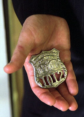
I’m not talking about icon that looks like a badge,
but a badge as a category.

My research indicates that a “badge”
is not just describing what it looks like,
but has some function to it…
It’s intended to fit lots of content into a square,
without worrying about background contrast
at least on the colored version.

I just think it’s just poorly named…
because there is an association with
the physical fashion accessory.
Badge_1012

sonething that looks like a badge,
might not serve the same function.
if it’s monocolored, or with transparency inside.,
while something that does not look like a badge,
like a wide solid rectangle does.

Basically what I am describing is something
that is transparent on the perimeter, but solid inside.
like a label, or sticker,

another reason I ask is because of these awful,
badges with the rounded text.

890b7f73ee01e7c1b8c0a30d7b9b7bbc

so many people send me these, and say can you just grab
the text and make a word mark…but they are not giving me the font or layers,
so that requires isolating and warping it back to flat.

but there is no distinction between a side by side combination,
and multilayered combination.

I’m gonna post this now before I lose it.
It;s a bit of rant sorry, lol