Hey Everyone,
I’m a little confused about the difference between combination marks, and emblems,
They are both images combined with Text…Emblems are typically more detailed, and historic looking…but I have seen them get simplified and minimalized to the point there is substantial overlap…
Other than the style…is there any solid criteria one would use to distinguish them?
Would it be safe to say that if you apply a solid colored filter to it, and you can no longer make out the details, it’s an emblem…but if if you can it’s a combination mark?
There’s a need to be so particular? A logo is a logo. Whether it’s a shield, badge, wordmark or any combination thereof.
The definition of “emblem” that I get from Merriam Webster is pretty much the definition of a logo:
an object or the figure of an object symbolizing and suggesting another object or an idea
No. There’s no need to try to categorize things when the continuum between them is a blur. For example, there are black dogs and brown dogs, but as the fur on a brown dog gets darker, at some point, it becomes a black dog. It’s not important to pin down the exact place in the continuum that this change occurs. It’s totally arbitrary and doesn’t matter. Many words that describe things are just rough references — they’re not rigid categories with defined and agreed-upon boundaries.
I’m trying to develop some type of logo SKU,
because my clients can’t open adobe files,
and want everything saved as individual PNG’s,
but I struggle to name them and provide an inventory list.
with all these variations these days.
Depending on the job, sometimes there are more, but sometimes less.
Here’s my reasoning.
For professionals, the .ai files will be enough to create anything else from SVGs to TIFFs.
Non-professionals won’t know what they’re doing, so they’ll usually resort to the PNG, which is why I create three different sizes — always 24-bit transparent files.
The PDF is an all-purpose file that anyone can open and look at. Plus, it contains the vector information a designer needs if the client has lost the .ai files. I always save them as Illustrator compatible.
I don’t supply JPEGs. A logo should never be in a JPEG format unless there’s a specific reason. And then, it needs to be made to size. Besides, supplied JPEGs tend to be the ones that get passed around and used, which is never good. If a JPEG is really needed, it requires someone with enough knowledge to make one, which they can do from one of the other files.
I don’t supply EPS or TIFF either. They’re just not needed.
I don’t usually supply SVGs. Anyone needing one will know how to make it from the .ai files. If they don’t, they have no business working with the SVG to begin with.
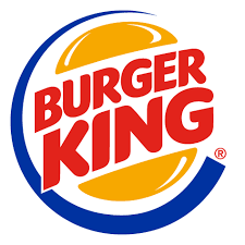
Is this a combination mark, or a logo badge…
the text is contained in a burger like a badge…
but if you removed the “burger king” and made it
black…I’m not sure you would know what it is…
I feel as though I already answered this last May, but here’s another go at a response.
There is no official dictionary for these terms. No governing body deliberates made-up categories or what to call this logo or that logo.
Terms like these are invented by random people trying to describe things. The Burger King logo looks like a badge to some people, so, I suppose, they might call it a logo badge. I just call it Burger King’s old logo.
It means nothing, but I can’t count the number of clients I’ve had who’ve asked for it. I no longer even try to explain it to them. Instead, I’ll save the, for example, 3000 x3000-pixel files at 300ppi, and everybody’s happy.
It’s a little like people asking for 72ppi web graphics. Somehow, people have it locked into their heads that any image having anything to do with print must be saved at 300ppi and for websites at 72ppi.
I think Just-B answered this eloquently before, but to paraphrase his point: there a logos which will meet the criteria to fall into both the catagories of being an emblem and a combination mark.
In such a case there is no solid criteria to differentiate them.
Totally appreciate how this can be frustrating as someone who also likes things to be catagorize things too, but in such a case there is no right or wrong answer to call it either.
in some situations…If I was to upload a sponsor logo to a website,
and I named it logo.png because who cares it’s a logo,
but the site already has a logo.png previously uploaded
it could potentially replace the previous file,
so now the sponsor is showing up as the page owner.
not a problem at all…
As for whether something is a badge, wordmark, lightbulb or toilet seat, choose a naming convention and keep it consistent. Consistency is key.
The term “lockup” is being used with increasing frequency. In my world of print, that’s like calling something “final.” It never is, but if you send me something called lockup, I will use it and set aside anything else that is sent. Before or After. Where things are vague, a PDF proof will arrive in your inbox for verification. I particularly love the instruction “use the lockup but remove the tagline.” Uh huh…
Never heard the terms “lockup” or “coated” until now,
I will look into it thanks.
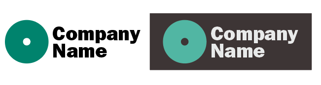
“Reversed” is also a new term.
Is it just the same logo on a solid background?
My problem with solid backgrounds…
is people assume the background is “part of the logo”.
so they cut it out with the shape, and then place it in another
shape and it turns in to a something like this…
it’s more likely to occur with none profit organizations,
with a lot of staff turn over… in which the logo files
get passed on and rebuilt, over and over and nobody
knows if it’s a decorative frame or accumulated junk.
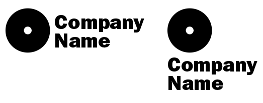
Here’s an example of two lockups of the same logo. Often, companies require a horizontal and vertical or squarish lockup. Sometimes the available space where a logo will be placed dictates which lockup to use. The term is pretty new, but it’s become quite common.
As Jakub mentioned, coated and uncoated refers to the surface on which something prints. As the term implies, coated paper stock has a coating applied to the surface to seal it, make it smooth, and reduce its absorbency. Most magazines, for example, use coated paper. Uncoated paper lacks this coating and is more absorbent. The same ink printed on one will often look quite different when printed on the other.
Yes, more or less. Often, colors must be adjusted in a logo to make legible and look good when printed on dark backgrounds.
This is one reason why I never supply clients with JPEG logos. Inevitably, it will be passed around and become their go-to logo. The result is usually a messy, blurry thing, as you said, cut out and pasted into a white square on a dark background.
When clients request a bitmapped (raster) version of the logo (they usually do), I’ll give them a PNG with a transparent background.
It’s not just non-profits that mess with their logos and use them incompetently. Almost any organization is prone to doing that when they don’t have in-house expertise in charge of the visual branding.