Print Driver:
to be honest, I’m often dealing with none profits,
and I’m starting to think they want that amateur look.
to justify needing donations, and volunteers.
even though they are swimming in cash.
It’s just that I want to transition into for profit,
which is the opposite…a struggling business wants to
to project success, to gain public confidence.
a for profit will run scared if they see a design I made
with horrible logo cut outs, and I might not get a chance to
explain it… I’m hoping it’s a temporary problem.
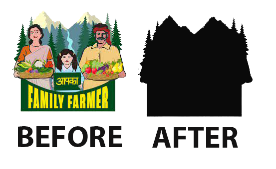
another issue is we have some massive business names in Canada,
because of the two languages…everything is doubled, and french text tends to be longer, more words and more characters.
so often a logo starts out with
a fun english acronym, entity name, local chapter, parent organization, tag line.
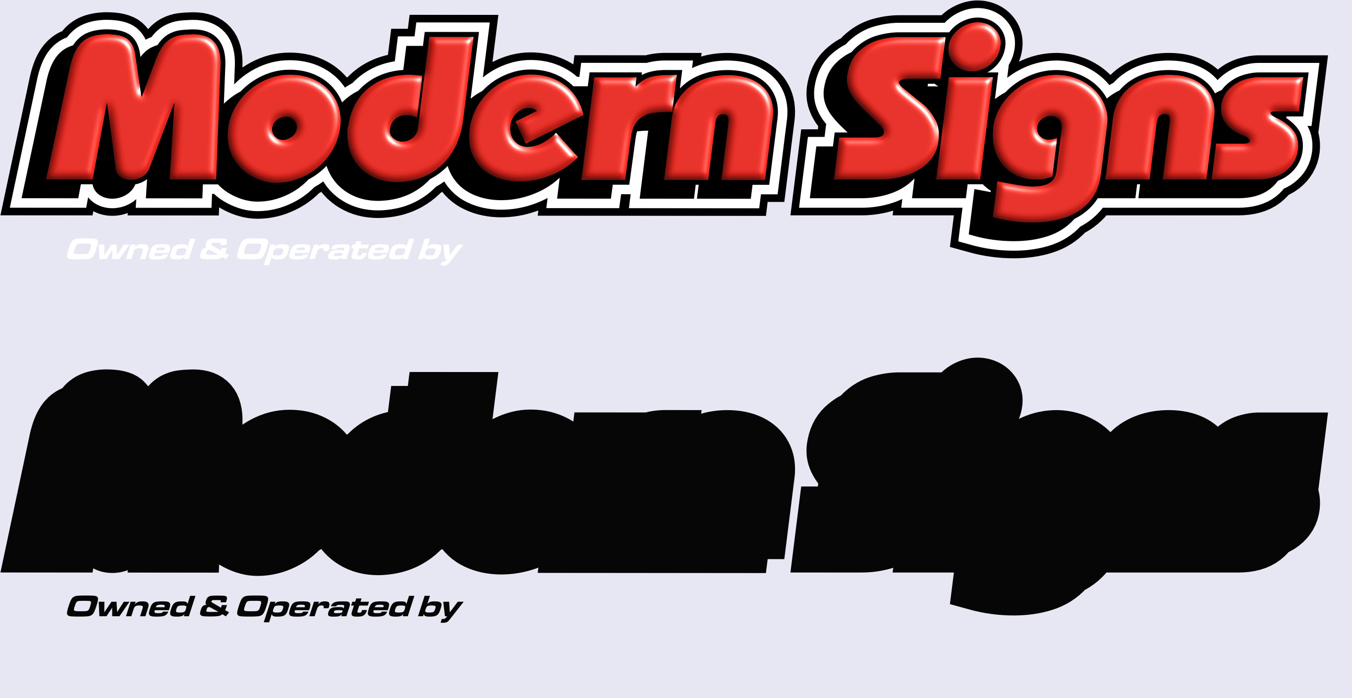
if it’s 20 words in English then it’s 30 words in french. a bilingual logo can push 50 words, plus an image. It’s to much content. It looks fine large…but when shrunken down it turns into a blob. so either I trim it down by removing unnecessary elements,
or leave it as an unreadable blob.
further there are hundreds of possible configurations when your pairing an icon, and two business names…
It;s possible for one entity to have all of these,
one just one…
I feel like we are getting a bit off topic though…
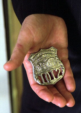
I’m not talking about icon that looks like a badge,
but a badge as a category.
My research indicates that a “badge”
is not just describing what it looks like,
but has some function to it…
It’s intended to fit lots of content into a square,
without worrying about background contrast
at least on the colored version.
I just think it’s just poorly named…
because there is an association with
the physical fashion accessory.
sonething that looks like a badge,
might not serve the same function.
if it’s monocolored, or with transparency inside.,
while something that does not look like a badge,
like a wide solid rectangle does.
Basically what I am describing is something
that is transparent on the perimeter, but solid inside.
like a label, or sticker,
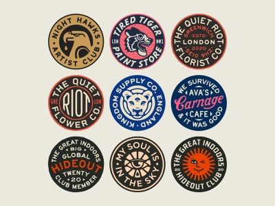
another reason I ask is because of these awful,
badges with the rounded text.
so many people send me these, and say can you just grab
the text and make a word mark…but they are not giving me the font or layers,
so that requires isolating and warping it back to flat.
but there is no distinction between a side by side combination,
and multilayered combination.
I’m gonna post this now before I lose it.
It;s a bit of rant sorry, lol