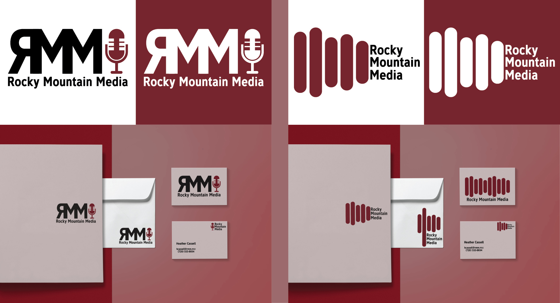
Positives:
– You kept them to two colors.
– You didn’t go crazy with type.
– You have some appropriate symbolism (microphone and, what I’m guessing, is an abstract of sound waves.
– Both designs are readily reproducible across a variety of mediums.
Negatives:
– II think you have to have a really compelling reason to flip a letter, and this is not it.
– Kind of boring color palette.
– Proportion between the type and the graphic is off.
– I think you could get more creative with combing a mountain them and audio theme to come up with something more unique.
First logo — Why are the vertical strokes on the M all different widths? I’m not a particularly big fan of the typeface you’ve chosen. The face itself is fine, but in this instance, a sans-serif with a little more finesse might work better — maybe something a bit more extended and a different weight. The backwards R is seemingly flopped for the simple reason that it wouldn’t fit up against the M if it weren’t — not sure that’s a good enough reason to do it. Did you try setting the line of type below in caps?
Second logo — Again, I think a different typeface would have worked a bit better. I think the type it’s too close to the vertical pill shape (a sound frequency spectrum graph, maybe?). I’d suggest moving that type so there’s the same amount of space between the type and the pill-shape. As letterheads go, they’re for correspondence, which means the logo’s position on the letterhead needs to consider that. Your logo intrudes too far into the body of the letterhead. Different colored stock for the letterhead and envelope — not sure that’s a good idea. They will likely come across as simply being mismatched if they were printed and used. You’re placing the logo on the back of the envelope? That’s an interesting idea, but doing so really draws attention to the oddity of doing so, and I’m not sure that kind of attention is desired. You’ve created different versions of the same logo for the letterhead, envelope and business card. Doing this might be sort of debatable, but I don’t mind the idea (I’ve done the same on occasion). I would, however, be sure to make them all match, and I’m not so sure yours do.
All that aside (I’ve been picky because you requested it), it’s not a bad effort at all. You kept it simple, readable and restrained, which is nice. There wouldn’t be production issues with this logo, and that alone puts you ahead of many other students who seem more concerned with decoration that function.
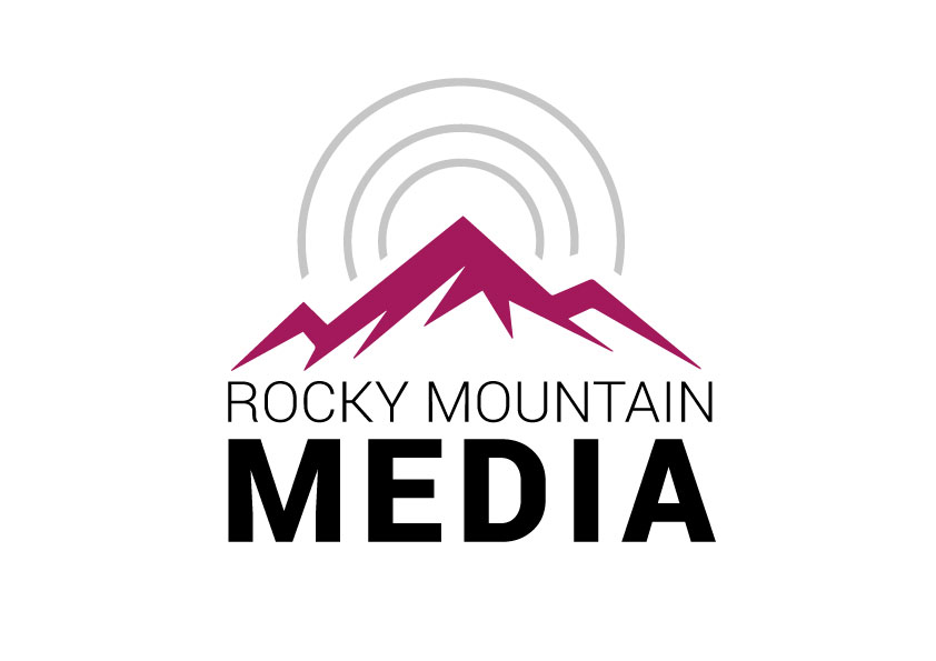
Example:
For the ‘radio wave’ logo, have you tried literally recording “Rocky Mountain radio” and using that audio wave for the logo? And play with that to build a mountain range etc.
For colour, depending on where the company is located (I’m assuming this is a fake company for a project—in which case pick a location on a map) take a picture, or source an image of a Rocky Mountain range and sample colours.
Sometimes if you take an actual location, you can start to image and create a logo based on that specific location. That use to help me with some projects.