Hi there,
I am a student just embarking on very beginning design projects for my course. The most recent exercise was to produce a poster to promote a local music event. We were provided the following:
Brief: You have been approached by a local community group to help promote their local ‘grass-roots’ music event.
They are after a simple yet informative poster promoting the event.
They are new to organizing live music events, but they’ve told you that this is aimed at ages 18-50 yrs old who like pop music
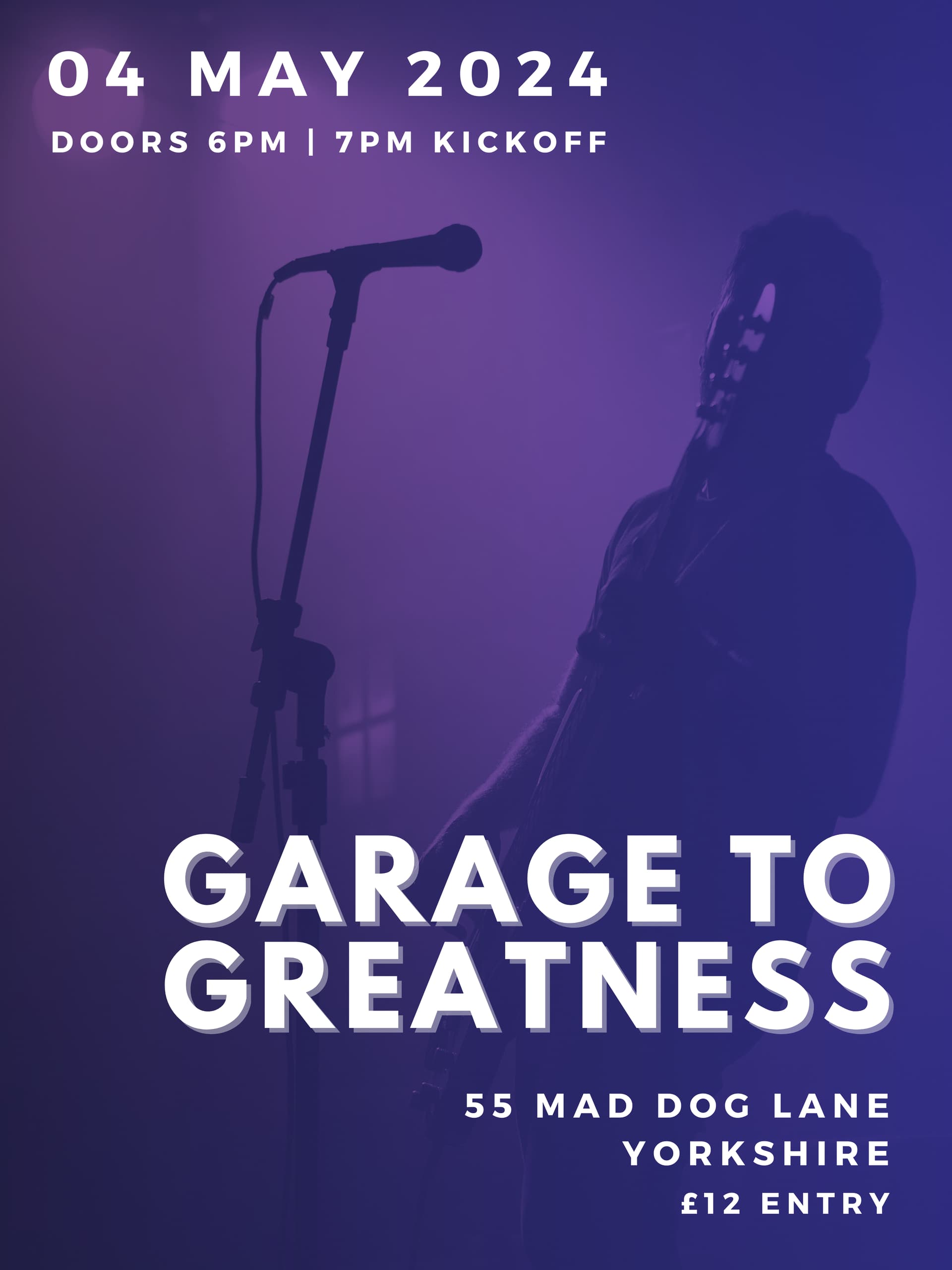
I have put together the following but I feel something is lacking with my design. Do you think I should start over, or have you any tips?
What colors define “Pop” music as opposed to, let’s say, “Blues” music.
Does this poster say “Pop” to you?
Drop shadows for the sake of drop shadows is simply meaningless decoration. And there is such a thing as too much distance between the top lettering and the hard-edged drop shadow. It looks like you are trying to make an extruded edge, but Illustrator is reeeeeeealllly bad at doing that.
First of all, I don’t like the assignment. But there is nothing you can do about it. A poster or flier like this should reflect the music, and saying “pop music” is way to large of a genre to be helpful.
Second, I think you have a messaging problem. Without the benefit of reading the brief, which your target market won’t have, I would assume “Garage to Greatness” is the name of the band — not a grass roots music event. When I hear “grass roots music event,” I think of a festival with a number of different bands. If that’s the case, the bands should be listed here. For example, “Garage to Greatness Featuring Dead Kennedys, Taylor Swift, and The Skatalites.”
I picked those three artists on purpose. I’m not looking to get into a debate here over music genres and subgenres, but let’s say all three of those fall into the overarching umbrella category of pop. Those are three distinct styles and the design should reflect those — this gets back to why I said I don’t like the assignment. In this case, I think it’s going to be up to you to communicate a sense of style with the design.
If it were me, I would scrap one large hero image that doesn’t mean much and have photos of all of the bands with their names. It’s up to you, as a designer, to tie everything together and to give a clue as to what an attendee might be in for.
Two other nitpicks. include a venue name along with the address and include a web address for more information — maybe even a QR code for someone walking by this poster who wants more information.
I’m not trying to be snarky, but it looks like a Canva template. It doesn’t seem to line up with the theme of the event. It looks like the designer found a free generic music template, and plugged in the info, and it’s done. And sometimes that’s perfectly fine, because the client only has a budget to cover a half hour of labor. So my question would be how much time does the instructor expect you to put in on this. Half hour, 5 hours, 10, 20, 40? It looks like a half hour project right now.
First thing I do before beginning a project like this is to do a review of the marketplace to get an idea of how other designers have approached the same problem. I’m not saying copy them. Just find out what’s being done and analyze the aesthetics. What things work and what doesn’t?
@Steve_O Thanks for your feedback. I found the assignment challenging on this account too, as what I’ve noted was all the information we were provided with which to create a poster. There was no line up of bands etc so I felt a generic image was best
But they are valid points you make - thanks
@mojo Thanks for your feedback. For your reference it wasn’t a template; I composed the poster myself.
Thanks for your suggestion of how you would approach the project, I find this very helpful and will do some research
One day, I think it would be really funny to hear back on this forum that the student actually went back to the teacher as if the teacher were a ‘client’ and ask for more information with which to do the project.
In the real world, that is what you’d have to do.
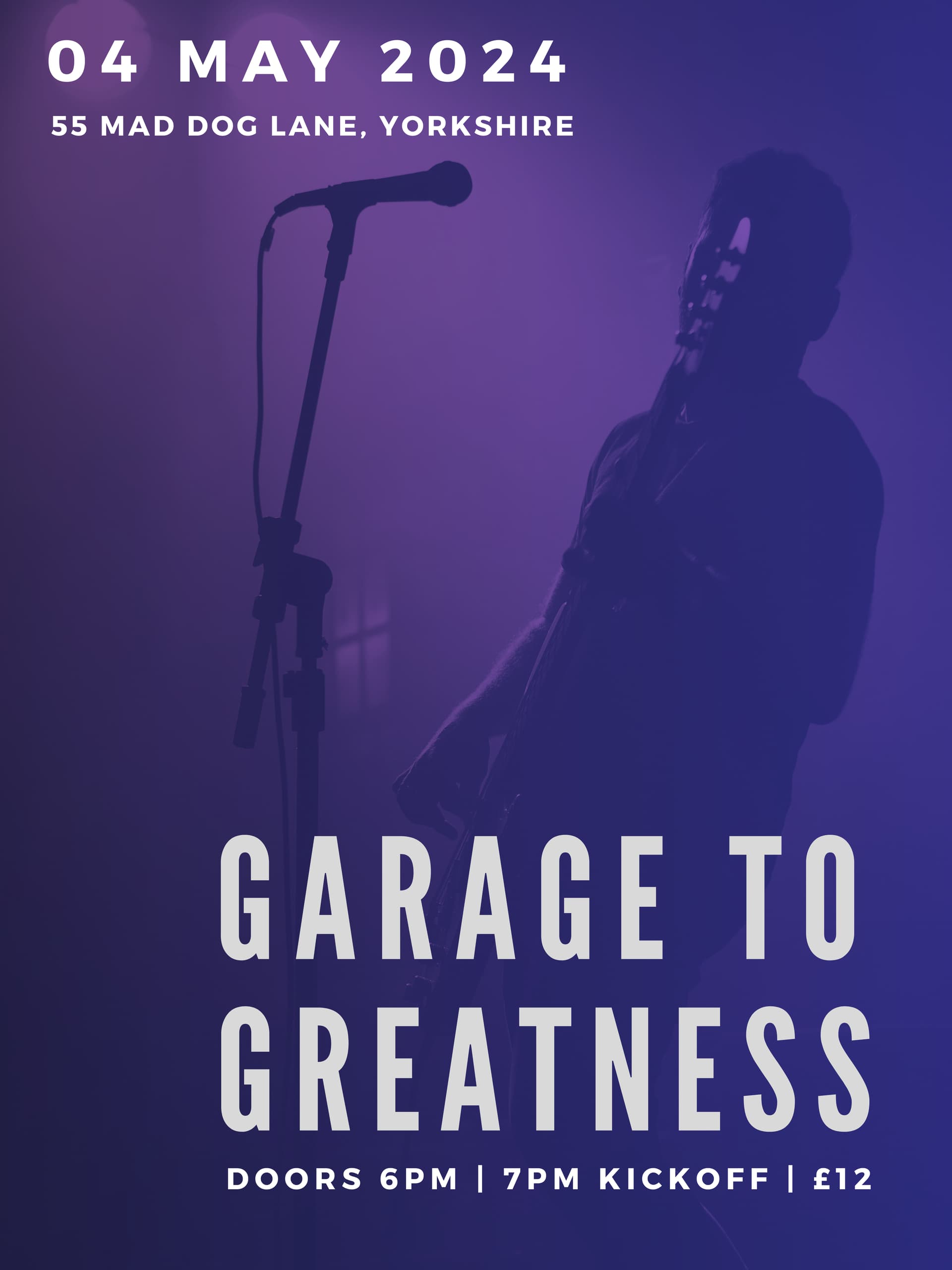
You’re welcome, but I am left wondering why you didn’t address any with the second iteration.
Your second effort is a step backwards typographically speaking. Mixing two sans serif fonts can be a challenge to pull off. It wasn’t working in the first iteration, and it isn’t working in the second. Also, there are leading and paragraph spacing issues in the second that you didn’t have in the first.
You’re paying attention to aesthetics but failing to realize that posters must effectively communicate information relevant to their purpose. If I had seen this poster for the first time, I would have had difficulty deciphering what it was advertising. As a result, I’d quickly dismiss it and forget I ever saw it.
The poster does not readily communicate that it is advertising a concert. Instead, you’re leaving it up to the viewer to infer from a dark and difficult-to-decipher image that the poster is advertising a concert built around music involving a guitar and a microphone.
There is no information about who’s playing, what kind of music to expect, or anything about the venue and what attendees might expect. The headline implies that the concert might have something to do with garage bands that became successful, but I suspect most people wouldn’t pick up on the reference.
There’s no mention of tickets or where to buy them. There’s no mention of where to find more information. There’s no call to action.
In other words, this poster would be ineffective in engaging its intended audience or providing enough information to entice them to attend.
In the real world the client would come back in 2 weeks and decide it needs an url. Then another week and they decide they need to include a QR. Then a few more days pass and they ask if you can include their name at the top as the promoter. Then they’ll figure out they really should include the band names so they’ll send you the names of three bands. Then after you send the proof for that they’ll tell you they’ve added 2 more bands that need to be included, and can you do it rush because they’re running behind. You send the proof for that and then they’ll tell you one of the bands has dropped out, and can you rush that change because they need to get this to the printer asap. Then it’ll be “Can you add ‘All Ages’ and the presale info, and can you rush?” etc…
It looks like you are really pushing to use that image, which IMO is not the best.
Have you done research. Just doing a quick web search I found this link which I think gives you a better understanding of how the poster needs to look.
I’m not saying to copy directly anything at the link, but take a look at what works and what doesn’t. To me, the biggest thing that stands out at the link is that the most of the posters use more vibrant colors, more contrast. There is also (as noted earlier) quite a bit more info on the posters at the link above.
Did you sketch out ideas prior to your design? If not, you should. Pencil or pen on paper. Even rough sketched ideas. It helps you to get a better sense of hierarchy and understanding the elements and the flow of things.
Also, most of the posters at the link above are for a band, not an event. Look at the examples that show more multi-band or multi-day events.
Looking great! The color scheme really sets the mood. There could be an opportunity to push this further and tie it to the pop music theme. Have you thought about incorporating pop music-related graphics or fonts?
As others have mentioned, it would be awesome to see a clearer call to action since this is a poster. Maybe include info on where to get tickets or even add a QR code for easy access?
You’re definitely on the right track. Awesome job!