Hello everyone. First of all, If my text has any grammatical errors or something, I’m apologizing right away.
So, I’m a rookie at graphic design and that’s the reason why I want to get your opinions and critiques.
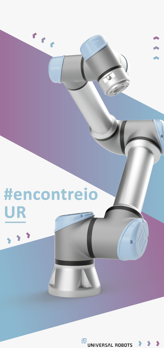
The following image is a flyer i’m creating for a Portuguese social media contest.
You’ve created a very nice illustration and placed it in a clean, nice-looking setting. However, there’s more to design than that. Graphic design is about developing visual solutions that address well-defined client problems. This typically involves working with clients to understand their objectives, identifying the target audience and determining how best to influence that target audience to achieve those objectives.
Your “flyer” seems more like an illustration with no particular thought given to how it solves the design problem. Furthermore, you’ve provided us with no information regarding what that design problem might have been other than saying it’s a flyer for a social media contest.
Like I said, your work looks very nice. I like it a lot. However, I have no idea what the design problem was or whether or not you solved it. In other words, there’s no way to offer a meaningful critique on anything but the aesthetics of your illustration and your 3D skills.
Thanks for replying, and you’re right! I didn’t give you much information.
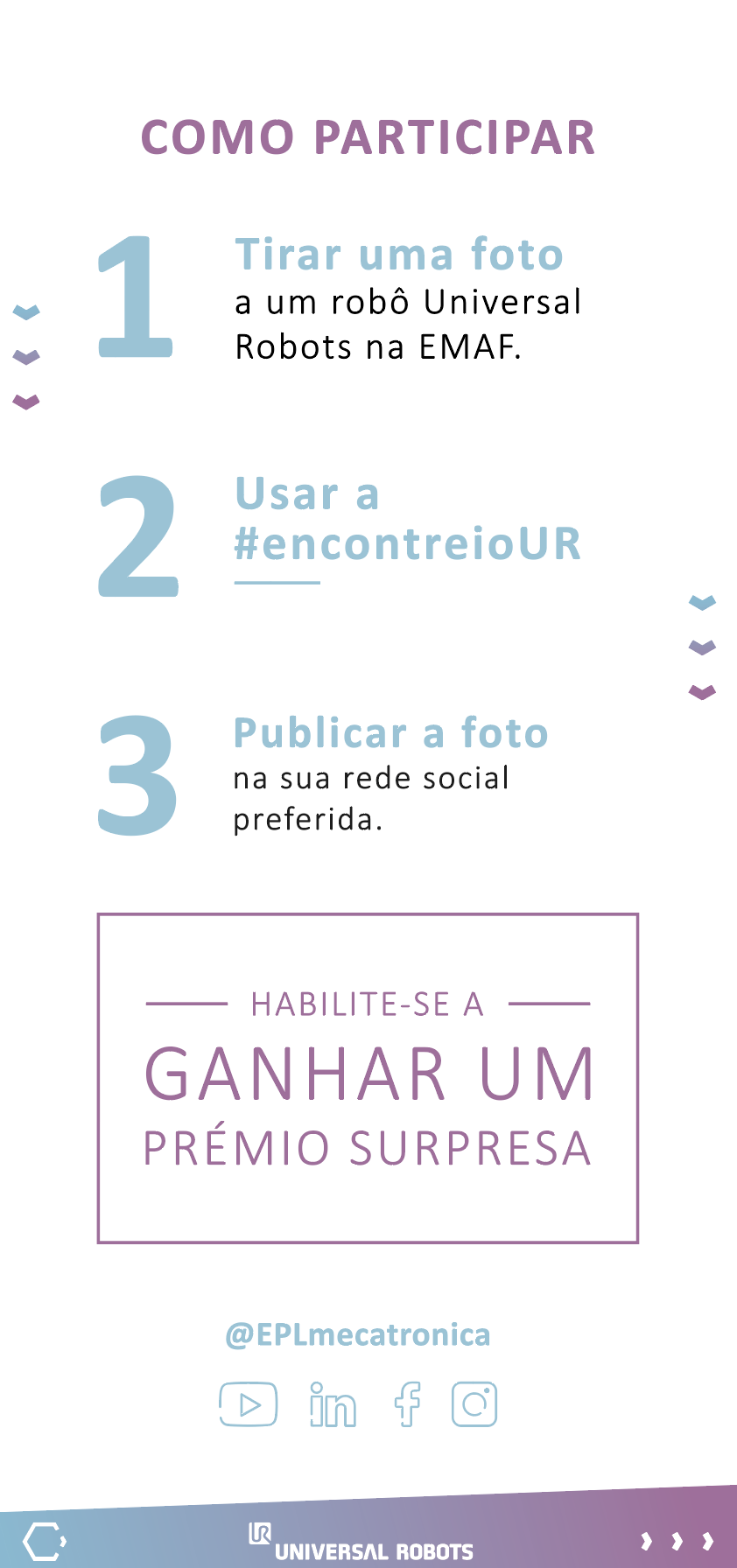
So, besides what I wrote above, this flyer is being created to promote the contest and the hashtag “encontreioUR”. The contest consists of someone take a picture to a product (the robot on the pic, in this case) and post it on social media with that hashtag.
The target audience would be between 18 and 30 years old.
I didn’t designed the back page (Page 2) yet cause I wanted to know if the cover page is good enough.
I like this a lot. It’s one of the nicest student posts i’ve seen in quite some time.
But like Just-B said, it tells me nothing about it’s purpose.
And sadly, I feel you’ve designed yourself into a corner here. The Piece is so visually aesthetic as it is, you almost don’t want to add any additional text to it. Yet it must be done to complete a functional piece of graphic design. Had you considered the additional typography in the initial layout, it wouldn’t be so painful, and present the feeling of “ruining” the design we’re looking at now.
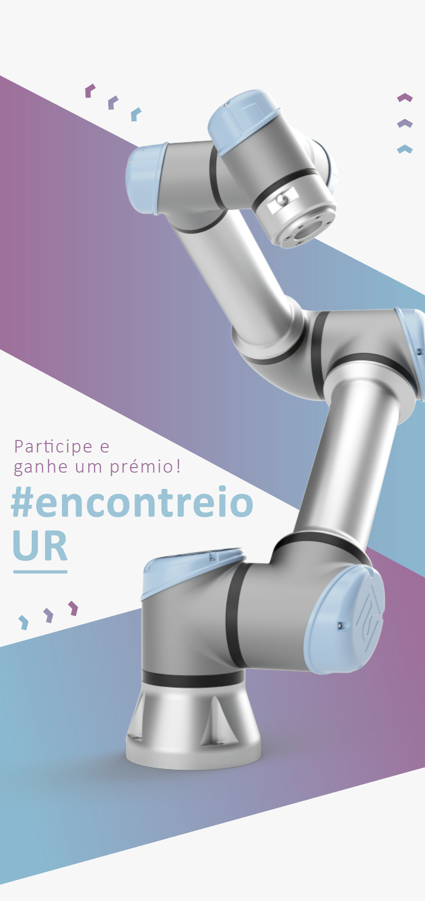
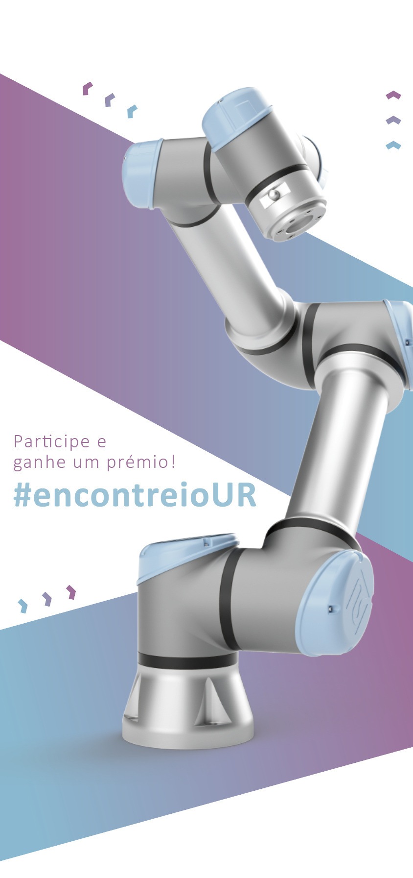
The call to action is participate on the contest, by taking a picture to a robot like the one on the picture cause the idea was to distribute this flyer on an robotic event. On that event would be lots of robots like the one in the picture. So after that, the person would post the picture with the hashtag.
And the winner would win a reward that I cannot share it yet on the flyer. But the details of this contest would be on the back page.
One good thing about flyers and small brochures (like trifolds) is that a catchy cover almost always results in people turning over the flyer or opening the brochure. Whether they read it is another matter, but if the cover does it’s job, people pick up the piece to see what it’s about.
I would likely pick up your flyer since it’s attractive, engaging and has something on the cover that makes me wonder what’s inside. So in this sense, the aesthetics are an important part of the design and I think you’ve done a great job with it. The colors are very nice.
However, I still think it would benefit from a short, stylish headline on the cover that’s more than just a hashtag and the UR letters (which are puzzling unless one makes the association with Universal Robotics as the bottom).
The back side is where you’ll need to get into the meat of telling people what they need to know in a way they’ll read, remember and take the desired action that the flyer is meant to produce. Have you given any thought to that back cover?
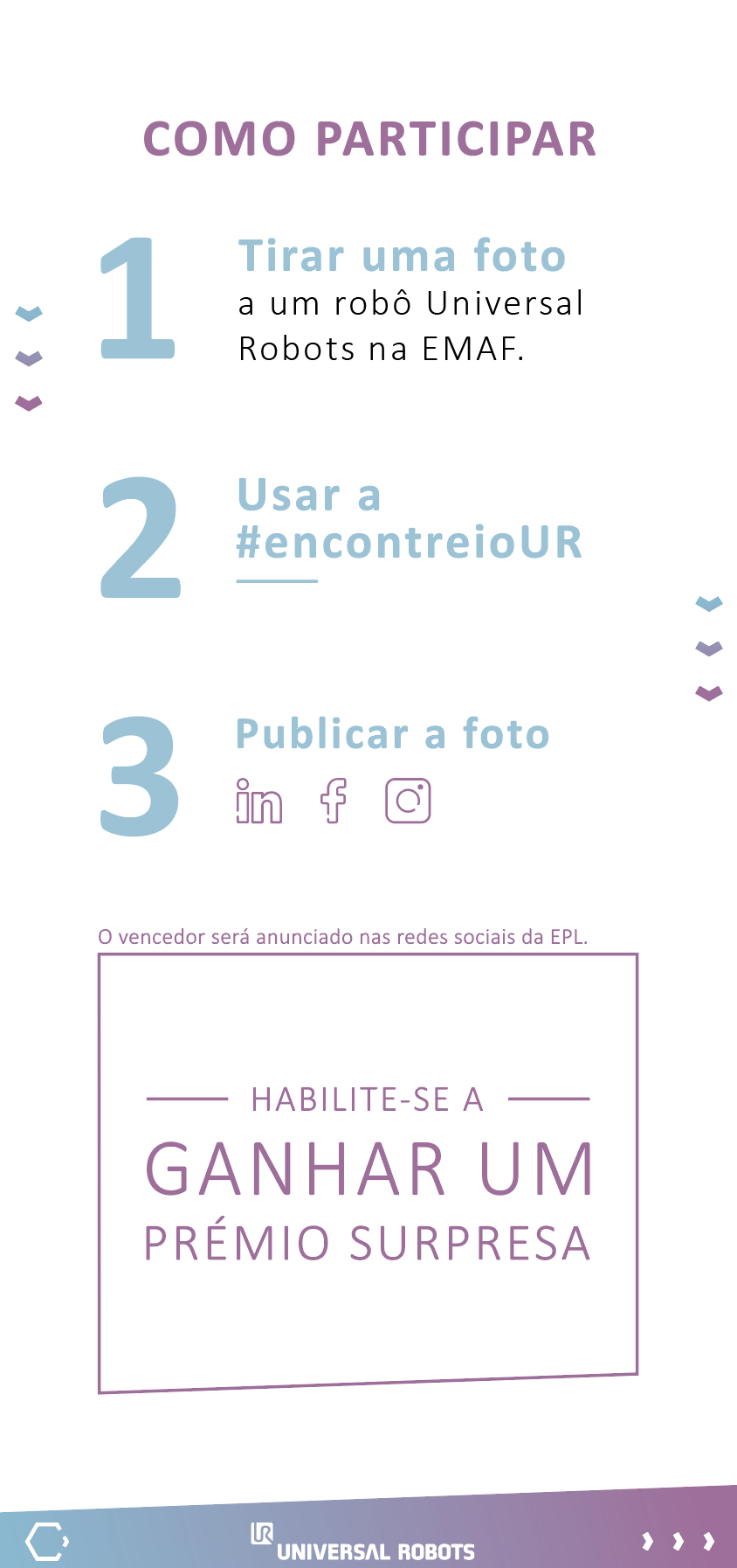
Yes, I already done a storyboard with the basic “3 steps” style like a contest would normally has.
I will post the back page later when I finish it.
Thanks for all the help guys. I really appreciate that.
(Note: it’s the first time I’m using this forum, and I am loving it!)
Hello again. I decided to create other versions of the front page and also, I already finished the design of the back page.
New versions of the front page:
I can’t read Portuguese, so I’m unsure if everything is there that should be. It does look nice, however.
Of the two, I prefer the one on the right. The box with the angle at the bottom on the back draws attention to itself. One thing I would definitely do is move the type at the bottom away from the edge. It’s way to close to the trim and could easily get cut off or cut in two.
Yes, I prefer the one on the right. I said the one on the left has a box bottom angle that draws attention to itself, which, in my opinion, is not where attention should be drawn. I don’t regard that as a major problem, however. Both solutions are nice.
Will this be printed? If so, the information in the angled gradient shape on the back is dangerously close to the edge. Other than that, its clean and overall well done.
For what it’s worth, that extra space around the edges is called the safe zone or safety. It needs as much space as the bleed gets on the outside of the trim. So if the bleed is 3mm, the safety should also be 3mm to ensure that it doesn’t get inadvertently trimmed.