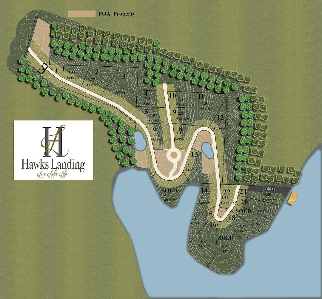
If you have been keeping up with my portfolio/job endeavor this is an extension of that. To sum it up, a potential print shop I am looking to work for is assigning me a small project to do prior to employment (we do not like that I understand)
“Recreate this jpeg and put it into an illustrator file. Make it clearer so it can be printed in a large format. Close to 4’ x 8’. Must be identical minus the logo”
Even if I decide not to take this job, I would like to learn how to recreate this. What type of software was used? There’s is shading on the trees and grass like texture.
It’s all doable in Illustrator. The background pattern in the big green areas would be problematic, but if the objective is to make it clearer and cleaner I assume you have some latitude to do exactly that. The contour lines (or whatever they are) in the dark green areas would be time-consuming, but doable. The trees would be simple; they’re all the same.
The texture is the problematic background pattern I mentioned. The pattern in the large lighter-green area doesn’t appear to be an intentional pattern. Instead, it seems more like a regular set of JPEG compression artifacts on a straightforward series of gradients.
There does appear to be an intentional pattern in the darker green areas (not the contour lines), but the resolution of the image isn’t high enough to see clearly. Whatever it is, it could be approximated with a seamless pattern fill.
give yourself a time limit. I’d say no more than 4 hours.
Limit all sections to solid color, no textures to start. Don’t bog down doing tiny detail work. But work in layers so you can isolate sections later if you have time for, or if they really want that texture.
The most time consuming part of this is the contour lines. I don’t see an easy way of doing those, except maybe asking if they are needed. You could maybe do a quick look to see if there is a geo survey map of that area available in vector download. Don’t hold breath.
once you make a tree, make it a line pattern and just draw lines of trees.
If you keep this vector you have no worries on bringing it up to size.
Seems as if theres a drop shadow effect on the trees and island too.
The most tedious part would be the contour lines. If you start at the apex of the contour, you could resize and make them bigger and at points in and drag out where needed.
I think you need clarification from the print shop on the assignment. You said the assignment was to “make it clearer,” and you’re asking about the “grass like texture.” Is the print shop looking for the big green area to be a solid color — which would be “clearer” in my opinion — or are they wanting the texture to show up? Is that texture actually applied on purpose or is it artifacting from multiple lossy saves? The directions also seem a little contradictory. Do they want it “identical” or do they want it “clearer”? My strong hunch is that the texture showing up in the grass is not needed and not what the print shop is looking for.
Yup, the topographic contour lines would be hardest. I’d recommend making the trees based on one symbol in Illustrator so if you do want to make a minor tweak, you just adjust one and they all update. And nothing against @PrintDriver, to be more precise I wouldn’t make the tress a line pattern. There aren’t that many that you couldn’t duplicate them to more precisely match.
I will say, for the topographic contour lines, Place the JPEG on the bottom layer in Illustrator, double click the layer in the layers palette and check the dim images box and play with the transparency where you feel like you can see it well enough but trace over it well enough. Then, as mentioned earlier make sure to use plenty of layers to isolate certain elements (such as the contour lines, the trees, etc.) I’d start with the smaller items and work my way “down” through the layers. So, trees, contour lines, path, lines divvying up the lots, etc.
For the contour lines layer and I would redraw each line as a solid line first to match each path, and then do a simple dashed line in the strokes palette. IMO, I don’t think it is as important that the way the line is dashed (i.e. the exact same line breaks appear) as the fact that they are close to the approximate segment and gap lengths.
I also agree that the moire/artifacted grass layer should be solid or at the most have that slight alternating gradient from the darker to lighter grass from left to right.
Very easy to do. But why remove the logo? Me thinks they are being sneaky and getting it redrawn without the logo because they are stealing it.
Contour map lines are extremely easy to do.
Start with the small inside one. Then the largest outside one and map it around.
You only need to draw 2.
Then use the Blend function in Illustrator and have a go at utilising the settings.
You can then tweak your blended paths after the fact.
There’s a few vids online that explain it better than I do.
You make x1 tree and make it a symbol.
Then place each one.
Overall it’s about 30 minutes work.
I wouldn’t do it - I’d tell them to go and jump.
If i was charging for this it would 4 hours x hourly rate.