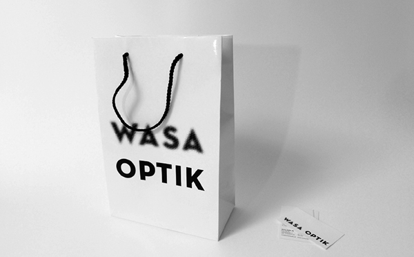
Designer: Carl Dacko
5 Likes
That’s great.
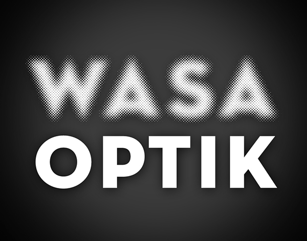
I dig it. As long as they made that halftone as a proper dot vector and not some photoslop trace.
Rasterbator is your friend.
(I’ll still let YOU weed it. ![]() )
)
1 Like
I like it. Very clever and memorable.
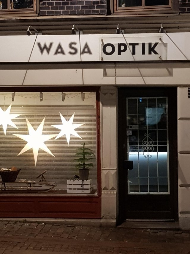
On the storefront sign, however, I’m not seeing the reasoning for what seems to be clear panels of some kind in front of or behind the word OPTIK. It’s obviously intentional, but why?
It represents a corrective lens – either glasses or contacts. So, on the storefront, when you look at WASA, it’s fuzzy. When you look at OPTIK through the lens, it’s sharp.
I thought that might be what they were attempting, but successfully pulling it off would seem to require the use of a panel actually shaped like a corrective lens instead of an ordinary rectangle. I think if it had been me, I would have just skipped that part — for anyone who wears glasses, the logo make a whole lot of sense without the extras.
It might have been cool to have used Optician Sans for the typeface.
3 Likes
The time of day that the photo was taken (causing a shadow over “optik” may also be affect the way it looks. Without the overcast shadow; it would probably look a lot better.
When considering dimensionality on any sign, it’s always best to consider lighting angles at all times of day. Outdoors, you are the mercy of the elements, and streetlights.
I do a lot of interior logos and often the upper cove lights washing the wall are at an angle far too steep to light dimensional lettering appropriately. So, you don’t stand them off, keep them 1/4" to 1/2" thick, and check that the top row of letters doesn’t drop a shadow onto the bottom row. Or you price in an electrician to remove the cove lighting and place some angled recessed units out at the proper 45° angle.