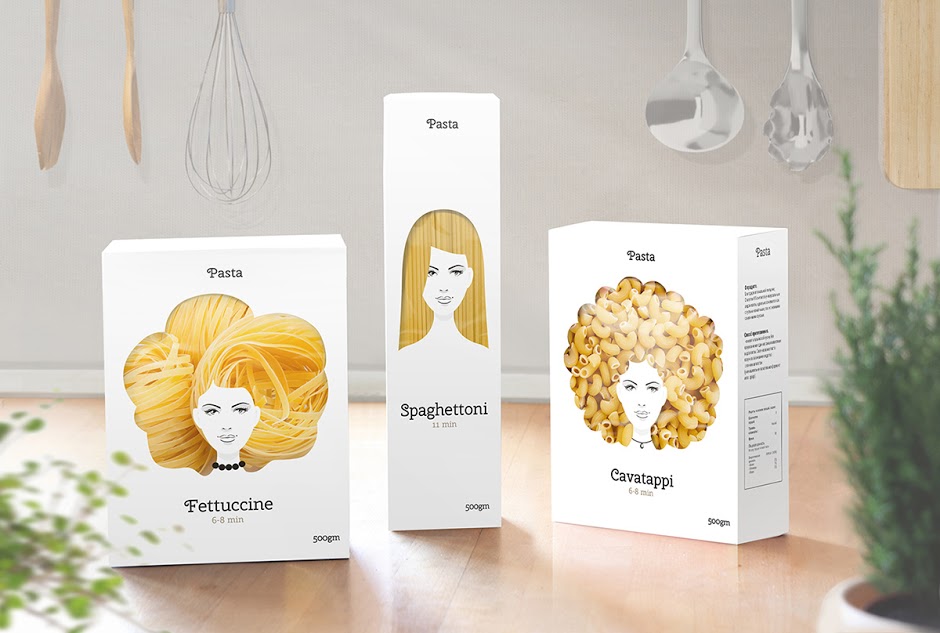
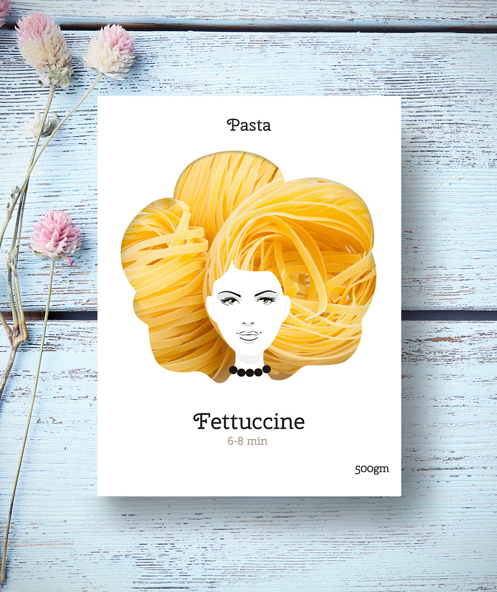
Looks great and a nice idea, but what relevance does the womans face have to the product?
Absolutely love it! I doubt the fettuccine will always go into the package in just the right way to look as though it was growing from her head. But still, great idea.
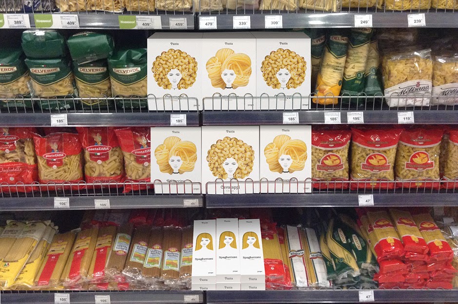
may just be me, but I don’t find the idea of hair to be very appetizing lol. Looks off on the shelf next to those other pasta products.
Ummm excuse me waiter, there appears to be a hair in my pasta! ![]()
![]()
Fun idea for “designer pasta”
but it will all depend on how it is displayed on the store shelf. Every regular grocer store I’ve ever been in displays pasta stick boxes on their side, not on their end like that. Maybe a boutique store will display upright.
Is there a brand name? Plain old white box pasta is not apt to draw in customers.
That’s sort of the whole point.
Loveeee this idea ![]()
.. I kind of want some to put around my kitchen ![]() LOL
LOL
Cherry Swash (Regular)
Agreed in loving the concept, but find a significant disconnect between hair, the people, and my pasta.
Perhaps Italian cities, or buildings, a boat, vegetable shapes perhaps. But not hair.
I understand the Pasta has a hair-like appearance, but it’s not solid enough for me to rule out that certain customers will have a distaste for the packaging. Your older generations won’t appreciate it, it’s very feminine, the thought of hair and eating, there are many reasons that could be a turn off.
As cliche as it might be, I would take the silhouette of the colosseum, a city skyline, a gondola - who could hate those? The genius concept remains, and all audiences are appeased.
All I have to go on is a personal reaction, but I wouldn’t be at all inclined to have a yuck-like reaction to the pasta-hair connection in what’s clearly an imaginary, fun and not-at-all realistic reference. How many other people might feel one way or the other, I don’t know. I suppose some market testing would soon determine if there’s a significant problem.
I don’t have any problem whatsoever with the face not having any immediate connotations to pasta. People are drawn to faces looking back at them — even imaginary ones. I see no particular reason why the graphics need to reference pasta, cooking or Italian clichés. The bottom line for the manufacturer is whether or not the packaging is effective at selling the product, and finding an attractive way of making the product stand out from the others surrounding it on the supermarket shelf is typically a good approach.
agree with everyone else … cool concept, but of all of the shapes to choose from, they go with HAIR!!!
This is one of the best design where pair of eyes can be impressed. Great design with creativity.
To be 100% honest, I wasn’t exactly turned off, or grossed out myself. But at first glance, I thought I was looking at a boxed hair product. And just by the forum posts, a reasonable percentage of the population is going to experience some correlation to “hair meets food”.
I just don’t feel it’s a safe enough concept to launch a product with. Sadly, the packaging is everything. People buy absolute garbage products daily because the company spent more on the package design then on whats in the box.
Now if you have a solid package AND a quality product within? Well, you’re golden.
Ahhh, that never occurred to me. Given the reactions here, yeah, I agree it wouldn’t be something I’d encourage a client to launch without some focus group and/or market testing to see what happened.
Strong idea but execution could have been much better and I agree the woman needs to link to the brand in some way otherwise what relevance does she have other than facilitating the hair idea.
SPAMMING NOT ALLOWED - all links removed!
The font you have for sale is not needed or allowed here. So long ![]()
Looks really good. Testing it with a sample of customers would be nice.
wow it is so pretty!! i love that work!!