I’m working on a calendar of events in where every entry aligns visually to the next, however there is one event that the title is too long and it got me thinking what is the proper way to handle this?
I’m using ARIAL NARROW BOLD and I can change to another font but how do you typically handle a job where there’s a lot of text events and one has a title too long?
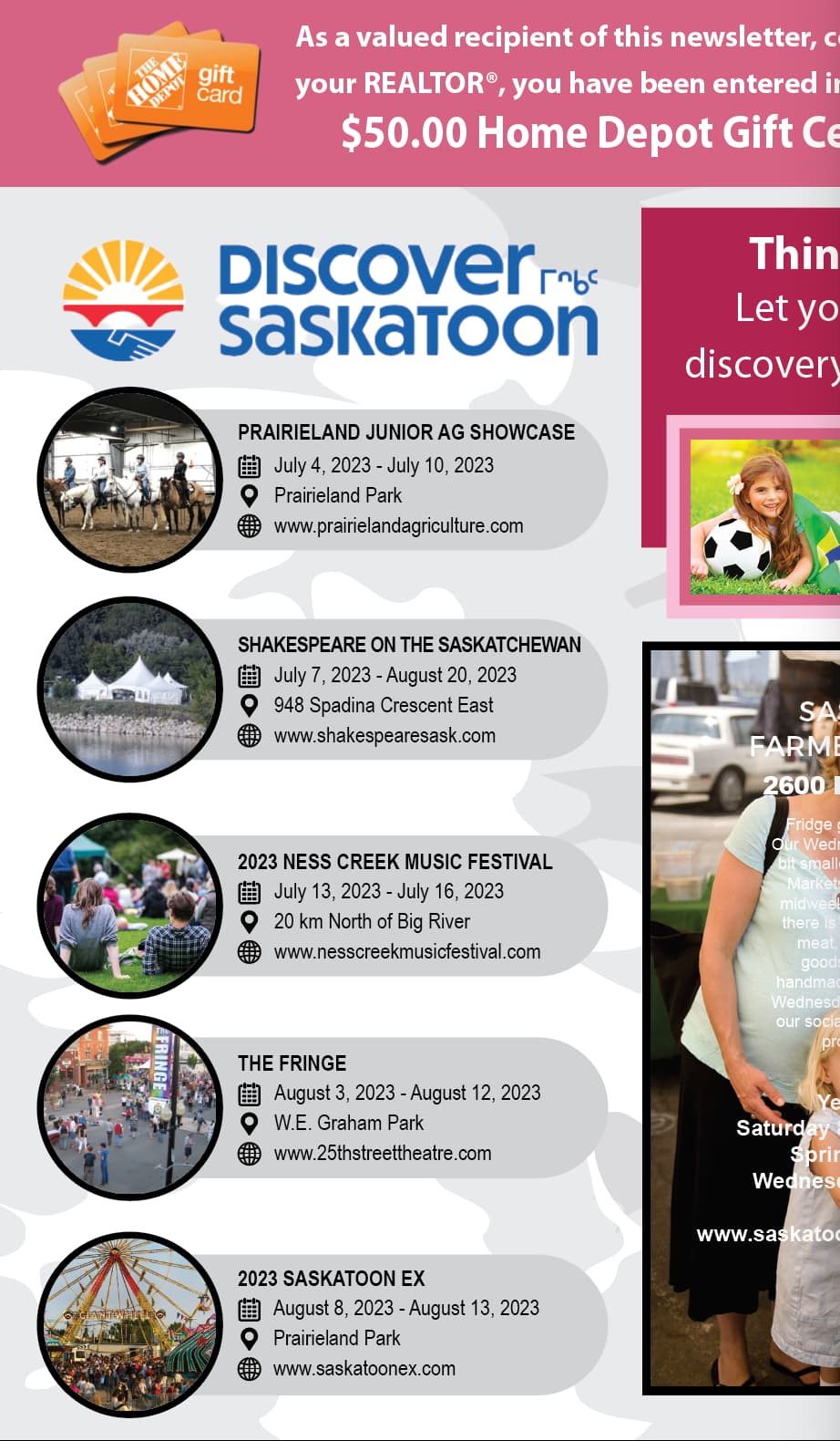
Since it’s a calendar of events, it doesn’t sound like a super high end job. If that’s the case, I’d be tempted to tighten up the tracking or scale the font horizontally to see if that helps. I’m not talking about doing anything too drastic, but if changing the horizontal scaling to 95% on something the end user will be pitching helps … I can live with that. Your other options are to edit the name of the event or set a style based on the longest entry and adjust all of the other entries based on the longest. I suppose you could reduce the overall size of just the one entry (change it from 12 points to 8 points or whatever), but I think that will look odd and it would be my last course of action. EDIT: One more thought, can you enlarge the container for the entries to accommodate the longest entry?
Hey Steve … you confirmed what I was already thinking that either tighten more or probably ideally extend the container … its a print newsletter that goes out quarterly to a fairly large audience and it got me thinking if there was a hard set of rules about this.
I ended up using arial narrow and I did look at other condensed fonts and it just started to confound me.
You could also pass this on to the editor. After all, the editor’s main concern are words. Just show him the facts, and get him to commit in writing (e-mail’ll be nice).
since the event names seem to be quite tight already (in case font size is already small) you could go for the grey background radii to make some air in the background “corners”
The Shakespeare title and the Prairieland title are both looking cramped. I’d make the gray blobs tall enough to allow for a two line title. Make all of the gray blobs the same height for consistency. The music festival title could go to two lines pretty easily. The other two with the shortest headline, center them vertically in the now taller gray blobs.
I know you didn;t ask for any advice beyond handling long text, but your spacing between your event listings is inconsistent. (the space between the circles with the photos in them varies quite a bit.) That and adding the year on the first part of the dates is awkward.
Instead of “July 7, 2023 - August 20, 2023” it reads easier as “July 7 – August 20, 2023”.
And lastly, a condensed font could solve your issue. You could also potentially shrink up the photo circles on the left by 10% or so, maybe a little more to give you a little more room for longer titles.
Yes, the spacing was off as I was in the middle of moving things around. However on the date excluding the year in the first entry I think that’s more of a stylistic call … honestly, I’m a bit OCD about things like that and that’s why I tend to put the full date down even though its not necessary. In this case the date line isn’t the problem so I’m not as concerned about that.
On the condensed font - I started there and that’s what brought me here to this forum as I was wondering how do you typically work when using a condensed font? Do you use it only where its tight and then resume to the standard version? It seems to me that would visually look ‘off’, I’m assuming you use condensed throughout? I’m interested on feedback on this.
Steve… this is exactly where I started on previous issues and it always looked a slight bit ‘OFF’ with the 2 line titles mixed in with 1 line titles … it wasn’t real bad and it may be that I’ve been looking at it too long but I thought there may be another way.
If you use a condensed font, you should use it for all the titles, not just the ones that are too long in order for it to remain consistent, IMO.
And the dates are your call (or the publication’s editor’s call) but it does make it harder to read. In fact the year is not necessary either as it is understood to be this current year.
Craig - as I’m working on this and looking at it in relation to the overall newsletter I’m starting to think that perhaps another font would be better for this. Ideally I want to use 2-3 fonts throughout the entire newsletter and having a font with various degrees of ‘bold’ and the option to ‘condense’ seems to be the best overall.
Do you have a font that you would recommend? And another question for you… if using a condensed font in the events calendar - I would use for title and body correct? But what about the remaining newsletter can I use a regular version or should everything be condensed?
This is how I ended up here in the first place … really wanting to understand what is the correct method. You would never believe I’ve been doing this forever and yet have these things come up… curious to hear your input.
You can use a condensed font for the headings and regular font for the copy. However, you may want to make it all condensed. Usually I avoid condensed fonts for copy, but since this is more of an event listing and not a large chunk of copy, using a condensed font in that case would probably be fine.
Since you are using a sans serif font, there are probably 100s of possible options that could work for you. Helvetica Neue is always a good option. For options included in Adobe CC font library, Proxima Nova or Acumin may work especially in the sheer number of weights and options. If you are looking for free options, Roboto and Roboto condensed are available through Google Fonts for free which could also work.
I typically end up using Myriad Pro for these kinds of things. It’s a nice-looking, neutral typeface that doesn’t draw attention to itself. It comes in a huge range of weights and widths, which makes it very flexible.
I have one comment on the solution you posted. If it were me, I’d extend the gray background container just slightly to the right to make just a little more space between where the long names and the edge of the circular, gray area. Having the text touching the edge makes it looks awkwardly crammed. Even adding an extra millimeter of space would greatly reduce the problem.