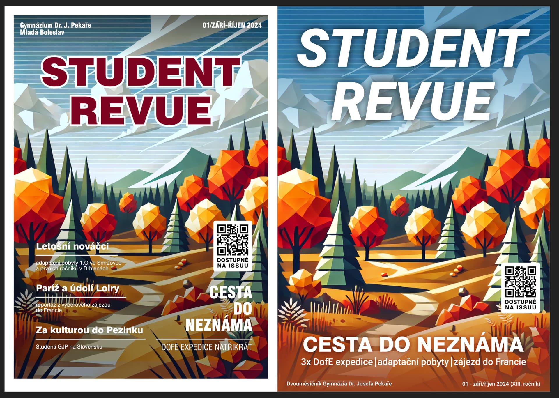
Hi, I’m preparing graphics for our school magazine, which is due out on Friday. I’m wondering whether to keep the version on the left, which was more similar to the earlier look of the magazine, or to draw a thick line under what was and go with the redesigned version on the right. It’s not quite all done yet, but the base would be like this, changing only slightly the placement of the texts or their size. The target audience is students aged 10 to 20 and teachers and parents. What do you think of this purely from a graphical point of view? Is the right version better? How would you improve it to perfection?
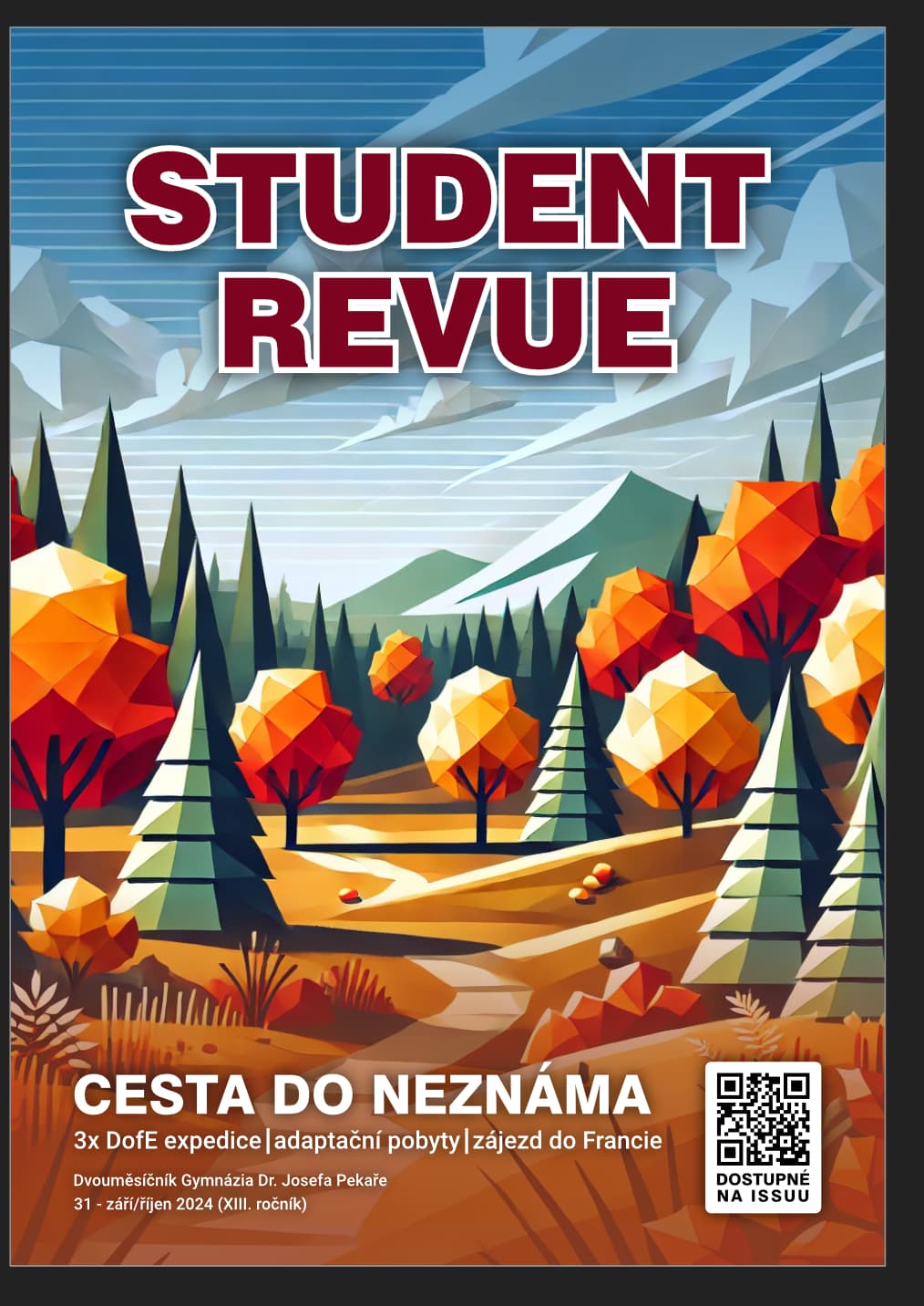
Since this is in Czech, it would maybe help you to somehow describe it in english. “Student revue” is name of our magazine. “01 - září říjen…” is the number of the issue. The QR code is with link to our ISSUU account (or will be, I would add that soon). “Cesta do neznáma” is the main topic of this issue and the other words are just another sub-topics in the magazine (articles…), on the left side every topic has also it’s description.
Did you create the polygon illustration? It’s very nice! Are you a student? Is this student work?
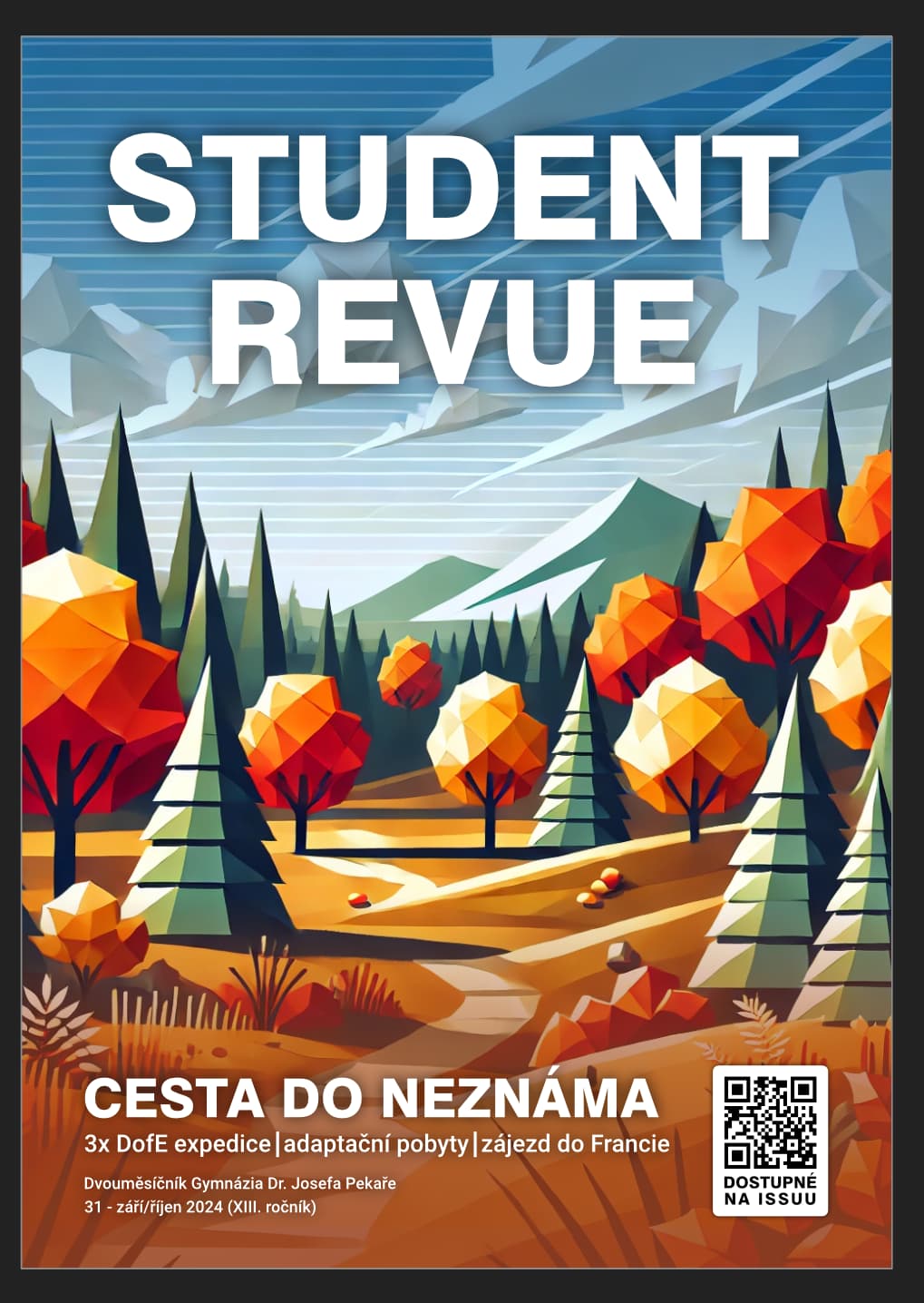
I prefer the second version, but I like the nameplate (the magazine logo) from the first version better. The nameplate from the first version fits the space better and has more character than the second.
The first version doesn’t bleed off the edges, but the second one does. Will the planned method of printing allow a bleed? For that matter, will it be printed at all, or is this just for online distribution?
In the first version, you dulled and darkened the illustration to make the teaser typography stand out, which compromised the overall impact of the illustration. In addition, the small typography gets lost in the clutter and presents a possible printing problem.
If you want to use teasers, they work best when they’re larger and brief. The second version doesn’t have this problem and instead of toning down the illustration, you’ve simplified it in those areas where the type is, which is the better solution.
The positioning of the QR code is a bit awkward. QR codes are not especially attractive, and its size and position draws attention. If it were me, I’d probably make it smaller and tuck it away in a bottom corner, as most magazines do with their barcodes. I also have mixed feelings about it being on the cover, although I suspect it needs to be there. My reservation is that if someone has a physical or PDF copy of the magazine, they won’t need to visit the ISSUU to see it. If it were me, I’d place it inside on the table of contents page or make it part of what’s sometimes called the masthead (the inside blurb that lists details of the magazine and its staff.) Then again, maybe it does need to be on the cover — I don’t know you or your school’s reasoning for it
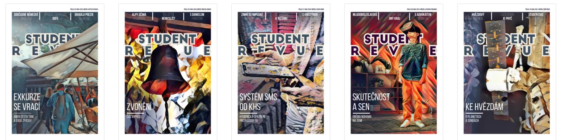
Yes, the picture will change. This one is here because of the theme of the issue - which is something like travelling through the autumn landscape. Before me, the magazine graphics were terrible, but I’ll post five back issues that were very good quality. Yes, the magazine doesn’t have to compete with other magazines, the important thing is that it is appealing and even visible to students at first glance, we will put it in the print shop and then the issues will be posted on bulletin boards around the school for loan.
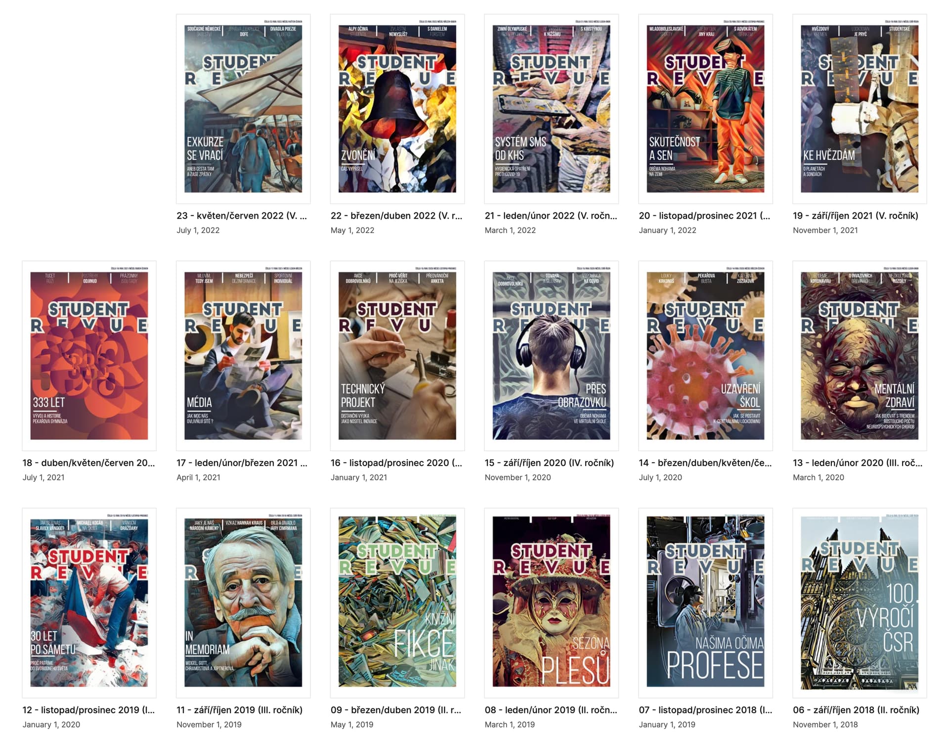
You can find all issues on ISSUU after searching “student.revue”. It’s the one account with orange profile image. I uploaded them today, this is all I have…
I’m a high school student with a general education degree. I do graphics on my own in my free time, I enjoy it very much.
We plan to print something like 40 copies - each author of an article will get one and the rest (about 20) will be posted around the school on bulletin boards for students to borrow. Printing all the way to the margins is possible, we already printed the last issue this way (not the cover, but the content inside).
I also think the second version is better at this. The students just need to see that they can find something inside about an adaptation placement, and they will figure out who has ever been there, and that it is therefore probably a report for an example.
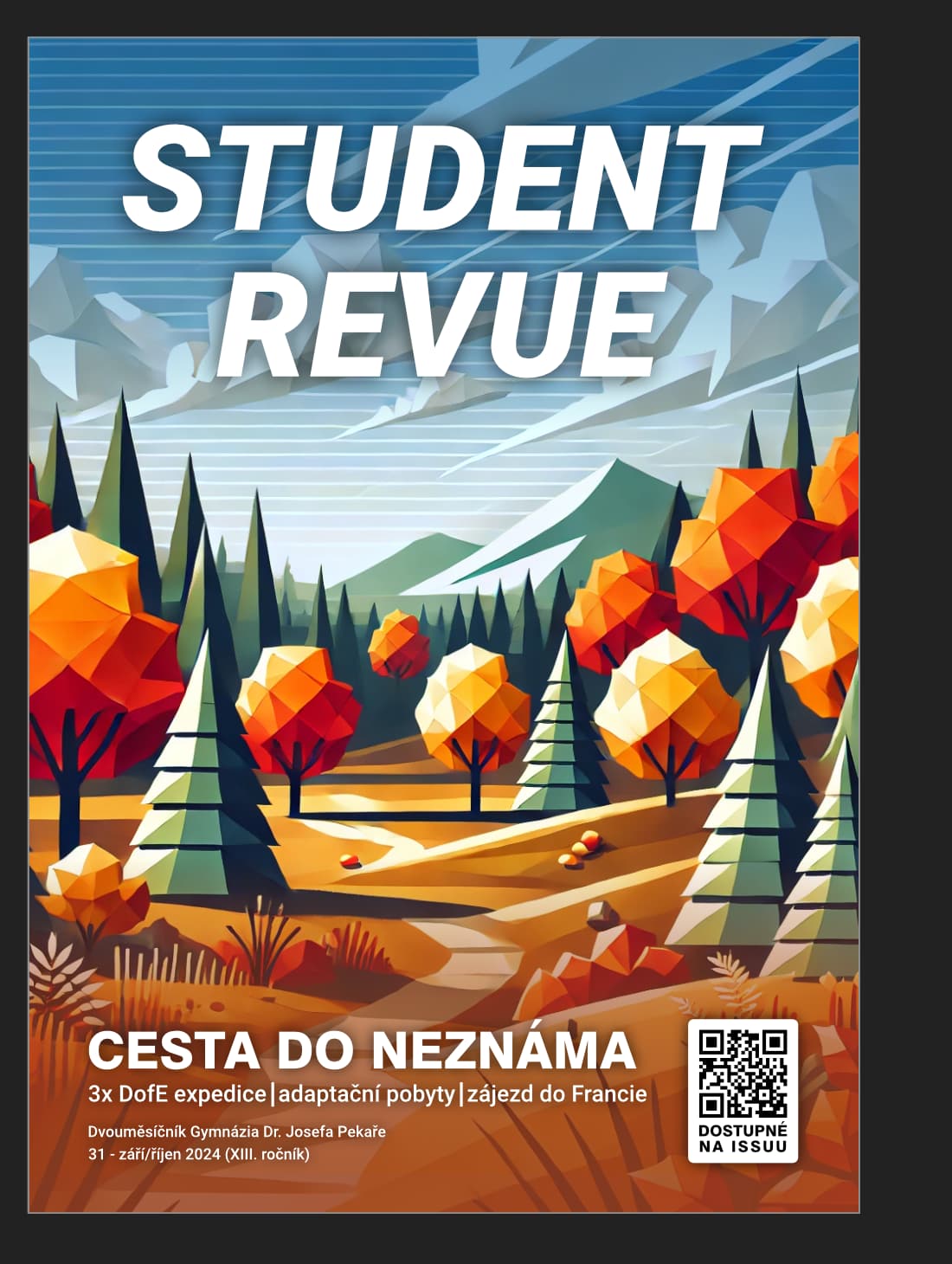
The QR code doesn’t necessarily have to be on the envelope, I was wondering whether to put it there or not. I figured it might come in handy when students don’t have time to borrow the printed version, they could just take a picture of it as it’s hanging on the bulletin board and view it on their phone. On the other hand, it’s true that the electronic version will be out about a week earlier than the print version, and that everyone will be able to access the issue through the school website as well. I was just thinking that the QR code could be some additional element on the cover, it didn’t seem enough. Do you think it’s not?
By the time I noticed the reply, I already had another version. What do you think? Should I throw away the QR code or does it fit in with the design?
I liked the old style too. The only thing that’s a hindrance is that the old design was done for a few years by a guy who graduated and passed it on to others, but he didn’t leave the graphics behind and it seems silly to me to emulate it again. I don’t know if he would have wanted that, plus the mindset of the magazine is a little different now than it used to be… I was wondering if I should “copy” it, but I don’t have contact information for the former graphic designer and I don’t want to “steal” his work. Even the inside of the magazine will be formatted a bit differently…
The publication is online. The readers are online when they are reading it. The purpose of a QR is to get people online, to the publication. So it’s not useful because people are already online and viewing the publication.
Put the QR on piece of paper, and make it bigger, and include some text that tells viewers what the QR does, and pin that on the bulletin board next to the rest of your display.
You mentioned posting physical copies on bulletin boards, so if that’s the case, I’d keep it on the cover for people to scan as they walk by.
When you mention “the old font,” are you referring to the publication’s name? If so, I agree it’s not the best look, but I like the italic type even less. Here’s why:
The font has no personality. It’s a generic geometric sans typeface used generically, as though you simply typed it out on your keyboard without any thought. It’s the magazine’s logo and should be a bit more distinctive.
The italics create a strong diagonal angle that’s inconsistent with anything else on the cover.
Thank you all so much for your help and support with my design! I guess I’d call this the final result, I’ll try to think about it some more, but the rest of the editorial team agrees with this design. We ended up pushing the release to Monday as there’s a bit of a problem with the final proofreading, if you’re interested, you can find the final result on ISSUU then! (I can’t post links here, you can find it under the student.revue account)
Once again, many thanks to everyone for your help!